
Collider
Amplifying experiences
[2023]
Services
Brand Strategy
Brand Narrative
Visual Identity
Art Direction
Photography & Production
Website Design
Press

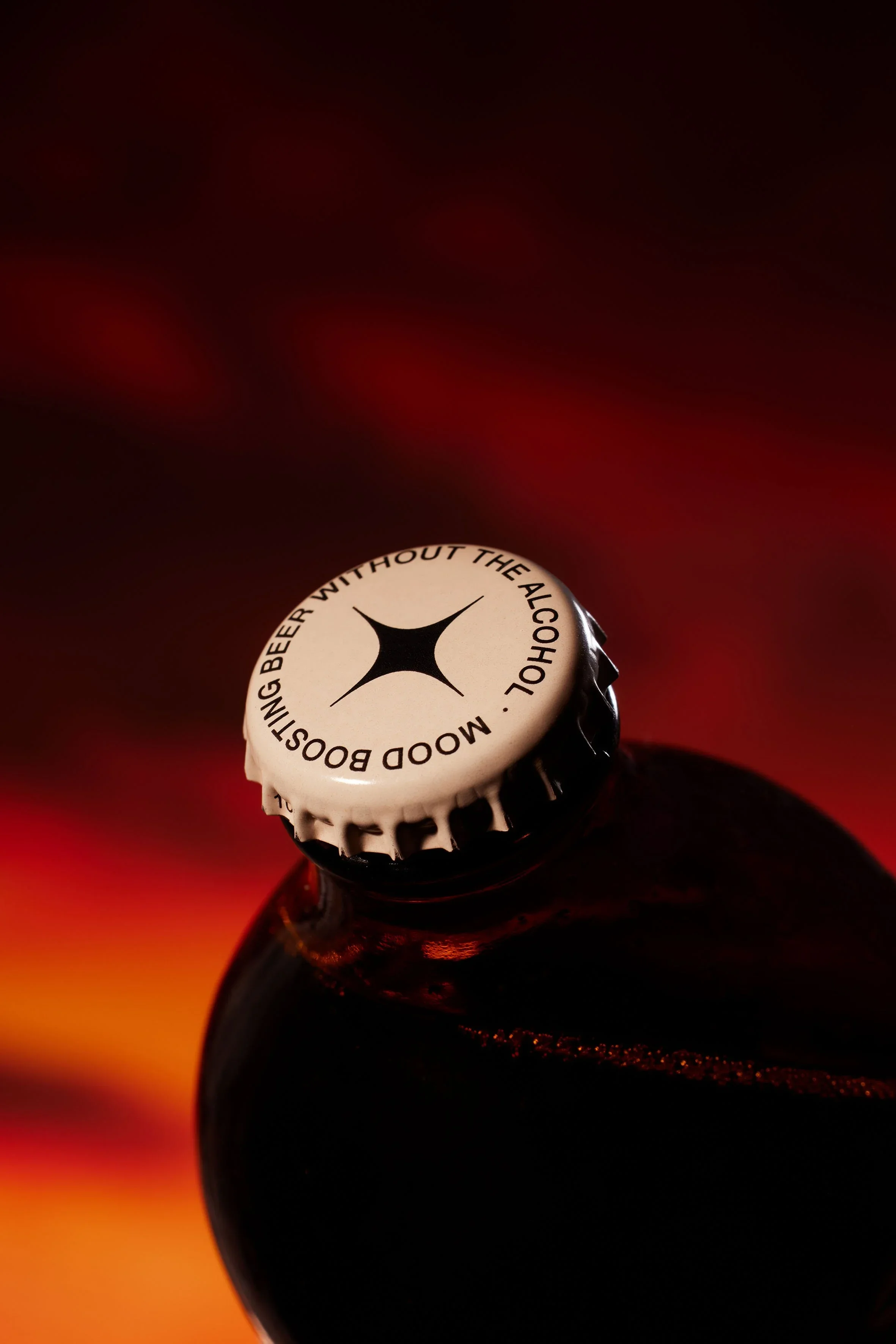
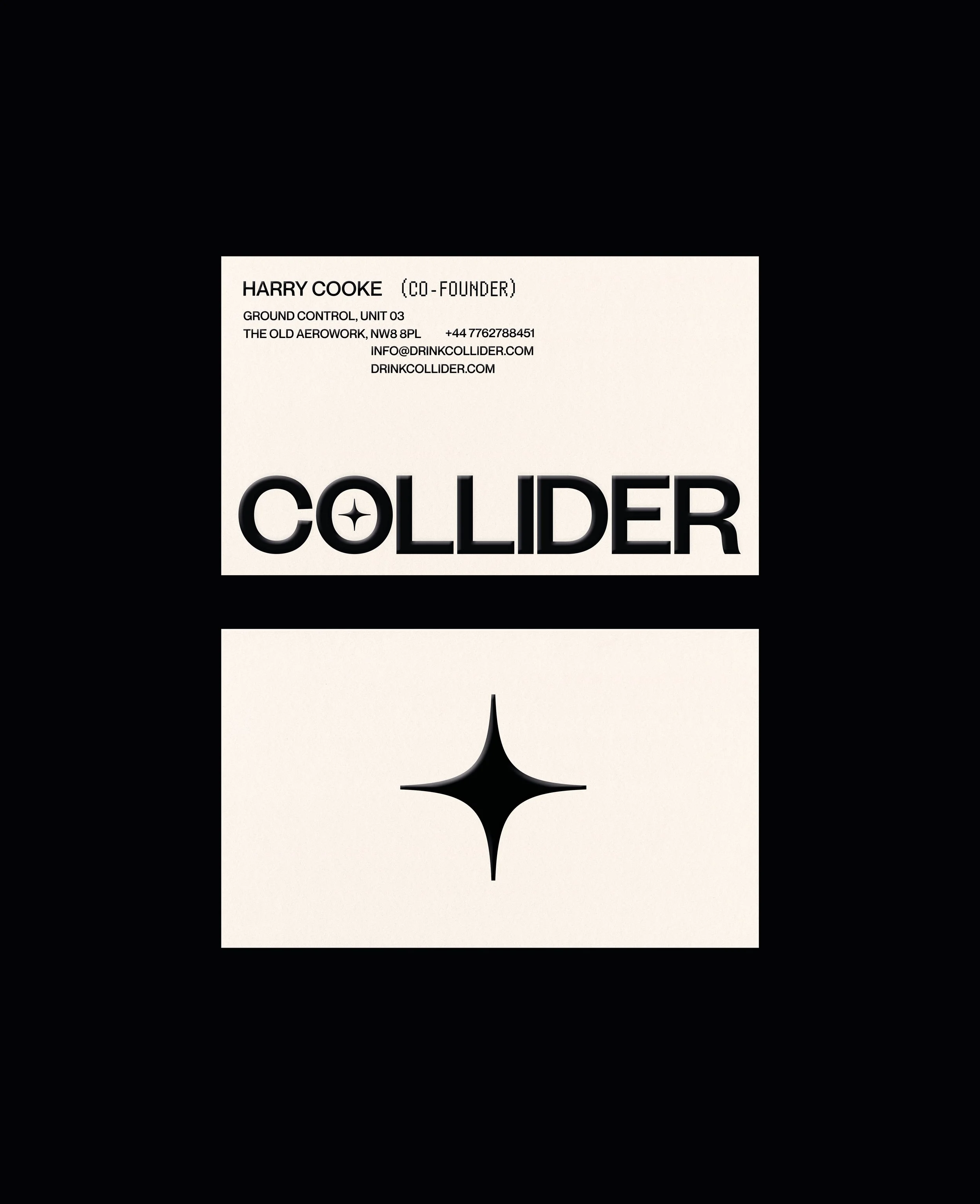
[01] The Collider logotype is a modern sans serif, kept simple for clarity and form. At its centre sits a spark motif that signals collision: a nod to the meeting of social and science, while also suggesting a burst of energy; an uplifting moment; a boost in mood.
Collider is an exploration of what beer can become when tradition loosens its grip. Positioned beyond the expectations of conventional brewing, it introduces a non-alcoholic proposition shaped as much by feeling as by flavour.
At its core is an infusion of nootropic and adaptogenic ingredients, designed to gently shift your mood. Rather than replicating alcohol, Collider proposes an alternative ritual; one that prioritises clarity and a more conscious style of indulgence. Early in our collaboration, we aligned with Collider’s founder on a defining principle: the brand needed to be less about disruption for its own sake, and more about expanding the edges of its own category, creating room for new behaviours, new aesthetics, and new ways of drinking.
[02] The Final Frontier for Beer.
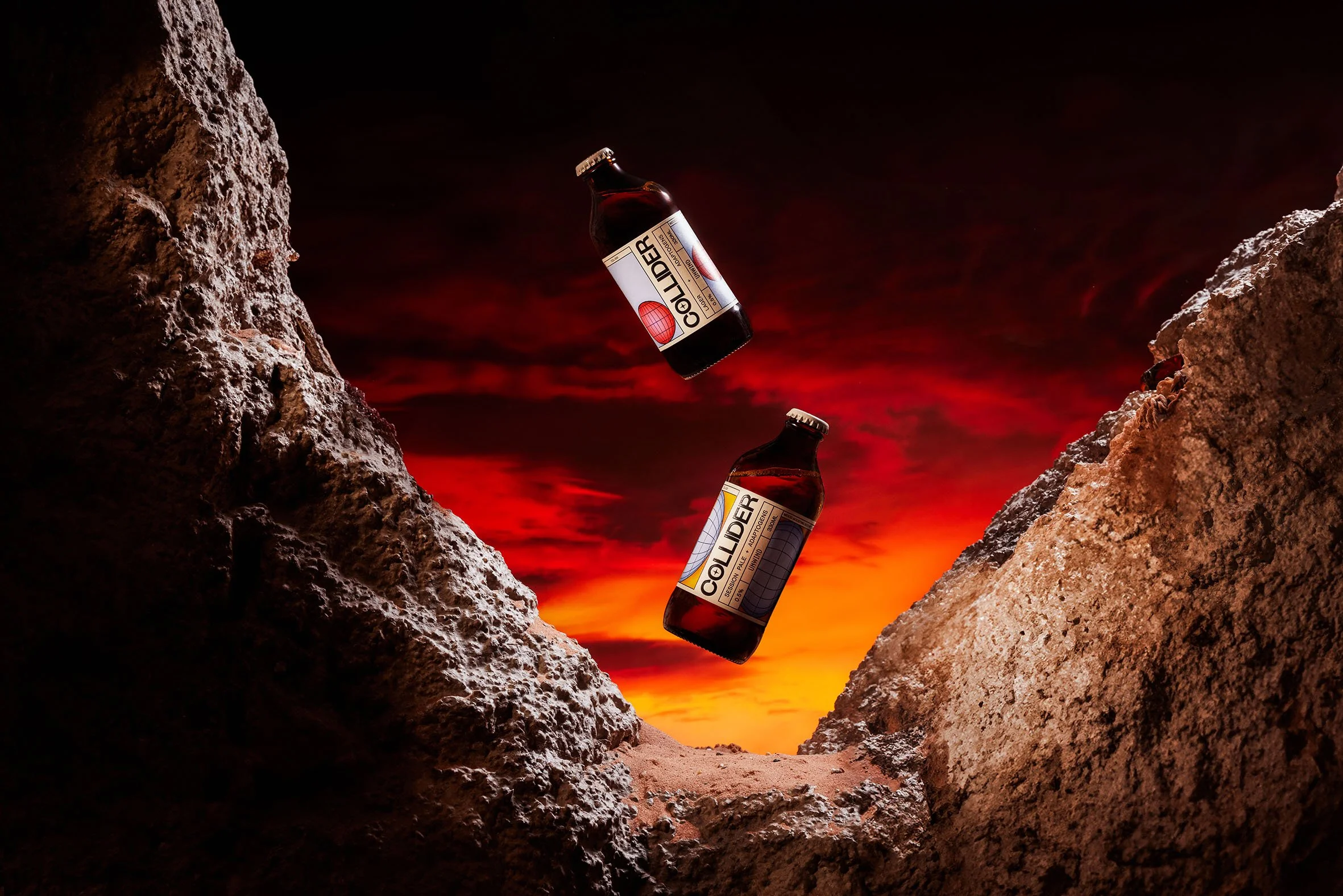
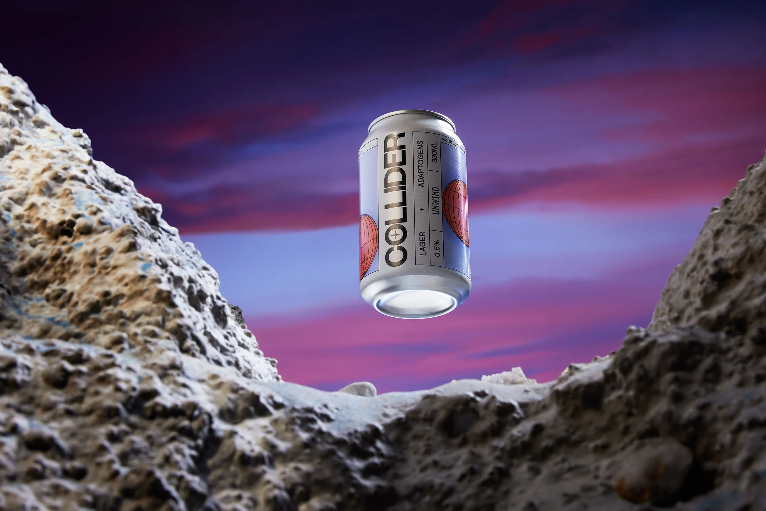
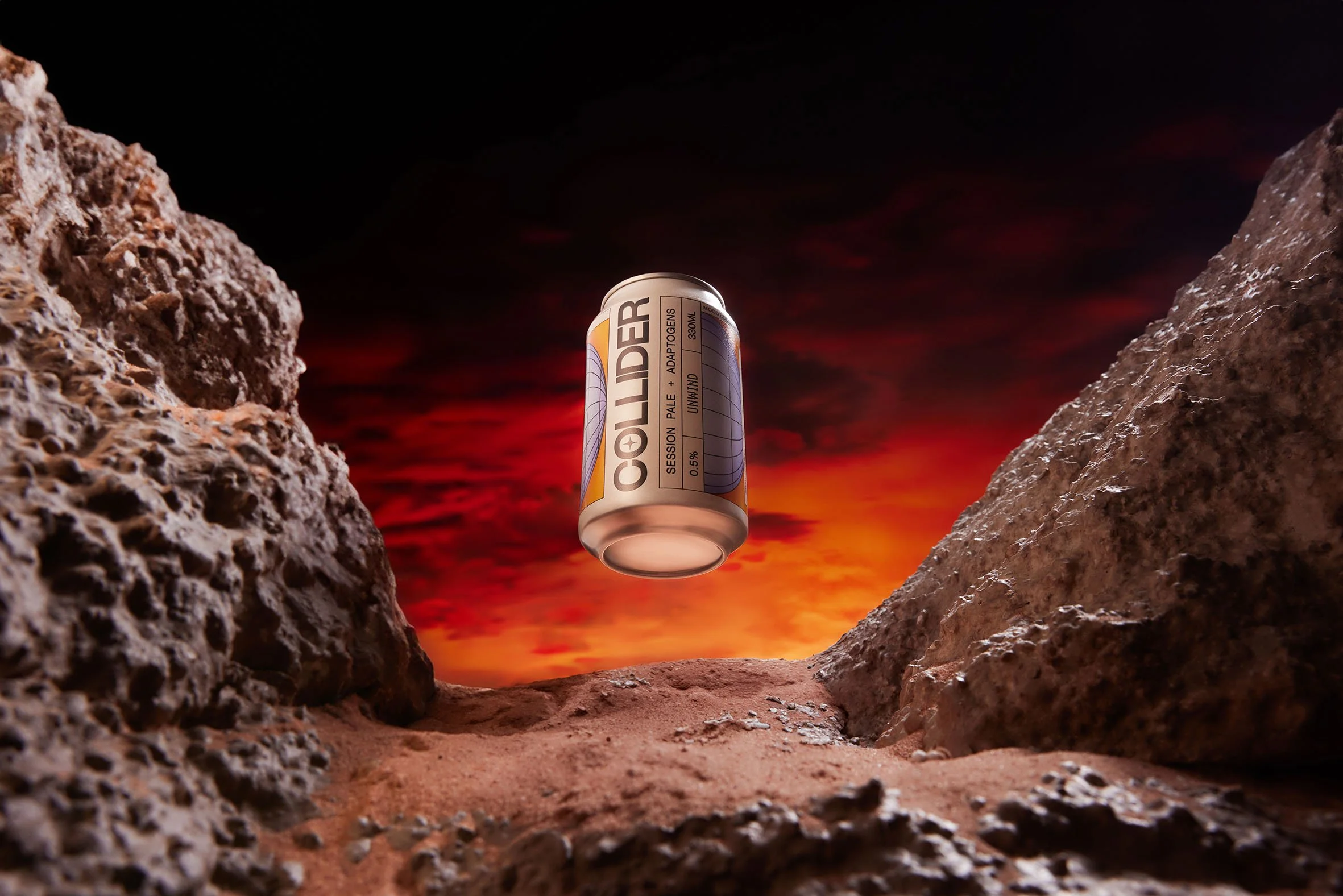
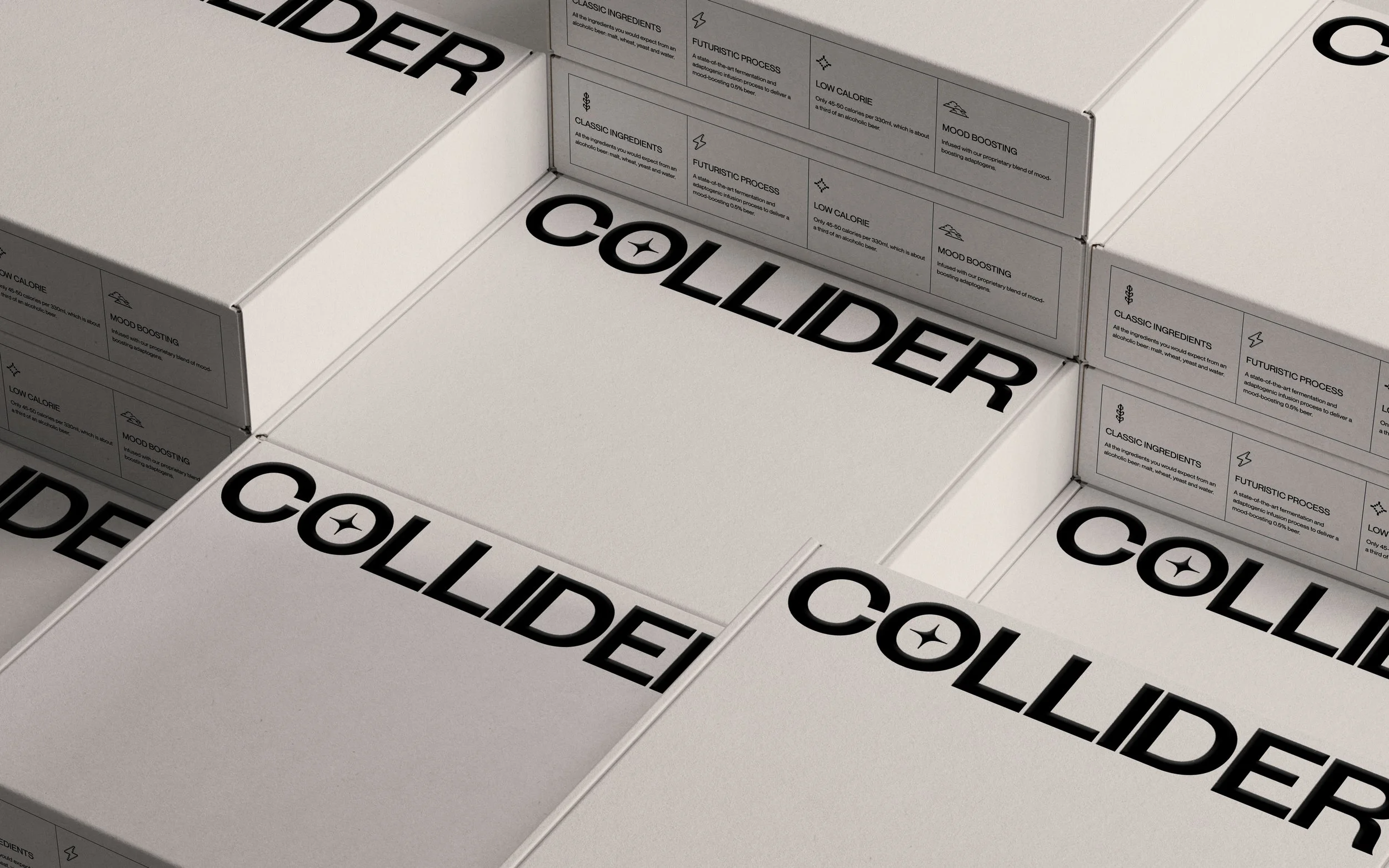
[03] The packaging design extends the same logic across can and bottle formats, using a structured grid to hold the system together. It creates consistency across expressions while allowing each variant to carry its own sense of momentum and visual rhythm.
![[01 / 10]](https://images.squarespace-cdn.com/content/v1/697bcd1af89ab47bd0161ef5/162b8881-1afd-42c1-93ec-13c32fe3000a/2023_12_14_COLLIDER+427.jpg)
[01 / 10]
![[02 / 10]](https://images.squarespace-cdn.com/content/v1/697bcd1af89ab47bd0161ef5/1ef8531f-2843-4ab3-9947-7849391cedca/2023_12_14_COLLIDER+432.jpg)
[02 / 10]
![[03 / 10]](https://images.squarespace-cdn.com/content/v1/697bcd1af89ab47bd0161ef5/e8fc4149-f3e7-4529-9e3a-690087d81b12/2023_12_14_COLLIDER+473.jpg)
[03 / 10]
![[04 / 10]](https://images.squarespace-cdn.com/content/v1/697bcd1af89ab47bd0161ef5/e87b555c-91da-4e8f-abe2-d488453d7069/2023_12_14_COLLIDER+514.jpg)
[04 / 10]
![[05 / 10]](https://images.squarespace-cdn.com/content/v1/697bcd1af89ab47bd0161ef5/0ca59958-9595-4fce-b6bc-f5fc7b8e12b1/2023_12_14_COLLIDER+499.jpg)
[05 / 10]
![[06 / 10]](https://images.squarespace-cdn.com/content/v1/697bcd1af89ab47bd0161ef5/e33727da-02e3-4f8a-8b7b-209b5051098d/2023_12_14_COLLIDER+526.jpg)
[06 / 10]
![[07 / 10]](https://images.squarespace-cdn.com/content/v1/697bcd1af89ab47bd0161ef5/45aff018-3596-467e-a482-8db0b19d8ed8/2023_12_14_COLLIDER+450.jpg)
[07 / 10]
![[08 / 10]](https://images.squarespace-cdn.com/content/v1/697bcd1af89ab47bd0161ef5/792e28b9-4a4f-4be0-969f-7fd9237d7115/2023_12_14_COLLIDER+443.jpg)
[08 / 10]
![[09 / 10]](https://images.squarespace-cdn.com/content/v1/697bcd1af89ab47bd0161ef5/1253f8ee-9b0d-4397-ab10-96c8560572d7/2023_12_14_COLLIDER+463.jpg)
[09 / 10]
![[10 / 10]](https://images.squarespace-cdn.com/content/v1/697bcd1af89ab47bd0161ef5/eb8ec9a0-493c-4cb4-bfba-e8bc53f1d313/2023_12_14_COLLIDER+534.jpg)
[10 / 10]
Collider’s concept reflects a broader cultural shift; a new generation of drinkers reshaping its relationship with alcohol, favouring moderation, functionality and self-awareness over excess. With that in mind, both the product and its expression are designed with intent: a non-alcoholic format that feels purposeful, paired with a visual identity that channels optimism and forward momentum.
Framed as a love letter to the dynamic design tropes of the 80s, Collider’s artful fusion of retro-futuristic aesthetics and forward thinking design creates a sweet tension between nostalgia and progression. Grid structures, luminous glows and controlled bursts of colour sit alongside a refined typographic system, deliberately reassembling familiar signals into something distinctly new and impossible to ignore.
Harry Cooke, Founder:
“I've worked with a number of brand design and creative agencies in my time and Duzi were the best.”
-
“I've worked with a number of brand design/creative agencies in my time and Duzi were the best. They get the right balance between incorporating founder feedback into their designs but also pushing back when they feel it is necessary, without being dogmatic. Most, importantly though, their work just looks cool.”
![[01 / 05]](https://images.squarespace-cdn.com/content/v1/697bcd1af89ab47bd0161ef5/2c9248aa-3b1a-471a-96d5-bd2b84cfc990/Duzi-Studio_Collider_Can.gif)
[01 / 05]
![[02 / 05]](https://images.squarespace-cdn.com/content/v1/697bcd1af89ab47bd0161ef5/085b6e64-cc7b-48d4-ad50-12848c1e2353/Duzi-Studio_Collider_Cloud.gif)
[02 / 05]
![[03 / 05]](https://images.squarespace-cdn.com/content/v1/697bcd1af89ab47bd0161ef5/c9098aac-91a2-4c86-afd8-3a0b48c64571/Duzi-Studio_Collider_Hourglass.gif)
[03 / 05]
![[04 / 05]](https://images.squarespace-cdn.com/content/v1/697bcd1af89ab47bd0161ef5/5b2393ce-65b3-4753-ba05-1bc3b1e0725e/Duzi-Studio_Collider_Mushroom.gif)
[04 / 05]
![[05 / 05]](https://images.squarespace-cdn.com/content/v1/697bcd1af89ab47bd0161ef5/7f9f8b1f-6816-447d-b8ca-220d19ebd6a5/Duzi-Studio_Collider_Speech+Bubbles.gif)
[05 / 05]
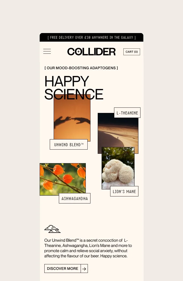
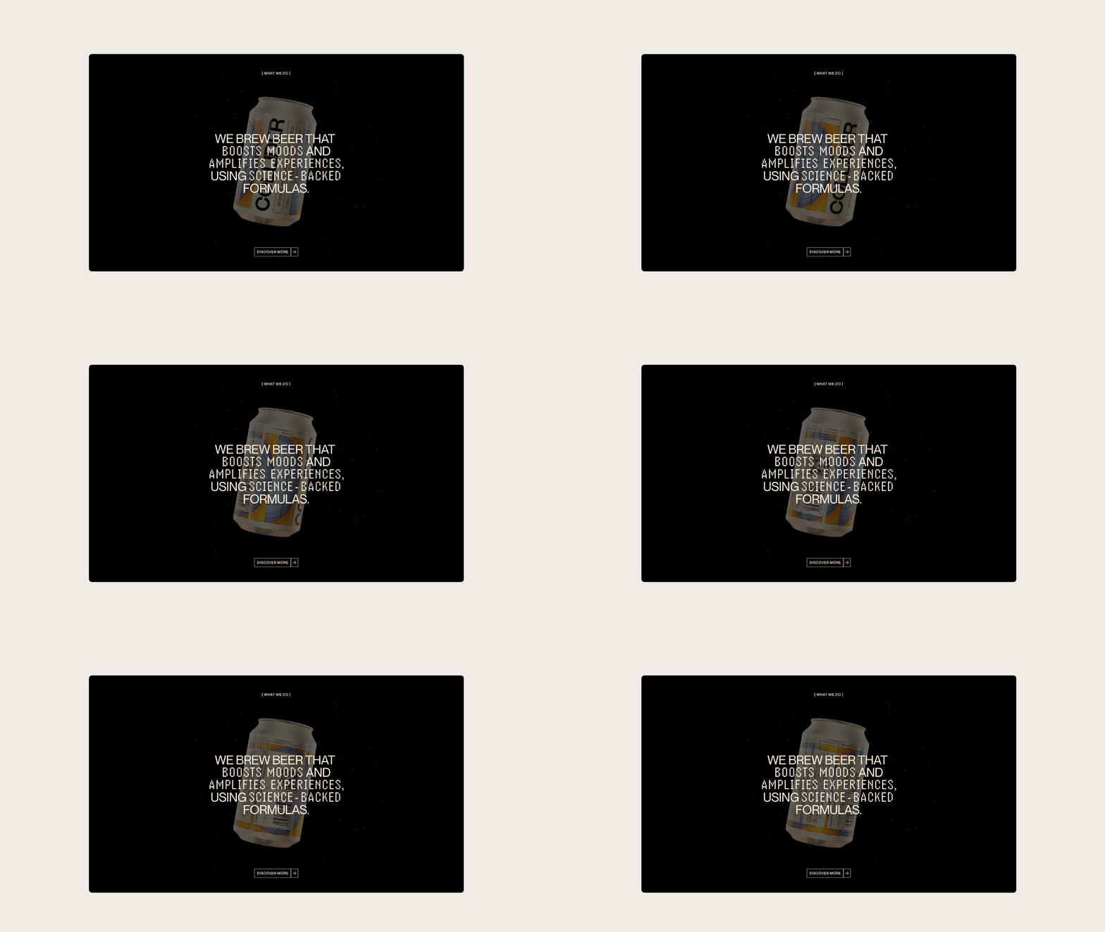
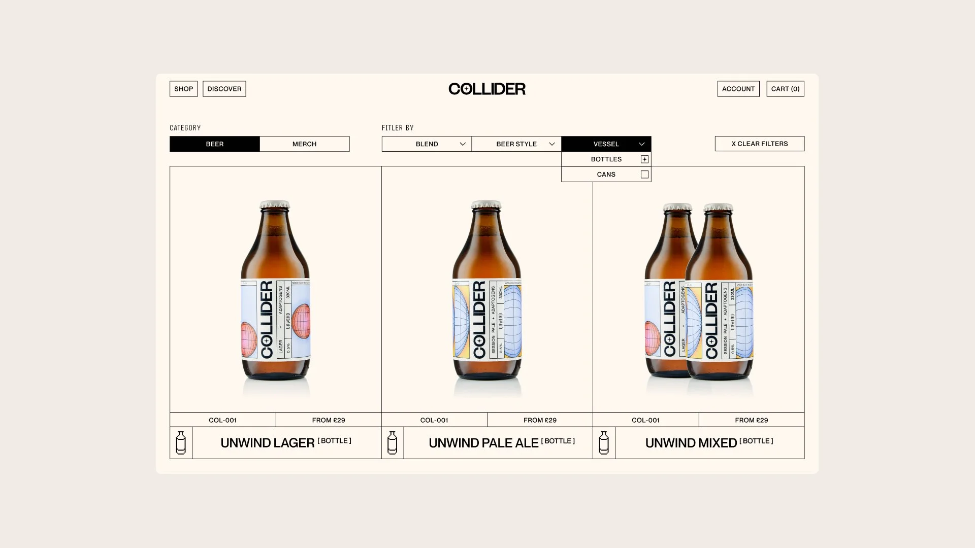

A Distinct Alternative
In a category that often leans heavily on novelty, Collider takes a more measured approach, balancing the playfulness of nostalgic references with the clarity of a purposeful product.
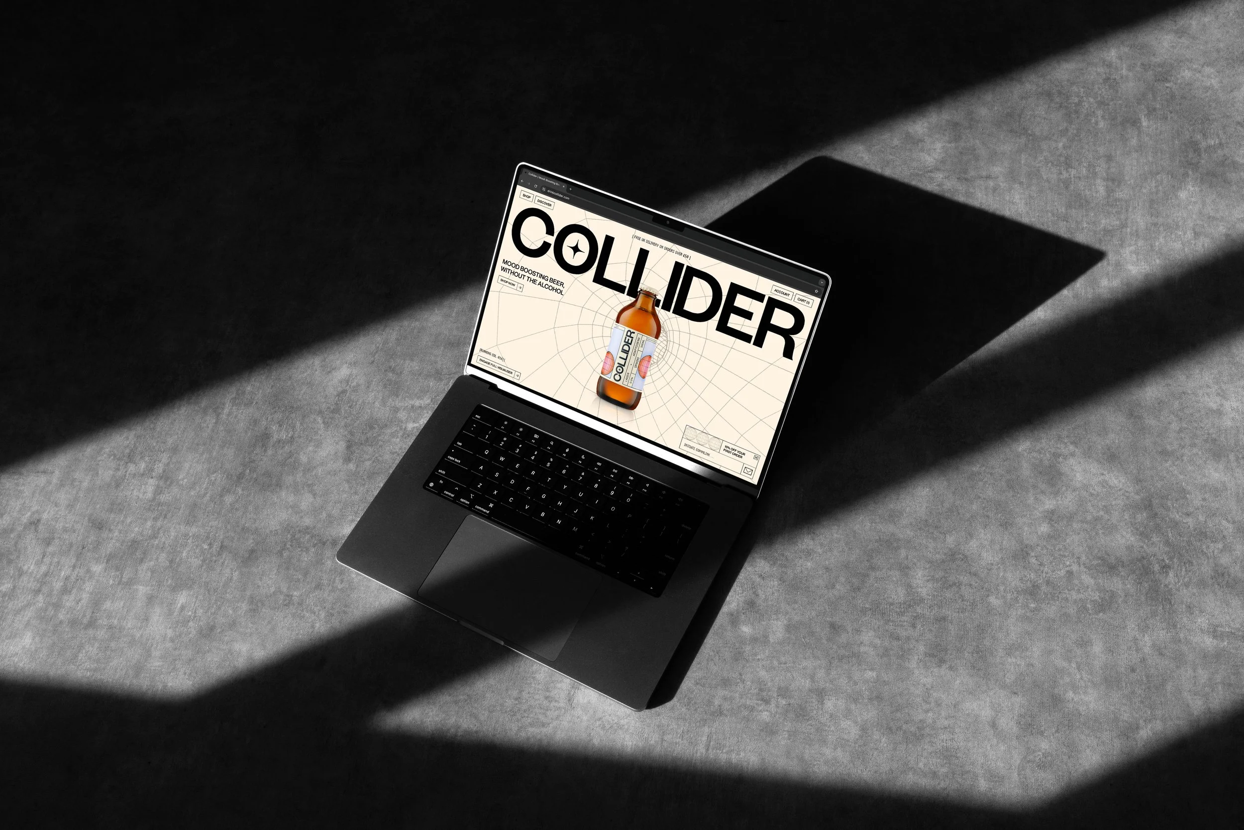
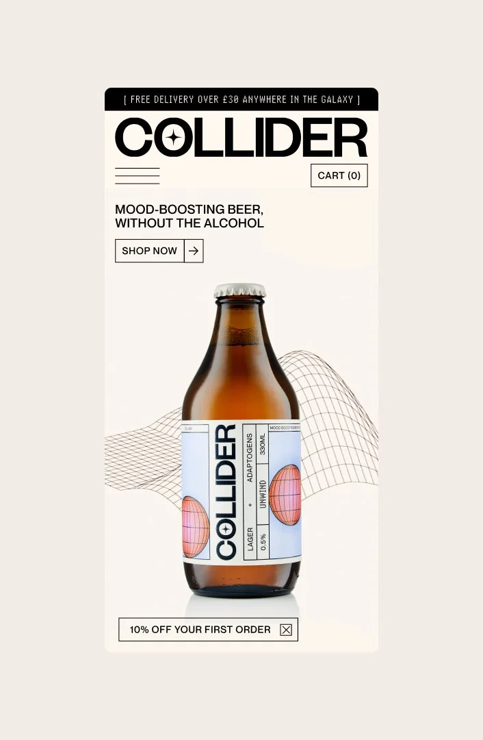
That balance runs through the brand world as much as the product itself. Through its retro-futuristic cues, structured system, and socially-oriented art direction, Collider is positioned not as a compromise or a substitute, but as a distinct alternative. The visual identity gives Collider a clear point of view: one that turns functional ingredients and a non-alcoholic format into something more expressive, more considered, and more complete.
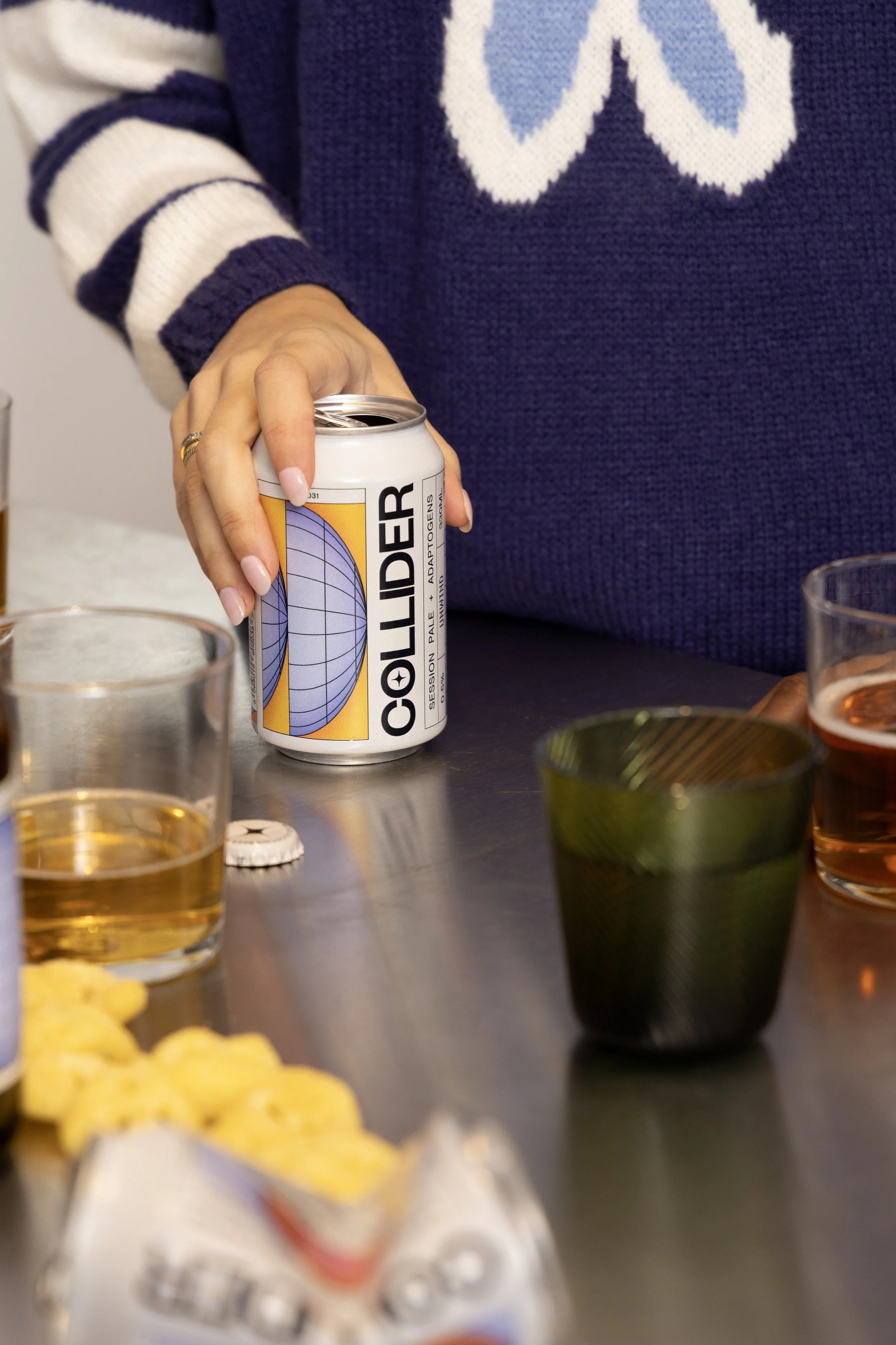

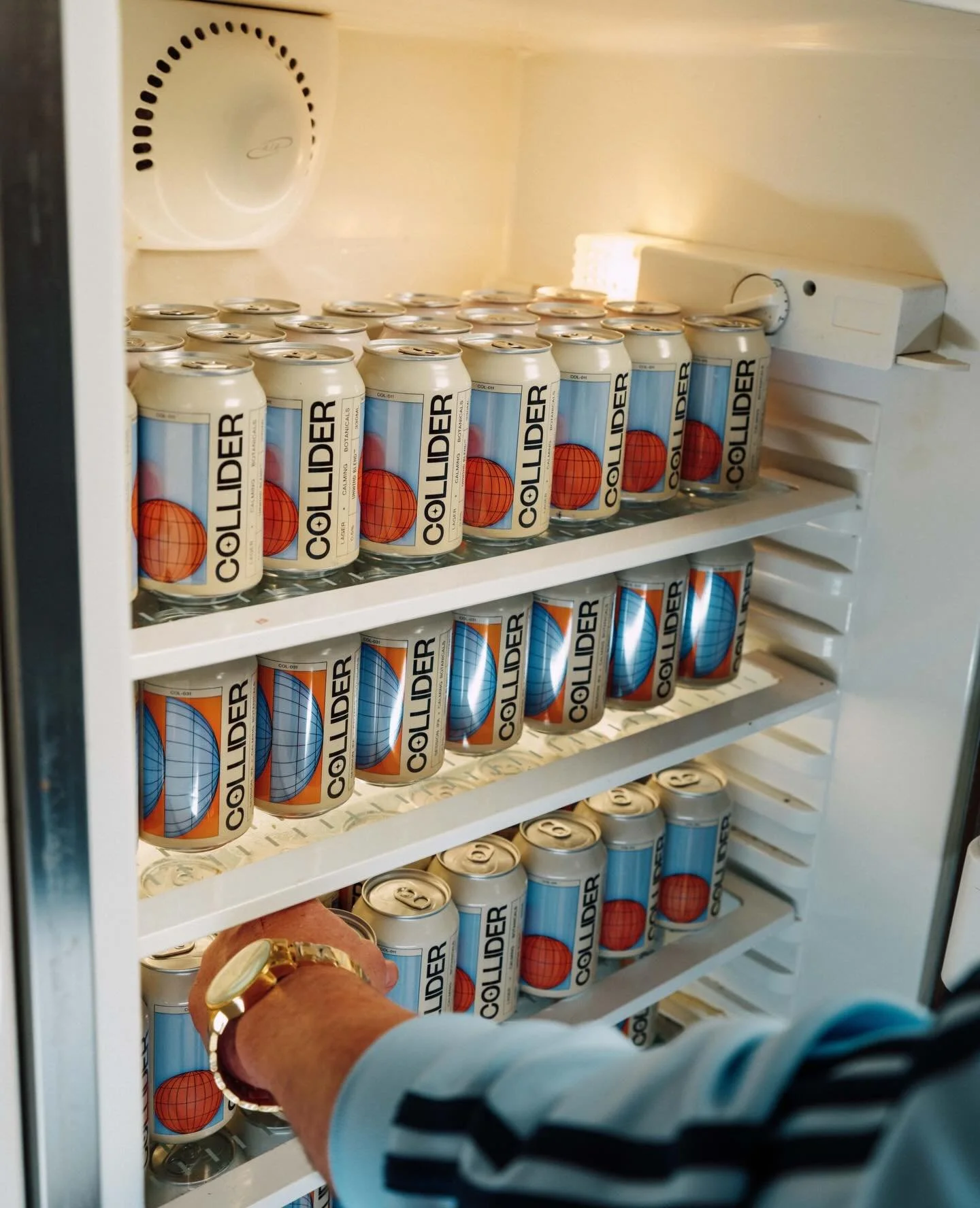
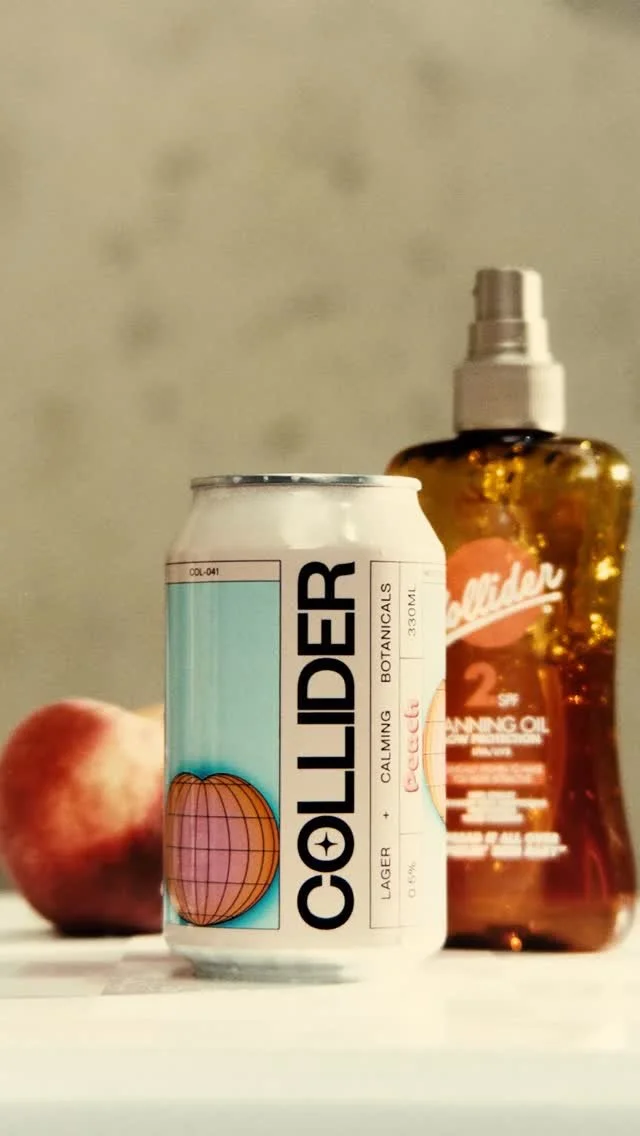
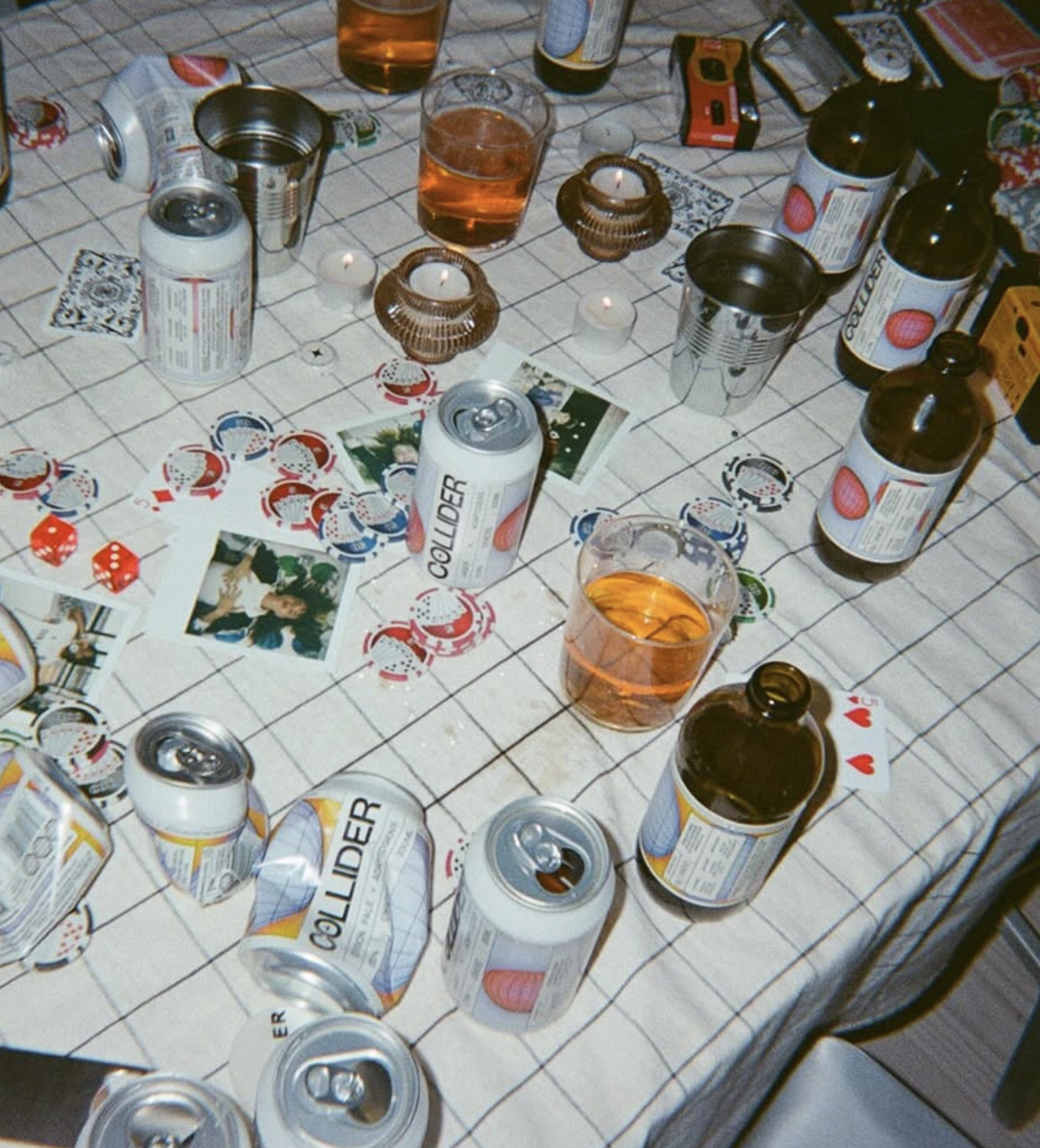
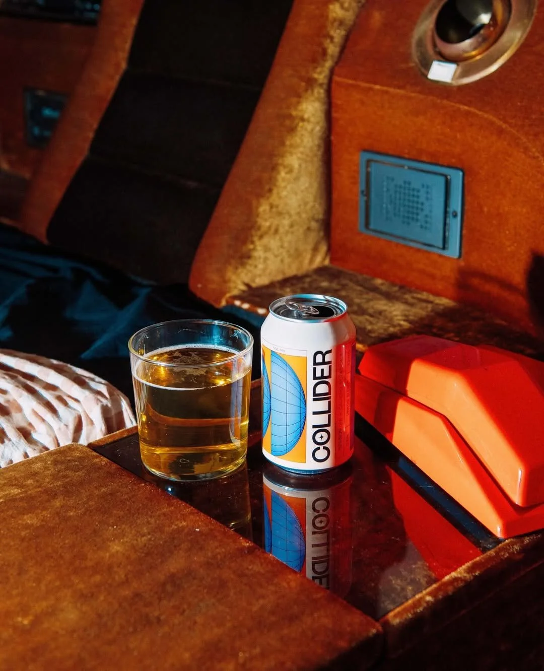
[04] The brand’s art direction builds a world that feels social, playful and always just a little out of this world. Energetic photography and mood-boosting environments give the brand its lift, turning Collider into something that feels as alive in content as it does on shelf.
![[01 / 10]](https://images.squarespace-cdn.com/content/v1/697bcd1af89ab47bd0161ef5/1a1d0805-7d45-4273-8b12-c58beb52a1de/23.12.13+-+Collider+x+George+Aslandis0269+.jpg)
[01 / 10]
![[02 / 10]](https://images.squarespace-cdn.com/content/v1/697bcd1af89ab47bd0161ef5/f2e7aeff-15f9-4682-87bb-b2976c3ca04c/23.12.13+-+Collider+x+Geroge+Aslandis0720+.jpg)
[02 / 10]
![[03 / 10]](https://images.squarespace-cdn.com/content/v1/697bcd1af89ab47bd0161ef5/03950978-de2f-4c2c-bfdb-b18e6a82a170/23.12.13+-+Collider+x+George+Aslandis2944+.jpg)
[03 / 10]
![[04 / 10]](https://images.squarespace-cdn.com/content/v1/697bcd1af89ab47bd0161ef5/e47331a1-1934-4671-acea-9b2128e50330/23.12.13+-+Collider+x+George+Aslandis2781+.jpg)
[04 / 10]
![[05 / 10]](https://images.squarespace-cdn.com/content/v1/697bcd1af89ab47bd0161ef5/e56a53c5-e517-4716-93db-9e52e07bb7c0/23.12.13+-+Collider+x+George+Aslandis0256+.jpg)
[05 / 10]
![[06 / 10]](https://images.squarespace-cdn.com/content/v1/697bcd1af89ab47bd0161ef5/28940ad6-4d52-45ca-8382-83635f3958fe/23.12.13+-+Collider+x+George+Aslandis2804+copy.jpg)
[06 / 10]
![[07 / 10]](https://images.squarespace-cdn.com/content/v1/697bcd1af89ab47bd0161ef5/3d712aae-b4aa-44cb-aa71-045c3793c023/23.12.13+-+Collider+x+George+Aslandis2903+.jpg)
[07 / 10]
![[08 / 10]](https://images.squarespace-cdn.com/content/v1/697bcd1af89ab47bd0161ef5/a53b2e30-dcaa-4172-a31b-30ba9e0992d5/23.12.13+-+Collider+x+Geroge+Aslandis0635+.jpg)
[08 / 10]
![[09 / 10]](https://images.squarespace-cdn.com/content/v1/697bcd1af89ab47bd0161ef5/a4494b68-c41e-4b57-8637-28f27b2a6e77/23.12.13+-+Collider+x+George+Aslandis0251.jpg)
[09 / 10]
![[10 / 10]](https://images.squarespace-cdn.com/content/v1/697bcd1af89ab47bd0161ef5/6b8ad394-1792-4b0d-945c-75a74fa80a18/23.12.13+-+Collider+x+Geroge+Aslandis0644.jpg)
[10 / 10]
The Collider

Scroll to discover the brand in action today >
AUDREY'S Something a little bit extraordinary

OOVII Everyday sunscreen for life’s adventures
LEGADO Moving beyond the familiar
PICOSO Coming Soon