
Graham & Brown
At home since 1946.
[2025]
Services
Brand Strategy, Brand Narrative, Visual Identity, Packaging Design, Print Design, Artworking, Website Design, Social Media, Environmental Design, Launch Campaign
The Telegraph
The Nudge
Wallpaper
Press

[01] The Graham & Brown logo is based on a traditional serif font that nods to their long standing history as experts in the interior space. However it has been modernised for their contemporary customer with softened flourishes and subtly connecting characters that bring a more fluid and organic nature to the mark
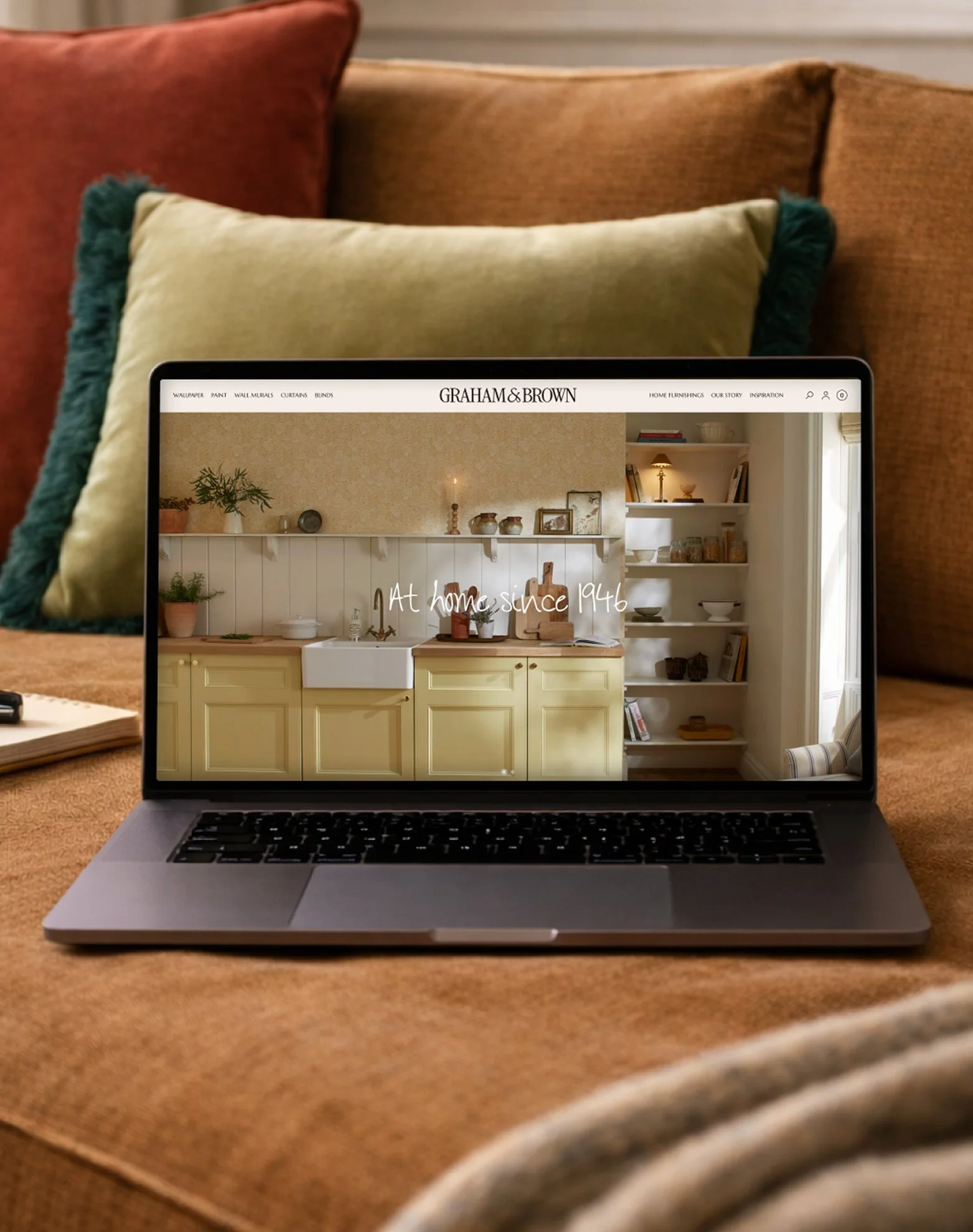
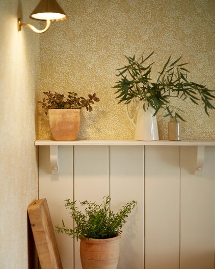
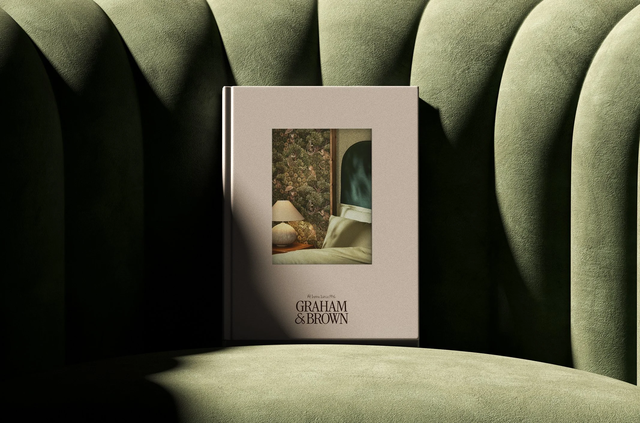
[02] Art direction shows snapshots of Graham & Brown, lived in. Moments where contrasting textures and patterns come together in harmony. Where soft evening light brings life to gentle, neutral walls. Where every space becomes a cherished place, made possible by Graham & Brown.
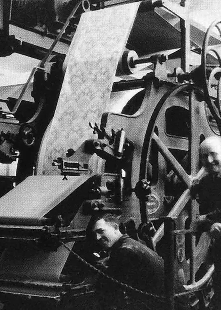
[03] Where it all began for Graham & Brown back in 1946; Blackburn, Lancashire.
Graham & Brown is a family business. And that business is creativity. For four generations, Graham & Brown have designed home décor for everyday life; defining spaces of enduring quality. To coincide with their 80th Anniversary, Duzi St. helped Graham & Brown with some renovations of their own. We developed a brand refresh that marks the transition from wallpaper specialist to full-home curator, perfectly partnered with customers as they design spaces that last.
At the centre of our creative process was the Graham family. Their pride in the brand’s legacy guided every decision. Conversations with family members and time spent exploring archival records inspired a new tagline, “At Home Since 1946.” The line connects brand and audience, positioning Graham & Brown in customers’ homes with warmth, authenticity and trust. Referencing the founding year adds authority without feeling dated, balancing emotional resonance with a celebration of the company’s enduring success.
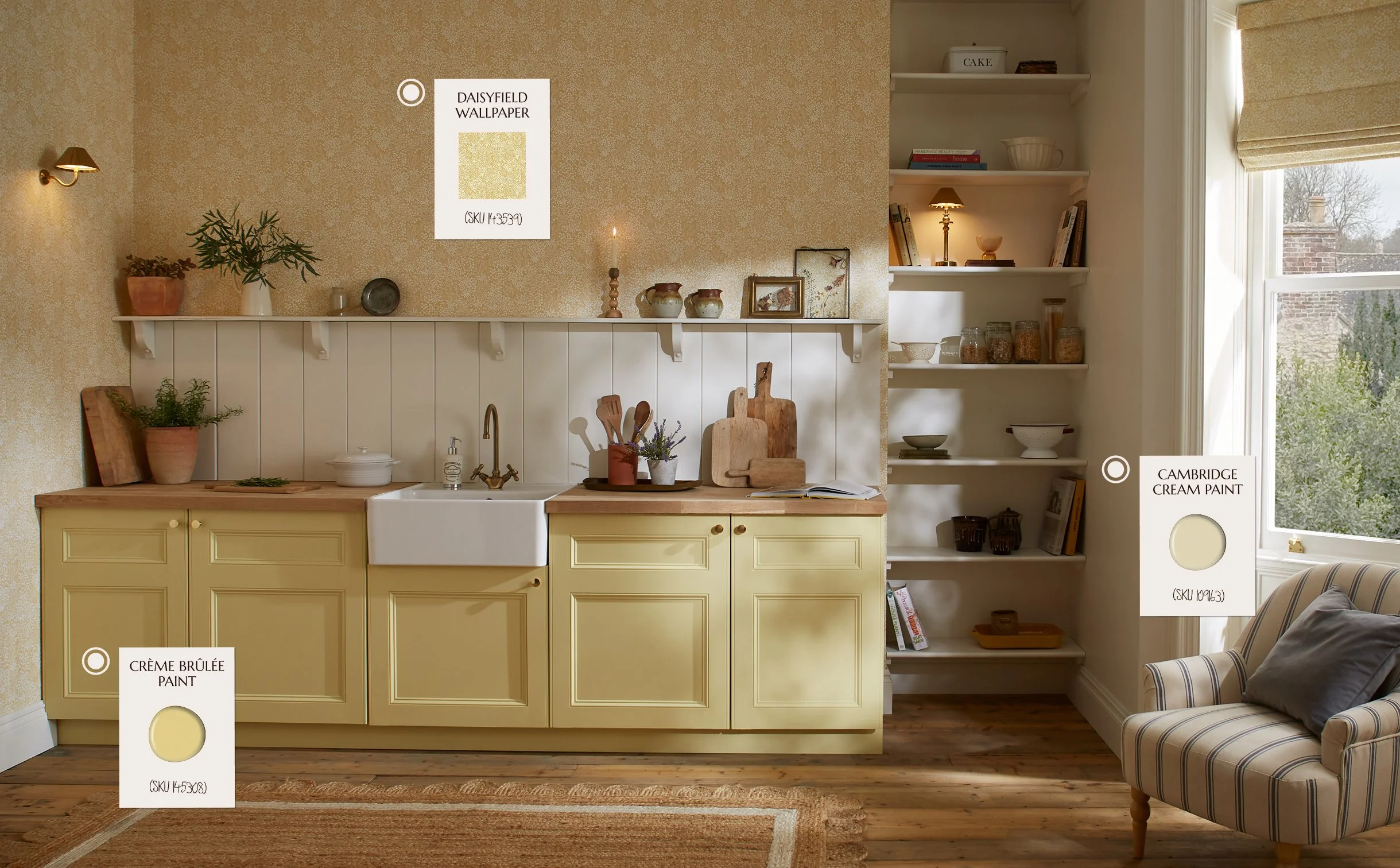
[04] At the centre of the brand experience, is the creative inspiration Graham & Brown provide their customers. The ‘Shop The Look’ feature is one way Graham & Brown break down the interior design process; staying true to their brand positioning as ‘Perfectly Partnered”.
A creative legacy
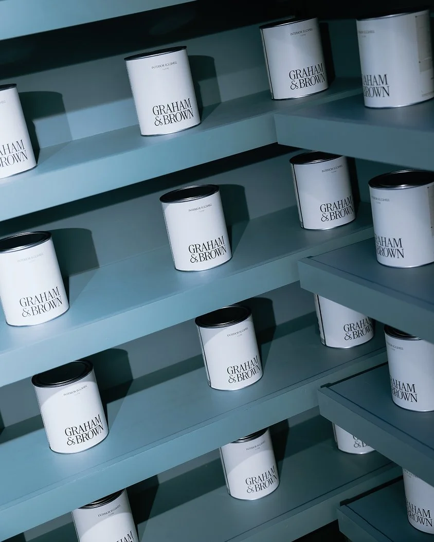
A confident modernised logo anchors the brand in its heritage which pairs perfectly with the leading brand colour ‘1946’; a timeless rich shade of blue named after the year Graham & Brown were founded. The rest of the core identity is considered, thoughtful and restrained in its expression. It simply acts as a trusted backdrop to the creativity unfolding in homes across the nation. A supporting warm, yet neutral colour palette supports editorial layouts and smart styling. This premium aesthetic is grounded in an art direction that truly feels at home. Authentic moments that capture the joys of good design, thoroughly being enjoyed. It’s about showcasing connection; how Graham & Brown products make people feel at home.
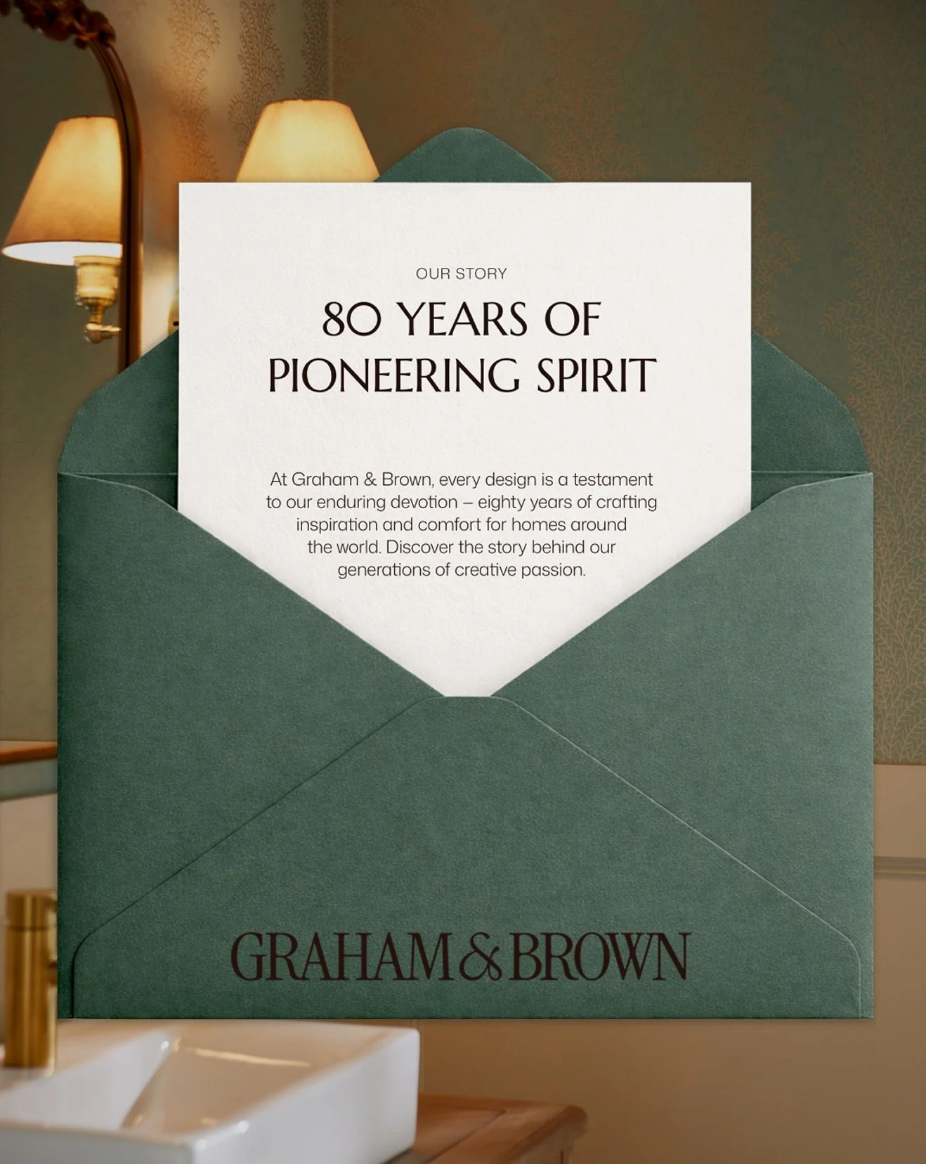
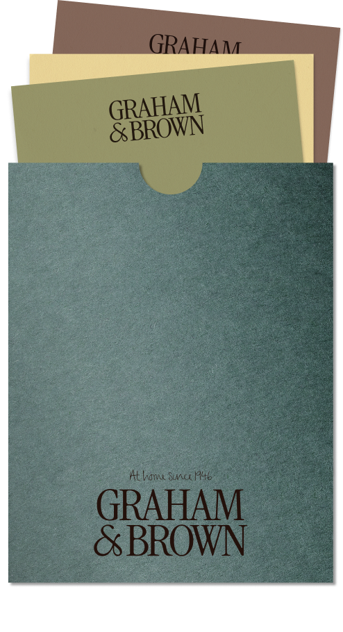
As a business offering physical products, it’s vital social channels feel tactile and authentic. To bring a level of materiality to digital comms, we use swatches, paint splurges and stationery layered over imagery.
The joy of making
Graham & Brown’s next chapter was about becoming a global lifestyle brand that empowers customers to create expressive, quality homes, supported by a community-centric, forward-thinking and inspirational company culture. This shift inspired a modernised brand world focused on tactile layering and playful styling; spotlighting process, experimentation and creative expression. This has shaped a visual language that feels both considered and alive. Together, these elements champion the making, the thinking and joy behind great design.
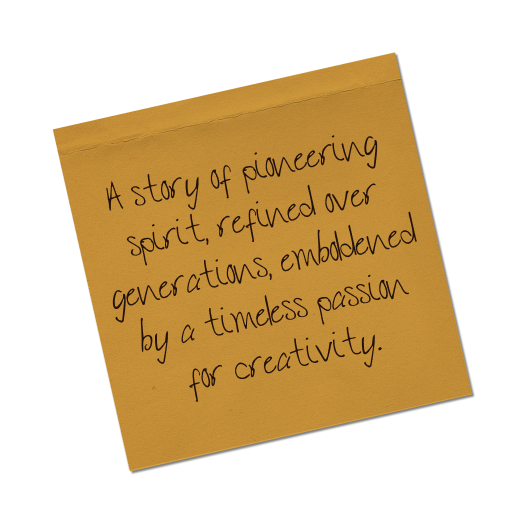
A social identity built around process and creative expression. Handwritten notes, paint samples, material swatches and layered mood-boards bring a tactile, human quality to the brand, celebrating the experimentation, craft and joy behind great design.
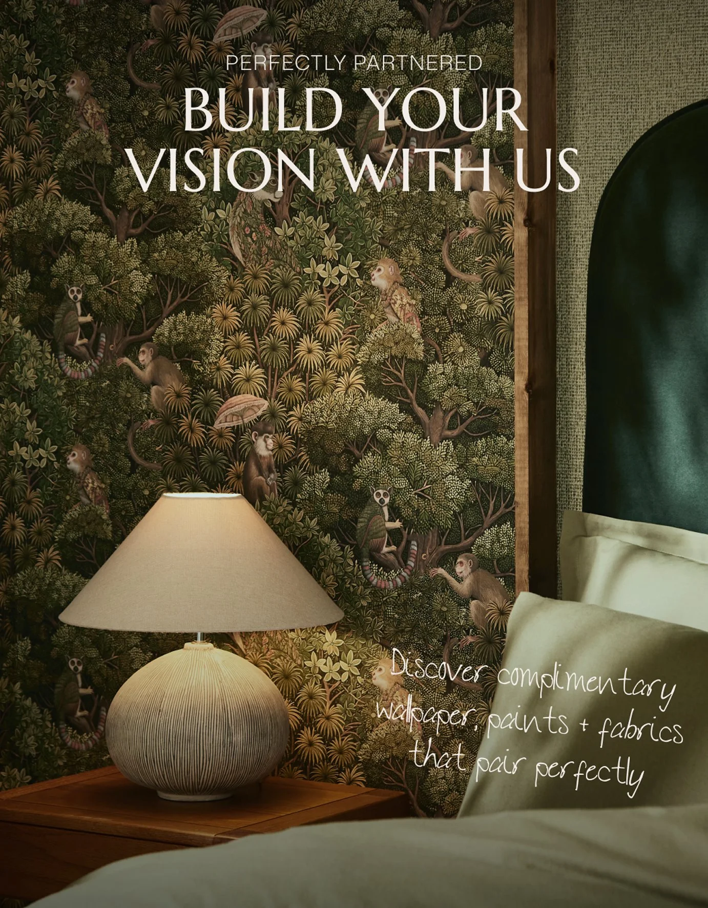
[04] Graham & Brown’s brand messaging fosters an authentic voice; one of charm, encouragement, expertise and support. There’s a balance we strike between professional and personable.
Giving signature craft a voice
Built on 80 years of expertise, Graham & Brown’s new identity celebrates the hands behind the craft. We pay homage to the legacy of their founders with the new bespoke typeface, GB Generations, which was inspired by the handwriting of four generations of Graham & Brown. From quirky flourishes found in Roger Graham’s script to the more modern angular details of his Granddaughter Iona Graham’s handwriting, this expressive typeface is a symbol of family spirit, executed in a modernized style that is humbled by their history.
A Sense of Place
A significant development in Graham & Brown’s history was the recent opening of their debut London showroom. Located on the King’s Road in the heart of Chelsea, the showroom has been designed as a creative playground for the home. A place that brings swatches, moodboards, consultations and samples together, helping customers turn ideas into confident design decisions. It’s this collaborative spirit that unites the showroom, brand refresh and their entire philosophy.
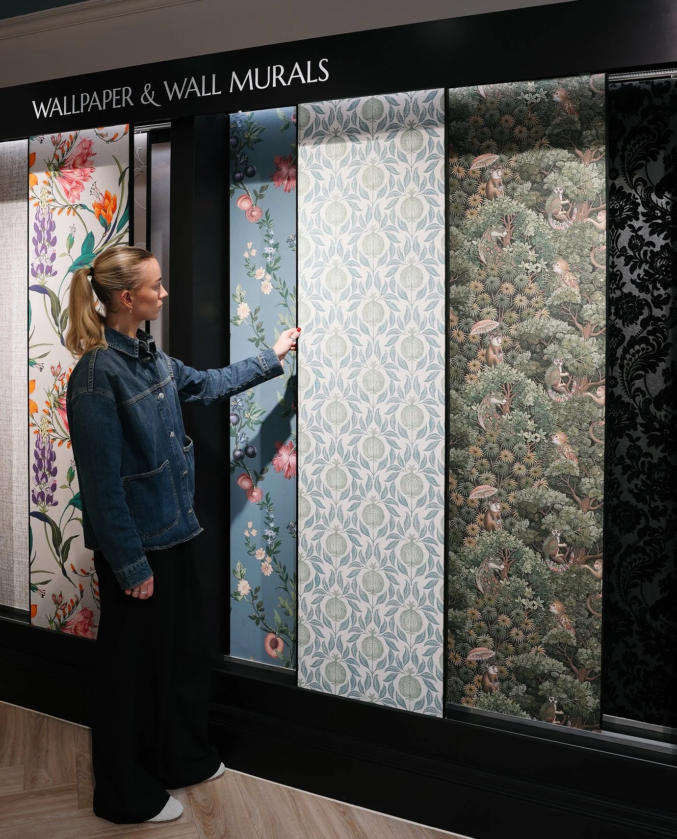
[05] The showrooms needed to feel like an extension of customers’ own homes; a place where they feel comfortable to have a cup of tea, ask any questions and spend time exploring everything Graham & Brown have to offer.
The Graham & Brown

Scroll to discover the brand in action today >


FOOT NOTES & CREDITS
[05] Photographer Name
[06] Photographer Name
[01] Photographer Name
[04] Photographer Name
[02] Photographer Name
[05] Photographer Name
[03] Photographer Name
[06] Photographer Name
[04] Photographer Name
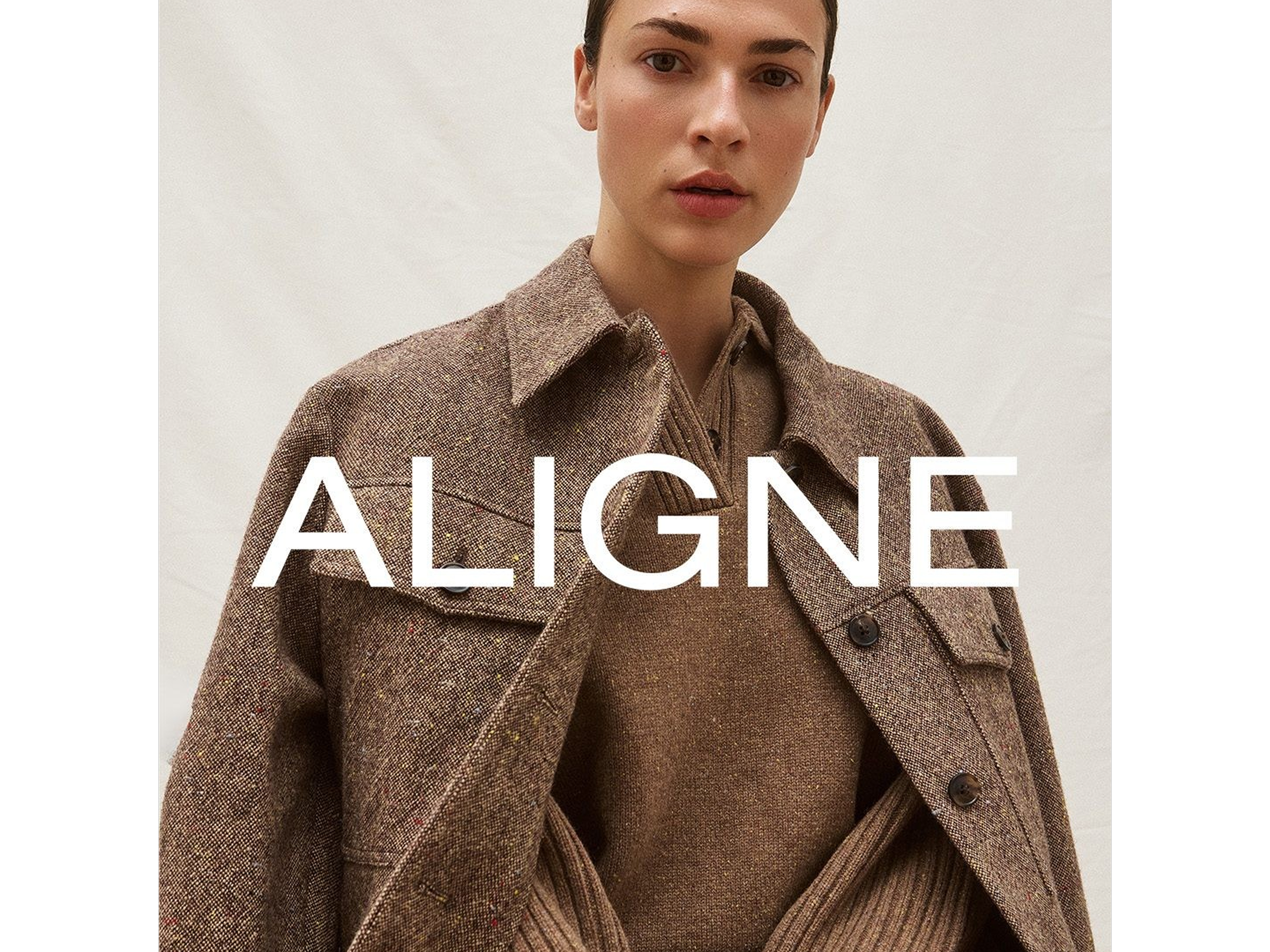
ALIGNE Women going places
AUDREY'S Something a little bit extraordinary
BERTIOLI The nature of beauty
TRIP Take a Trip to find your calm