
Elsa
Poetic pairings on Charlotte Street
[2024]
Services
Brand Strategy, Brand Narrative, Visual Identity, Print Design, Website Design, Illustration
The Brand Identity
The Telegraph
The Times
Press
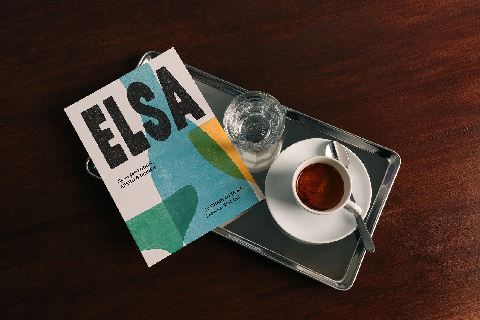
[01] Bold, strong typography is contrasted with soft layered illustration to bring a playful energy to the Elsa menu. The identity has been designed to sit comfortably alongside the quiet rituals of leisurely dining, bringing a warm and welcoming touch to any table setting.
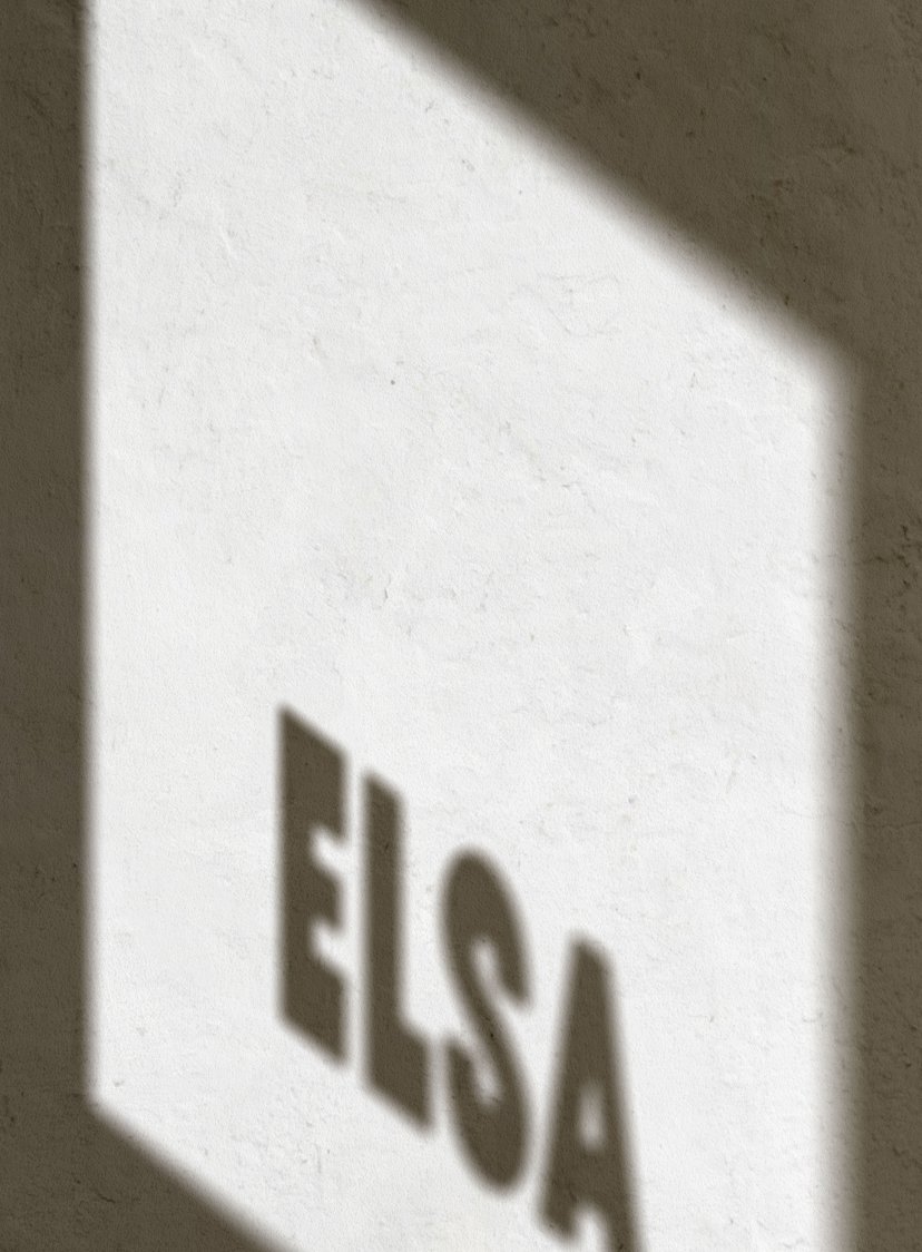
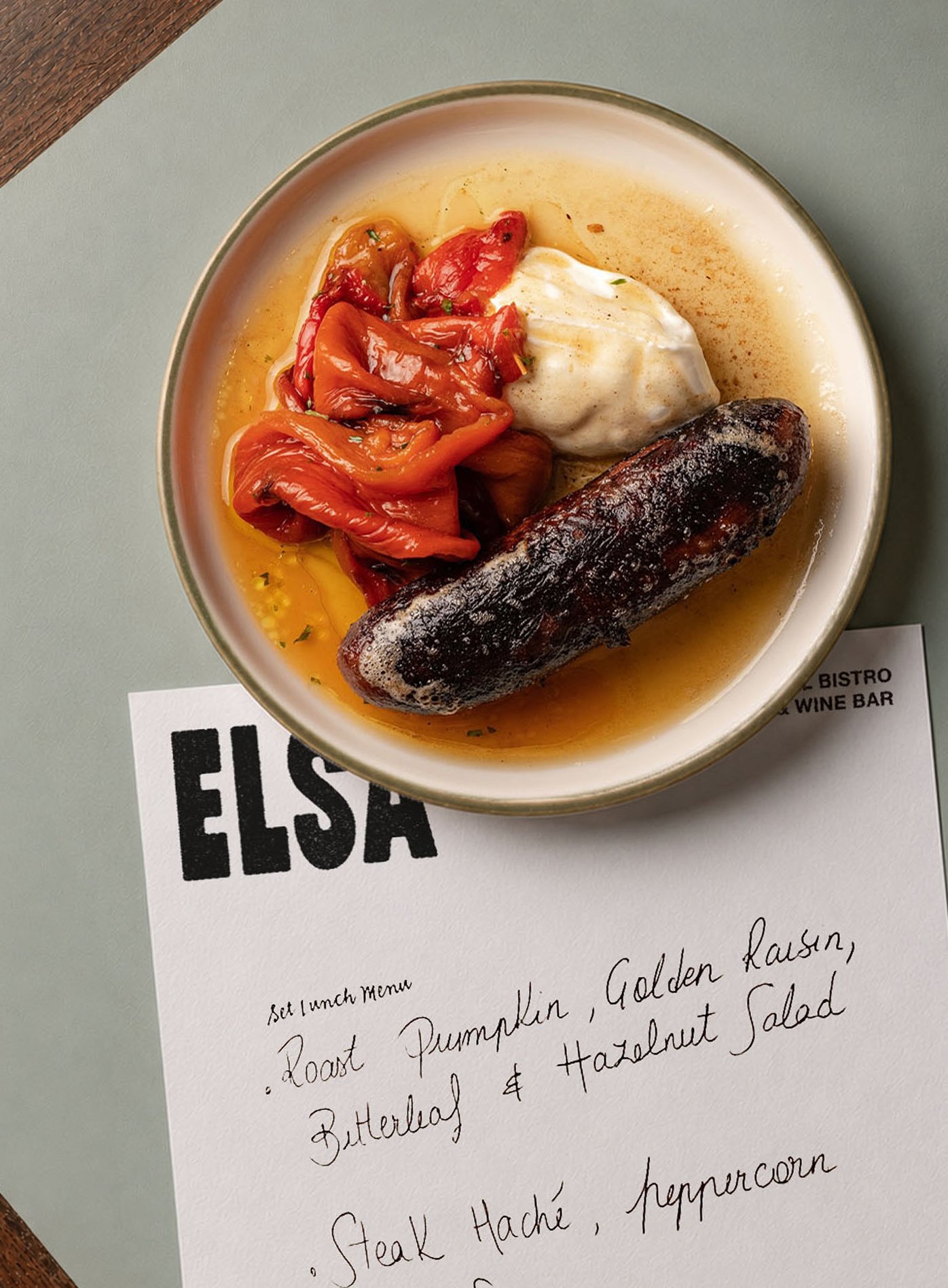
Elsa is a seasonal bistro and wine house on Charlotte Street, inspired by the Alsace region and its culture of generous, convivial dining. Together with Elsa’s founders, our team set out to build a brand and website that felt like an extension of a home dining room — warm, welcoming and in step with the seasons.
The poetry of pairing sits at the heart of the identity; where wine meets food, London meets Alsace, and familiarity meets the unknown. A crisp white Riesling paired with a traditional Alsace-inspired dish; a Fosse Meadow roasted chicken plated with this month’s freshest vegetables; or this evening’s chosen vinyl mixed with a side of the seasons. Because good taste, for Elsa, lives in the complementary relationship between culinary and creativity, between the comfort of the familiar and the thrill of the yet-to-be-discovered.
![[01 / 10]](https://images.squarespace-cdn.com/content/v1/697bcd1af89ab47bd0161ef5/f367ce1b-4c54-4740-aff8-5b3869be0028/Elsa_Neighbourhood+Restaurant_Duzi+St.jpg)
[01 / 10]
![[02 / 10]](https://images.squarespace-cdn.com/content/v1/697bcd1af89ab47bd0161ef5/ed3a6d67-7614-4358-95ef-cd616d3d31f6/Elsa+_Facade_Duzi+St.jpg)
[02 / 10]
![[03 / 10]](https://images.squarespace-cdn.com/content/v1/697bcd1af89ab47bd0161ef5/238a03c5-a6de-4695-805d-014335f4b404/Elsa+_Team_Duzi+St.jpg)
[03 / 10]
![[04 / 10]](https://images.squarespace-cdn.com/content/v1/697bcd1af89ab47bd0161ef5/c8cf9bcd-8527-4999-a1ac-2008f6581dc9/Elsa_Menu_Duzi+St.jpg)
[04 / 10]
![[05 / 10]](https://images.squarespace-cdn.com/content/v1/697bcd1af89ab47bd0161ef5/bad4c877-74ab-4329-9bfe-fe9dac6ac7b4/Elsa_Interior_Duzi+St.jpg)
[05 / 10]
![[06 / 10]](https://images.squarespace-cdn.com/content/v1/697bcd1af89ab47bd0161ef5/ca49af96-23f9-499e-8f95-dc8549cce218/Elsa_Website_Duzi+St.jpg)
[06 / 10]
![[07 / 10]](https://images.squarespace-cdn.com/content/v1/697bcd1af89ab47bd0161ef5/2fa645b5-0339-4da4-9248-3e0d4f62418b/Elsa_Madelines_Duzi+St.jpg)
[07 / 10]
![[08 / 10]](https://images.squarespace-cdn.com/content/v1/697bcd1af89ab47bd0161ef5/9cf0444e-e6f9-4fd6-8e9d-856adeb754a2/Elsa_Paper+Print_Duzi+St.jpg)
[08 / 10]
![[09 / 10]](https://images.squarespace-cdn.com/content/v1/697bcd1af89ab47bd0161ef5/b6f62450-96bc-4976-92b0-e6a1fea2d314/Elsa_Menu+Board_Duzi+St.jpg)
[09 / 10]
![[10 / 10]](https://images.squarespace-cdn.com/content/v1/697bcd1af89ab47bd0161ef5/29fa2221-a3e1-4a5d-9111-d9d454ec9aa5/Elsa_Produce_Duzi+St.jpg)
[10 / 10]
Manhattan, New York
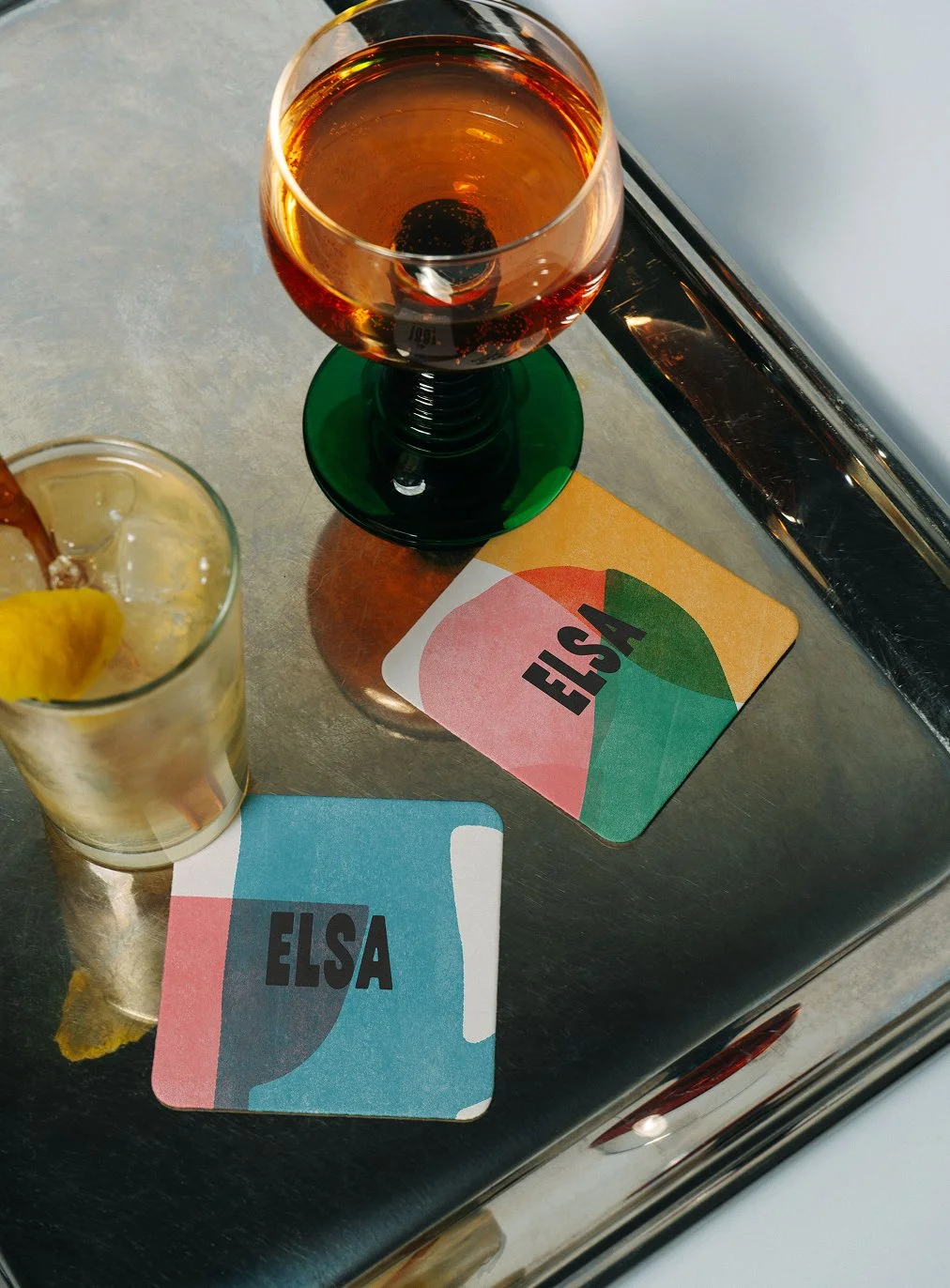
Illustrated coasters make use of a lively palette, turning simple barware into small, tactile mementos of the Elsa identity during Apero hour.
Good food in Good Company
Elsa’s brand tone is refined yet easygoing, with narrative that complements the menu philosophy and celebrates the relationships at the heart of the restaurant’s offering: hosts and guests, chefs and winemakers, good food and good company.
Good company is Elsa’s currency. Because they understand that even the simplest menus are elevated when enjoyed in the presence of those you hold dear. Visually, the brand is built to reflect that feeling: the logotype is bold yet balanced, and the colour palette is vibrant yet refined, echoing the seasons and the light shifting from dawn to dusk.
![[ 01 / 05 ]](https://images.squarespace-cdn.com/content/v1/697bcd1af89ab47bd0161ef5/843b23c0-78ea-4ad6-a381-b8f2ca822c7b/611693191_17993396750884891_3201315775130715286_n+2.jpg)
[ 01 / 05 ]
![[ 02 / 05 ]](https://images.squarespace-cdn.com/content/v1/697bcd1af89ab47bd0161ef5/3e5aea12-c939-4811-919d-5b824db6d2ef/Elsa_01.jpg)
[ 02 / 05 ]
![[ 03 / 05 ]](https://images.squarespace-cdn.com/content/v1/697bcd1af89ab47bd0161ef5/2665d5f4-9d4b-4813-b285-3051b94ba844/Elsa_02.jpg)
[ 03 / 05 ]
![[ 04 / 05 ]](https://images.squarespace-cdn.com/content/v1/697bcd1af89ab47bd0161ef5/4d807a88-9abe-4dc4-b65d-ac870101ec08/Elsa_03.jpg)
[ 04 / 05 ]
![[ 05 / 05 ]](https://images.squarespace-cdn.com/content/v1/697bcd1af89ab47bd0161ef5/0c6307b8-ac26-456d-b328-0dbec7518612/Elsa_04.jpg)
[ 05 / 05 ]
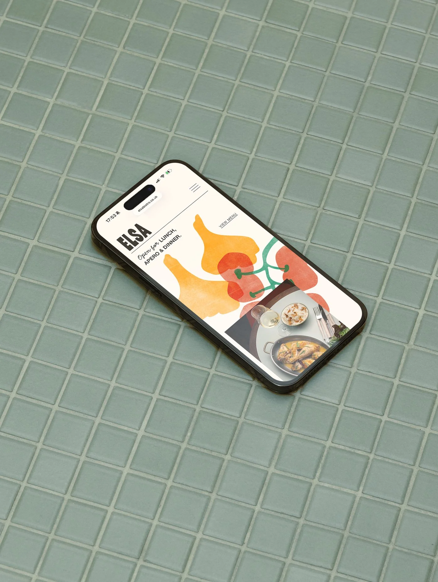
For the website, Duzi translated the rhythm of an evening at Elsa into a calm and intuitive digital front door for the restaurant, ensuring the experience from street to screen feels seamless.
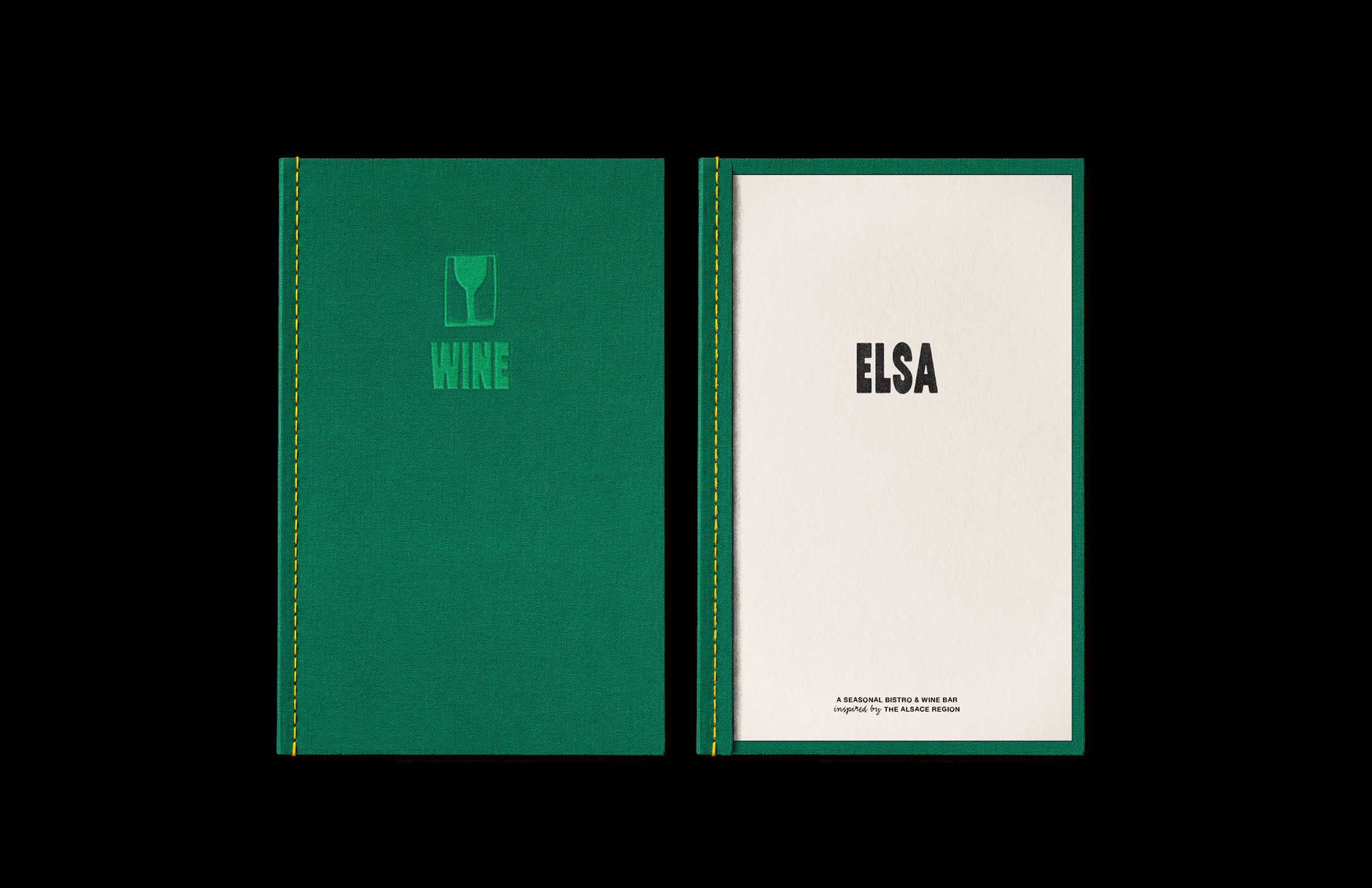
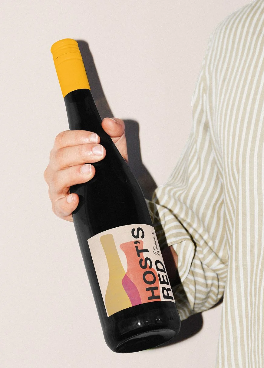
To hold its warmth and avoid slipping into formality, the brand assets were designed to be flexible and dosed in a bit of charming mischief, putting a playful spin on fine dining. Illustration, contrasting colour combinations and typographic accents can dial up or down in intensity depending on the situation. The aim is to capture the thirst for discovery; familiar enough to feel inviting, surprising enough to feel like there is always something more to taste, indulge in and share.
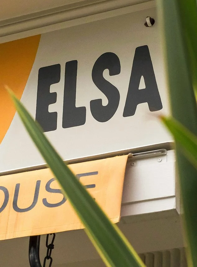
Elsa is, at its heart, a neighbourhood restaurant. It’s a place to drop in midweek for a glass and a plate, to linger over a long dinner, or to celebrate quietly with friends; a house that feels lived in, rather than staged. The brand touchpoints support that character: approachable, generous, and designed to feel as natural on a handwritten note slipped with the bill as it does on the façade facing Charlotte Street.
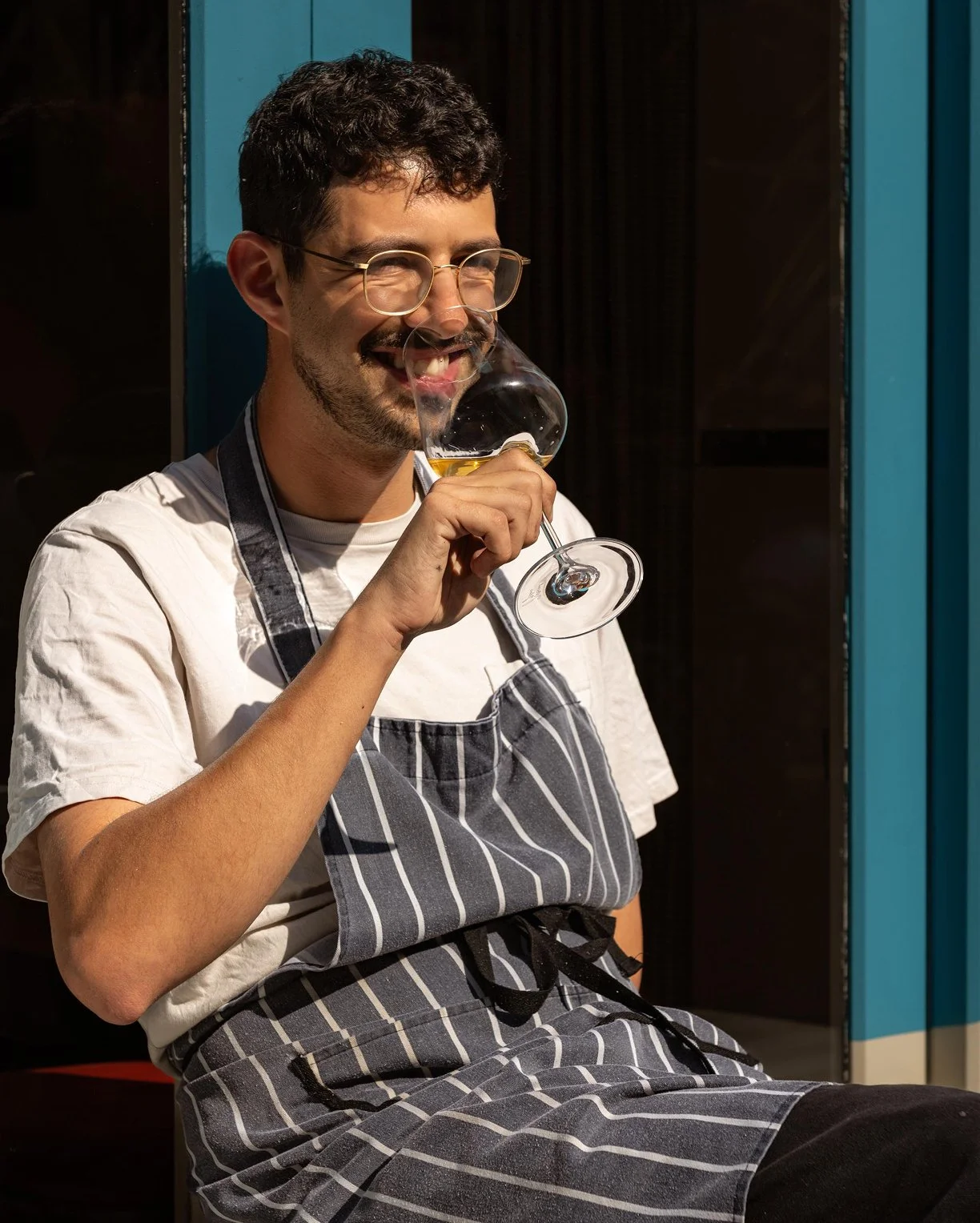
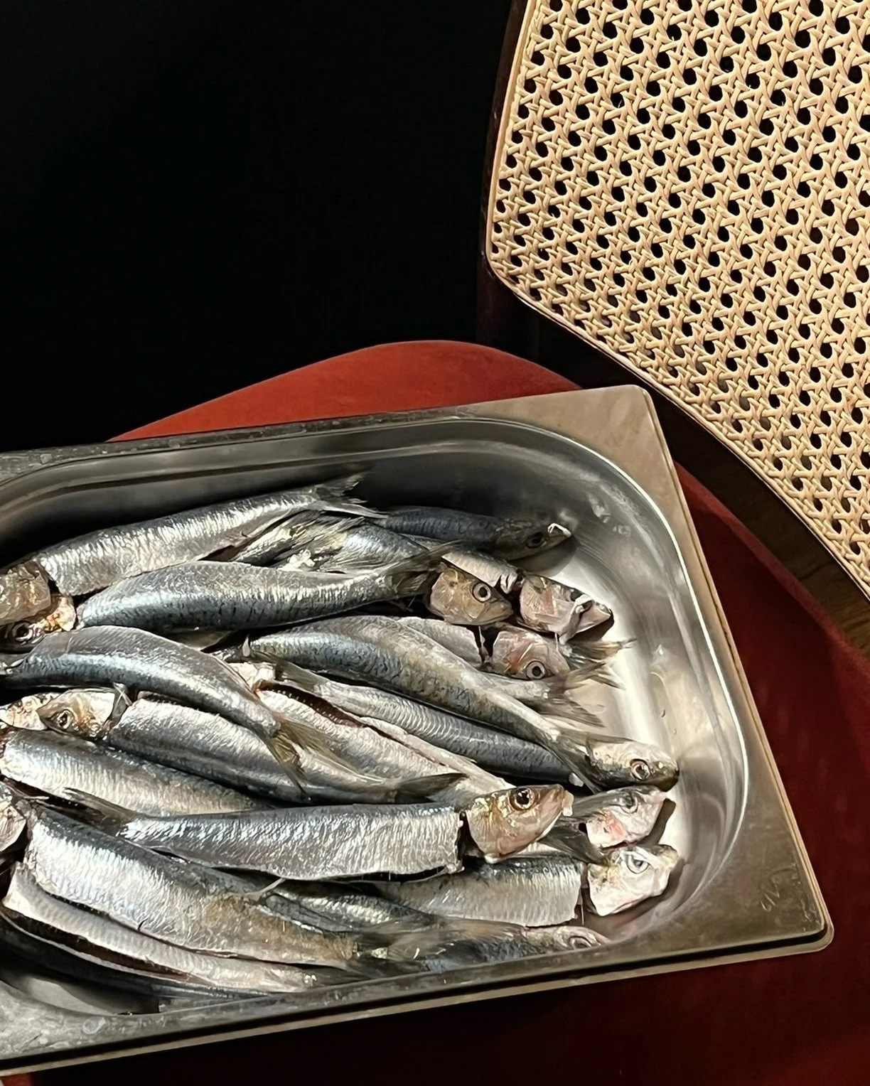
Generous, sunlit photography pairs raw ingredients with the people behind the pass, echoing Elsa’s focus on honest cooking, neighbourly hosting, and the convivial rhythm of service.
“If you’re looking for a team
that will take your brand seriously and put in the work to get it right, I can’t recommend Duzi highly enough.”
-
Working with Duzi on my online brand has been a brilliant experience from start to finish. From day one, they took the time to genuinely understand me; my background, my career, even the detail of my football stats, so that what they built wasn’t just a website, but a brand that actually feels like me.
The level of detail and care they brought to the whole process was something else. Lucybronze.co.uk is something I’m really proud of, and that’s entirely down to how thoughtfully they approached it.
What stood out most was that their commitment didn’t stop at launch. They made sure the vision would carry forward by creating tailored training for my team and brand guidelines we can use going forward, so the identity they built stays consistent whatever comes next.
Lucy Bronze MBE:
![[ 01 / 12 ]](https://images.squarespace-cdn.com/content/v1/697bcd1af89ab47bd0161ef5/612ce477-c395-4248-966c-37f1322aed7f/Frame+6.png)
[ 01 / 12 ]
![[ 02 / 12 ]](https://images.squarespace-cdn.com/content/v1/697bcd1af89ab47bd0161ef5/a6e7fb14-2383-4935-883e-86336400b534/Frame+7.png)
[ 02 / 12 ]
![[ 03 / 12 ]](https://images.squarespace-cdn.com/content/v1/697bcd1af89ab47bd0161ef5/80dcf9a3-ea6f-4111-952c-ceac301a6a8b/Frame+8.png)
[ 03 / 12 ]
![[ 04 / 12 ]](https://images.squarespace-cdn.com/content/v1/697bcd1af89ab47bd0161ef5/76fd8e8f-5137-41a8-9c21-c21e0e8e1cd5/Frame+9.png)
[ 04 / 12 ]
![[ 05 / 12 ]](https://images.squarespace-cdn.com/content/v1/697bcd1af89ab47bd0161ef5/18c27f84-d568-4ba3-b814-158315e837c2/Frame+10.png)
[ 05 / 12 ]
![[ 06 / 12 ]](https://images.squarespace-cdn.com/content/v1/697bcd1af89ab47bd0161ef5/97b09e29-3649-4a32-9042-b4452fbef74c/Frame+11.png)
[ 06 / 12 ]
![[ 07 / 12 ]](https://images.squarespace-cdn.com/content/v1/697bcd1af89ab47bd0161ef5/79941b00-951f-4410-9d63-b04eae22c214/Frame+12.png)
[ 07 / 12 ]
![[ 08 / 12 ]](https://images.squarespace-cdn.com/content/v1/697bcd1af89ab47bd0161ef5/4d99f5ae-9834-4854-8ea5-b64f943f2266/Frame+13.png)
[ 08 / 12 ]
![[ 09 / 12 ]](https://images.squarespace-cdn.com/content/v1/697bcd1af89ab47bd0161ef5/9690f0ed-8b8c-49b2-b059-bf7d9c254ce6/Frame+14.png)
[ 09 / 12 ]
![[ 10 / 12 ]](https://images.squarespace-cdn.com/content/v1/697bcd1af89ab47bd0161ef5/4b46f03f-ec8c-492e-b091-df5fc20836d6/Frame+15.png)
[ 10 / 12 ]
![[ 11 / 12 ]](https://images.squarespace-cdn.com/content/v1/697bcd1af89ab47bd0161ef5/6d005d69-aa30-4296-bb91-e33f44120b96/Frame+16.png)
[ 11 / 12 ]
![[ 12 / 12 ]](https://images.squarespace-cdn.com/content/v1/697bcd1af89ab47bd0161ef5/f895db83-3695-487f-9e42-21e1de2eaca8/Frame+17.png)
[ 12 / 12 ]

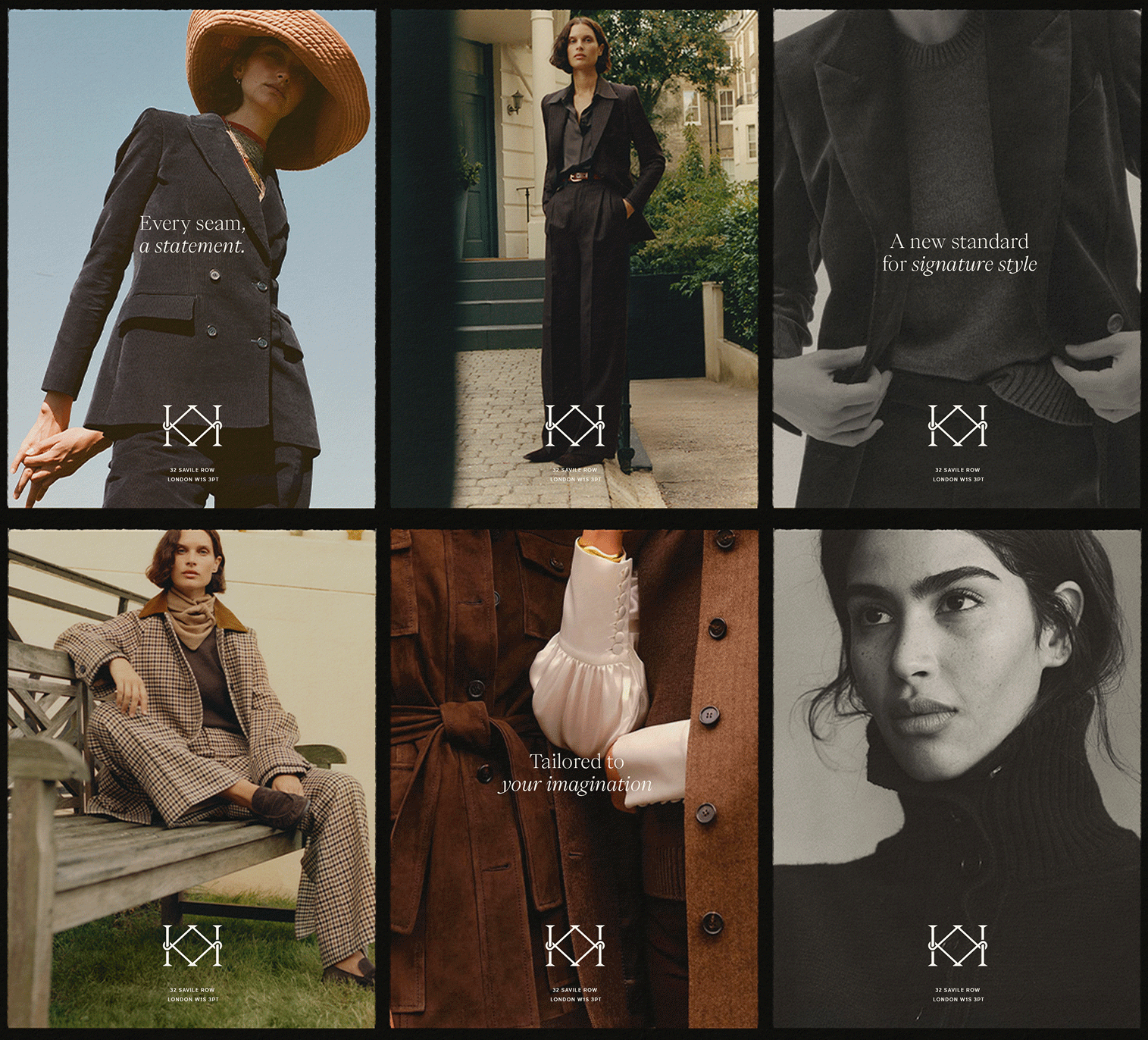
The art direction leans into the same energy; filmic, intimate imagery follows the modern women through city streets and luxury locations showing the suit as a lived-in power, not an occasional costume. Every shot nods back to Knatchbull’s core traits; British authorship, thoughtful service, enduring quality, crafted power and a shared state of mind.
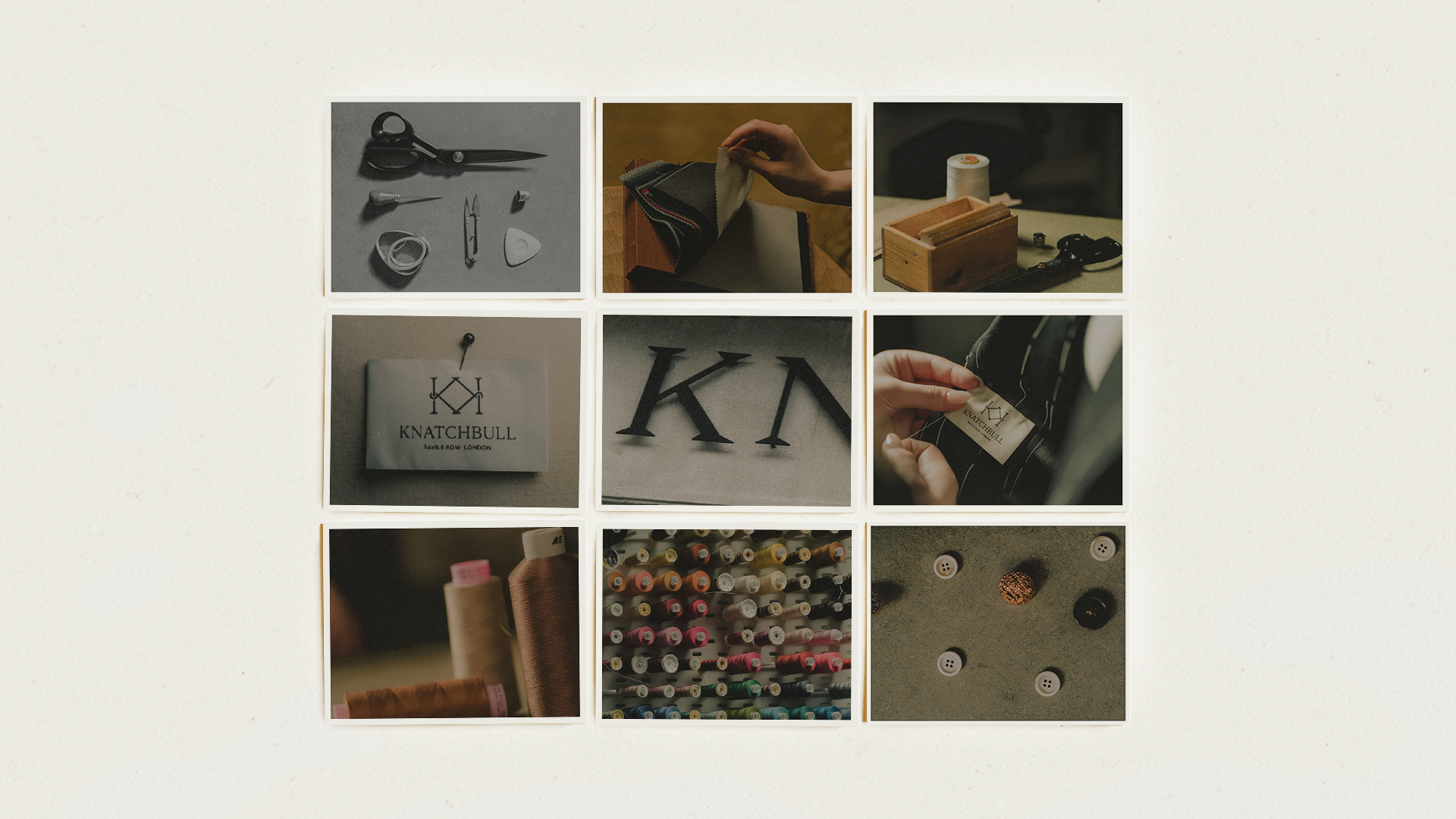
Knatchbull values beauty in the smallest gestures. Every stitch, every texture, every curve of fabric tells part of the story. Knatchbull’s art direction helps to celebrate this intimacy - through close up compositions, still life studies and tactile imagery that reveals tone, structure and craftsmanship. These details aren't subtle, they are statements of Knatchbull’s uncompromising vision.
Testamonials
services
Credits
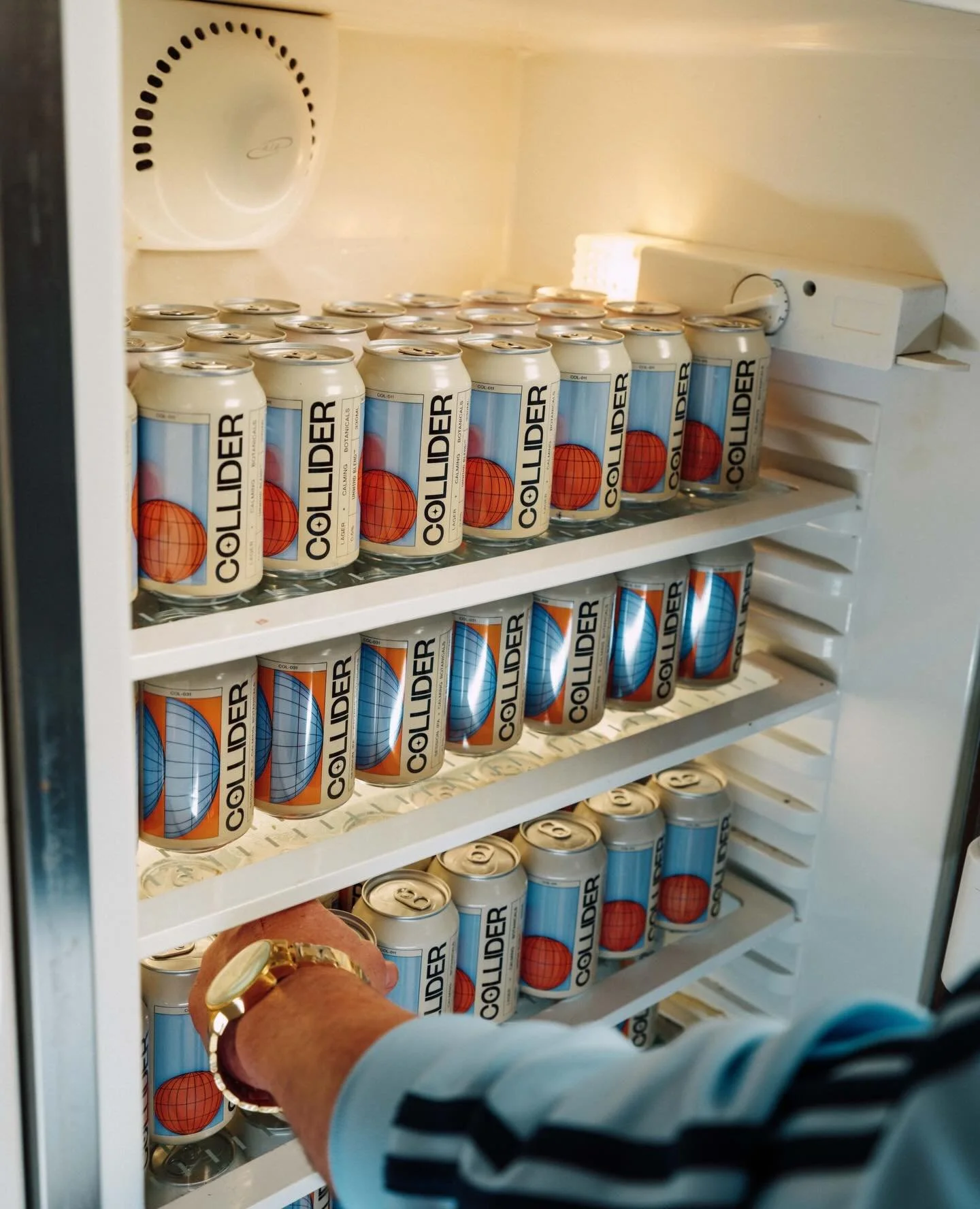
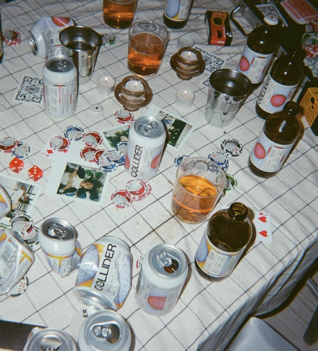
The Collider

Scroll to discover the brand in action today >


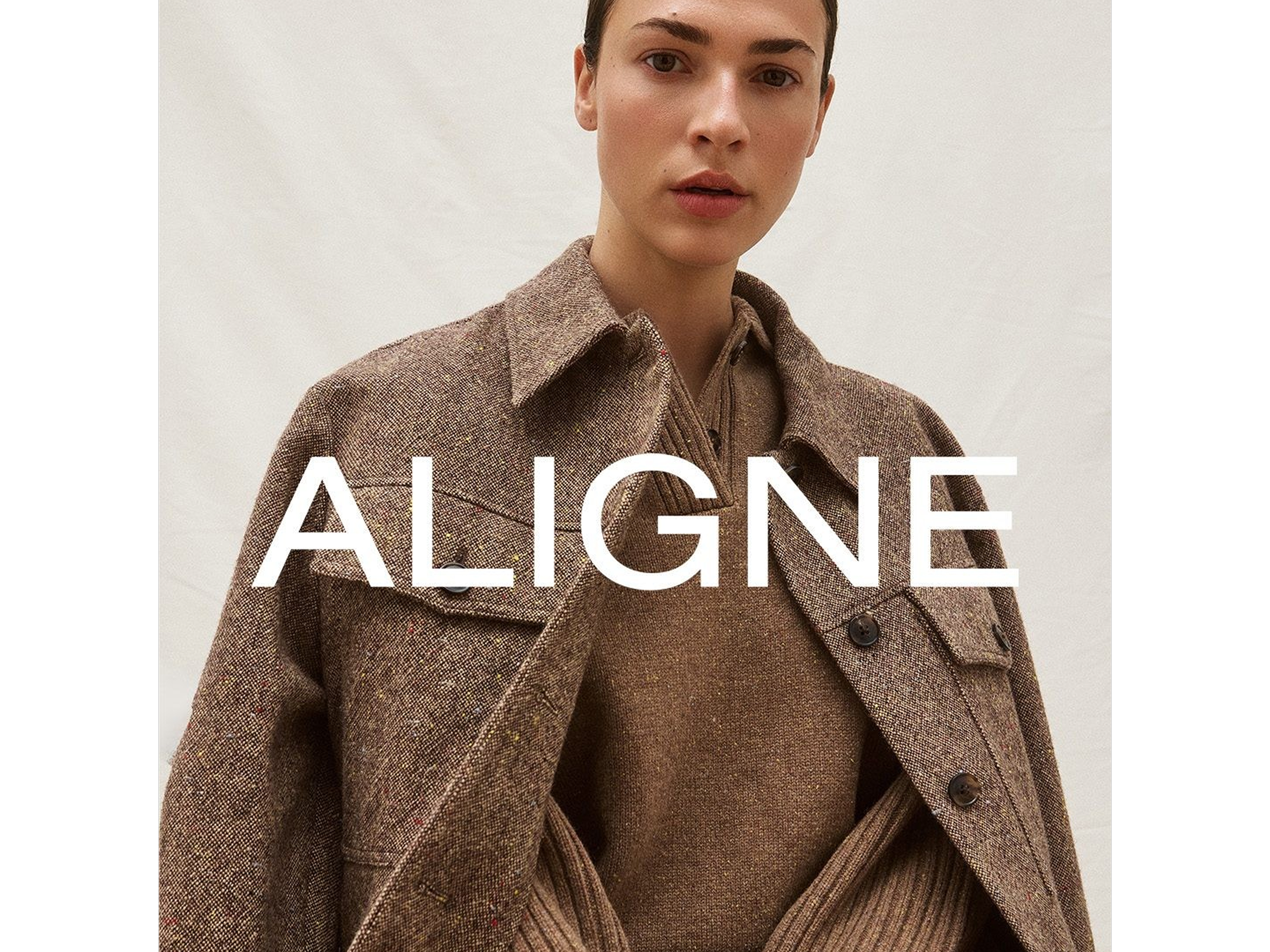
ALIGNE Women going places
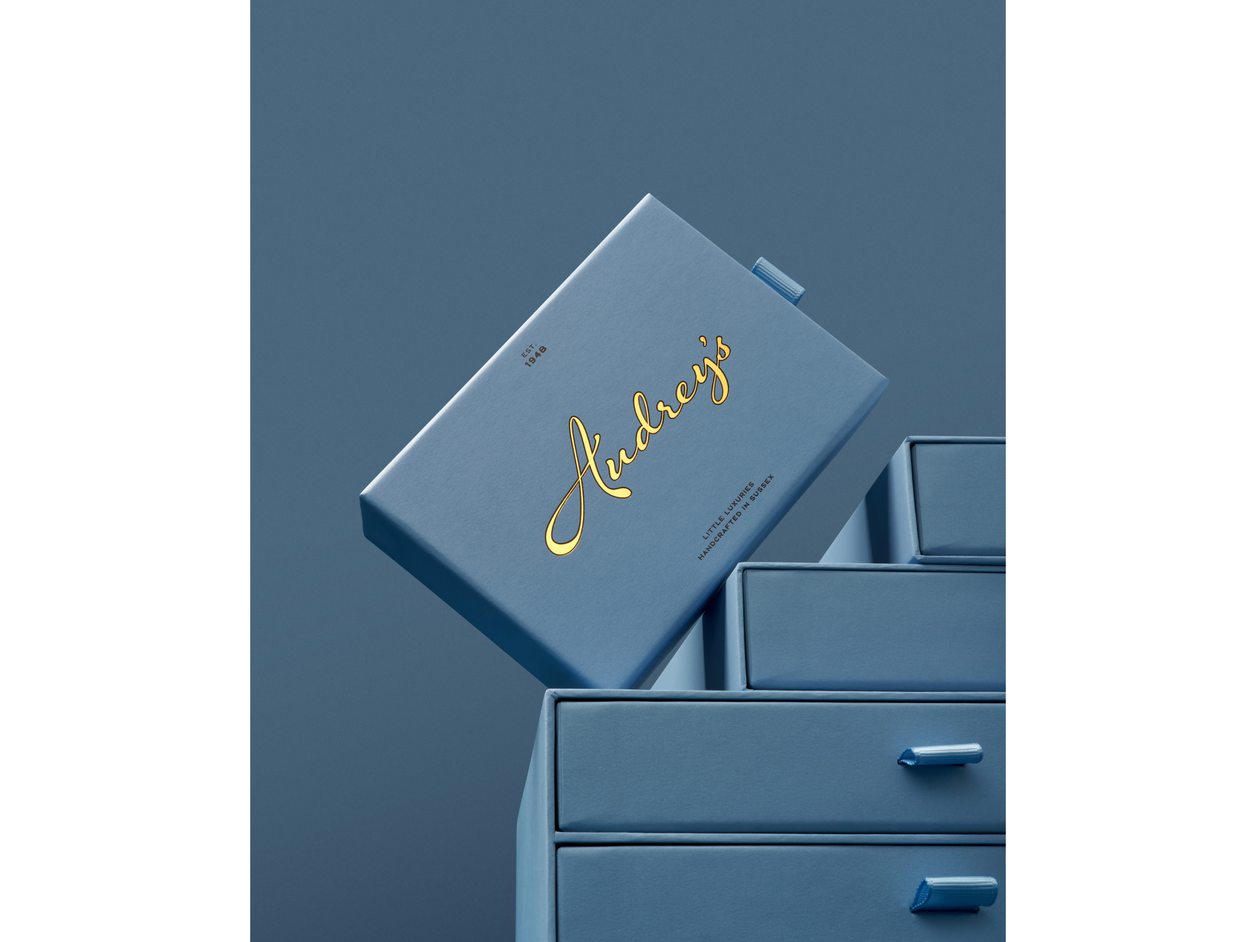
AUDREY'S Something a little bit extraordinary
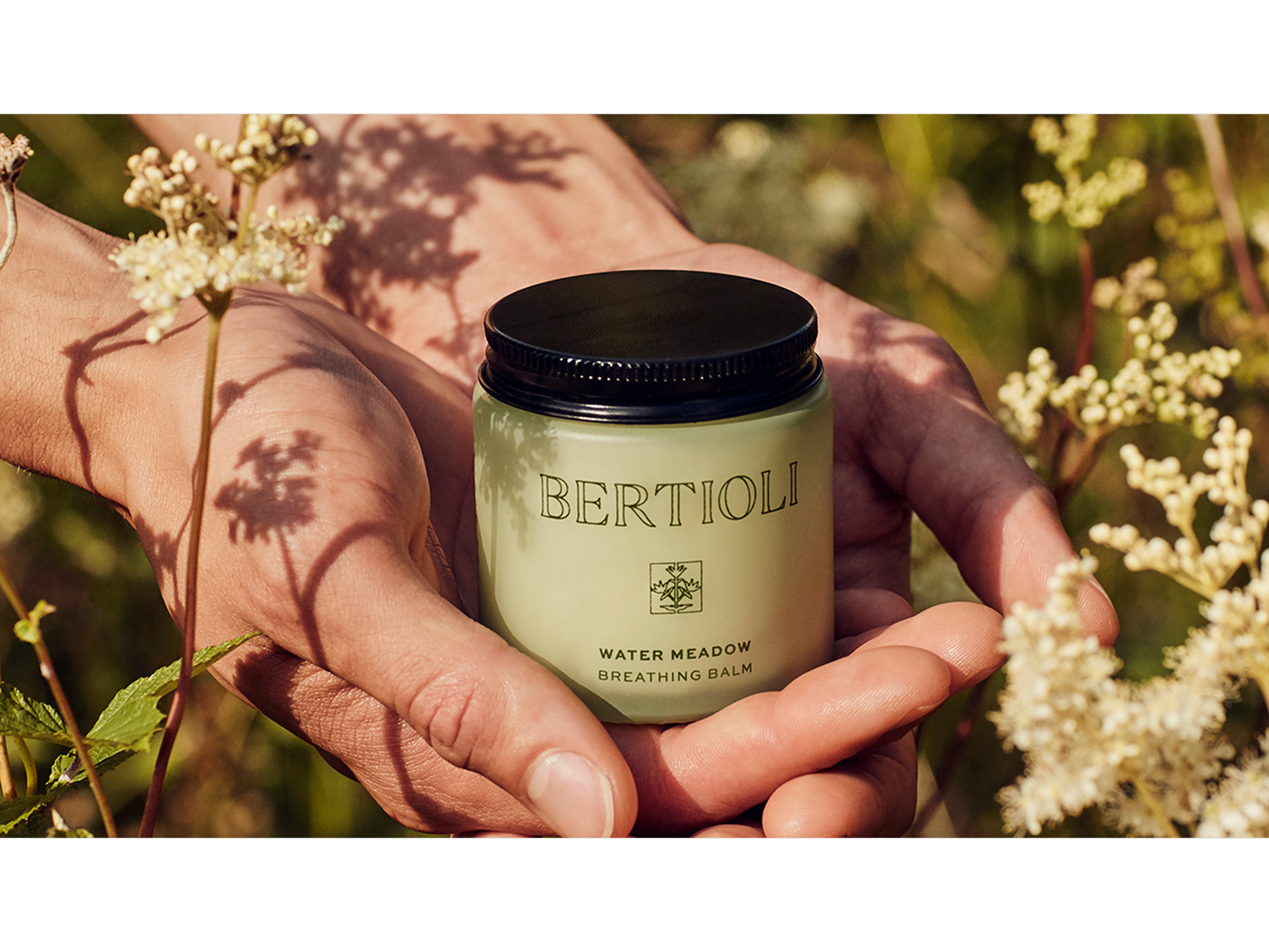
BERTIOLI The nature of beauty
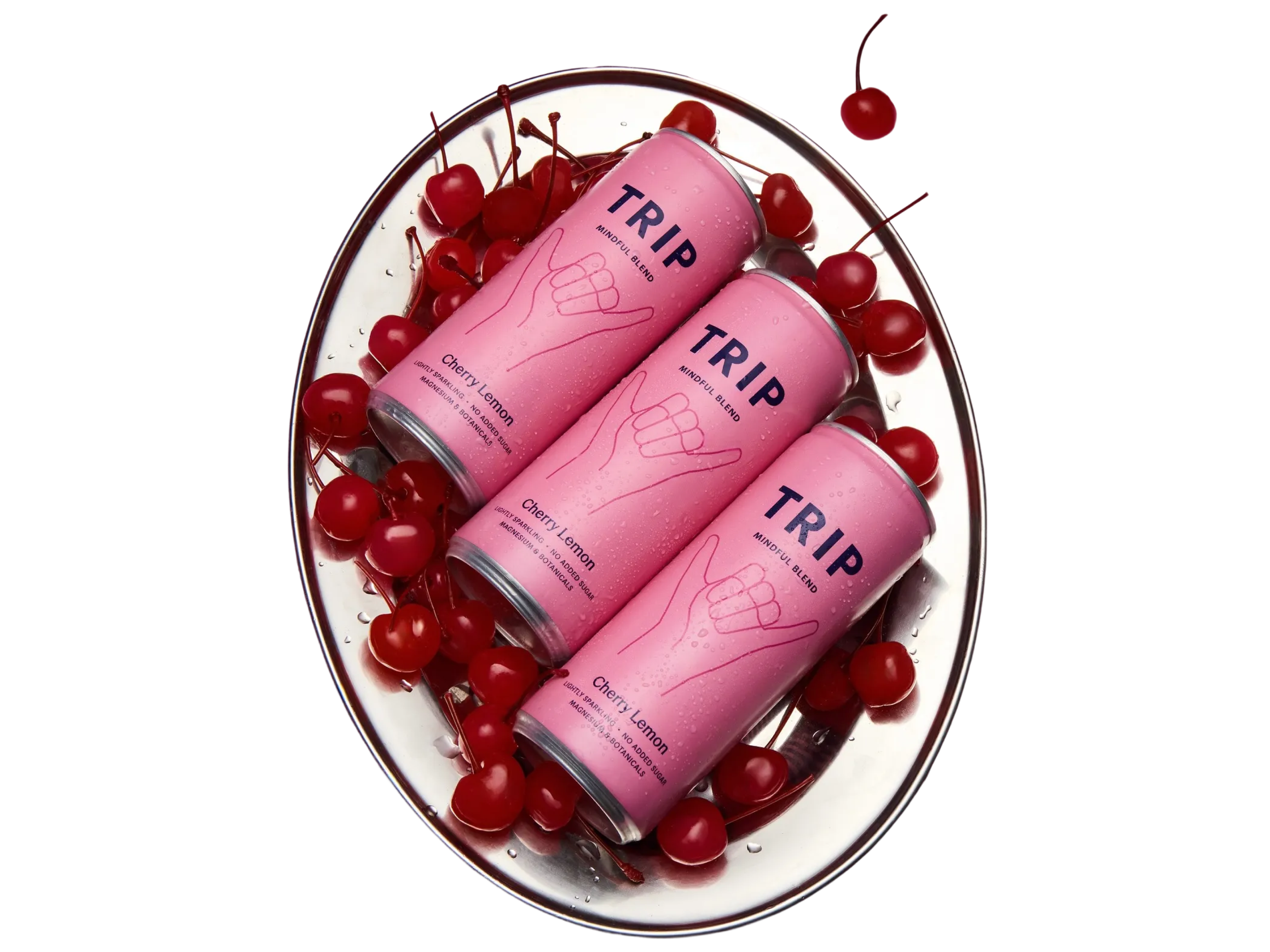
TRIP Take a Trip to find your calm