
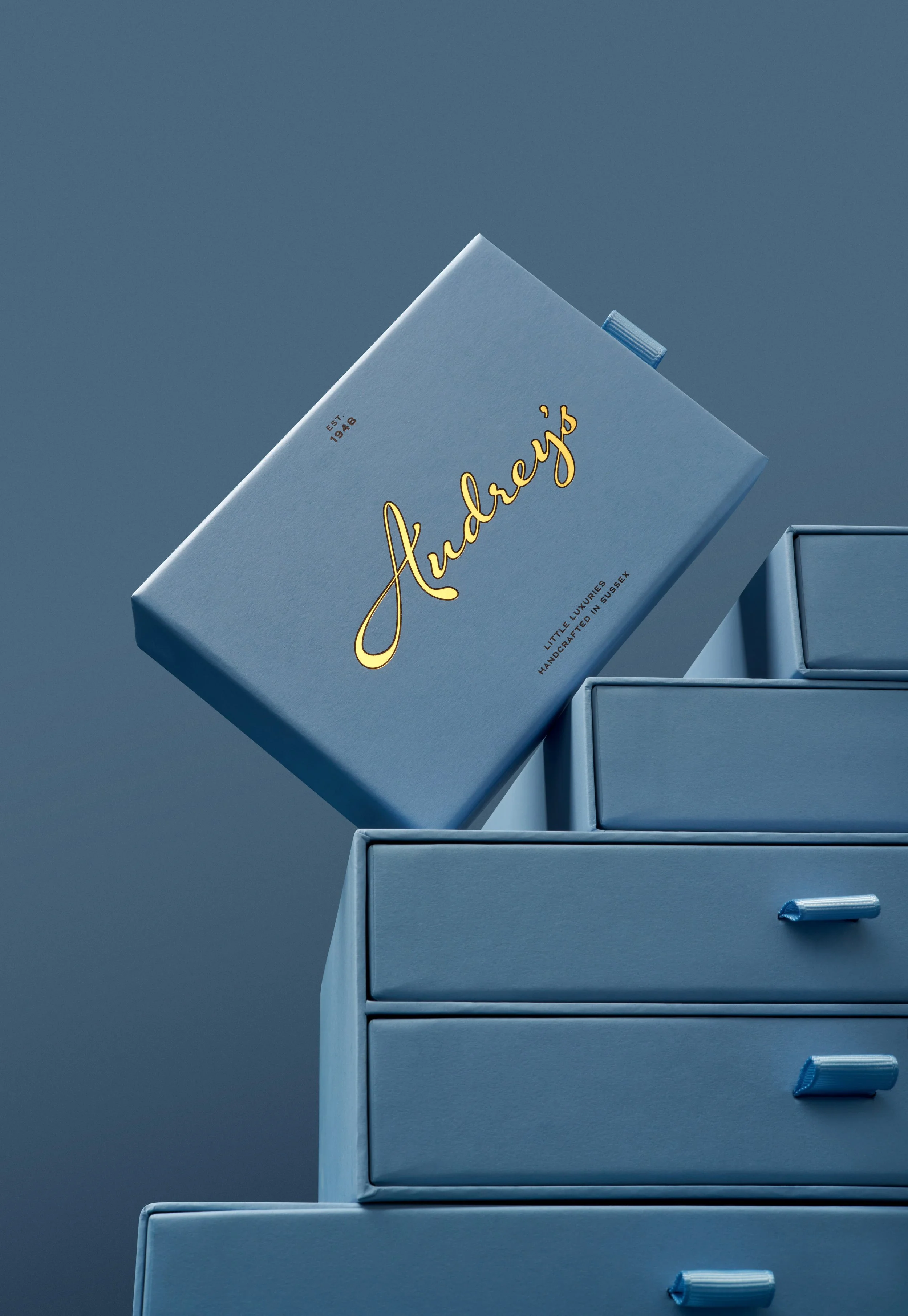
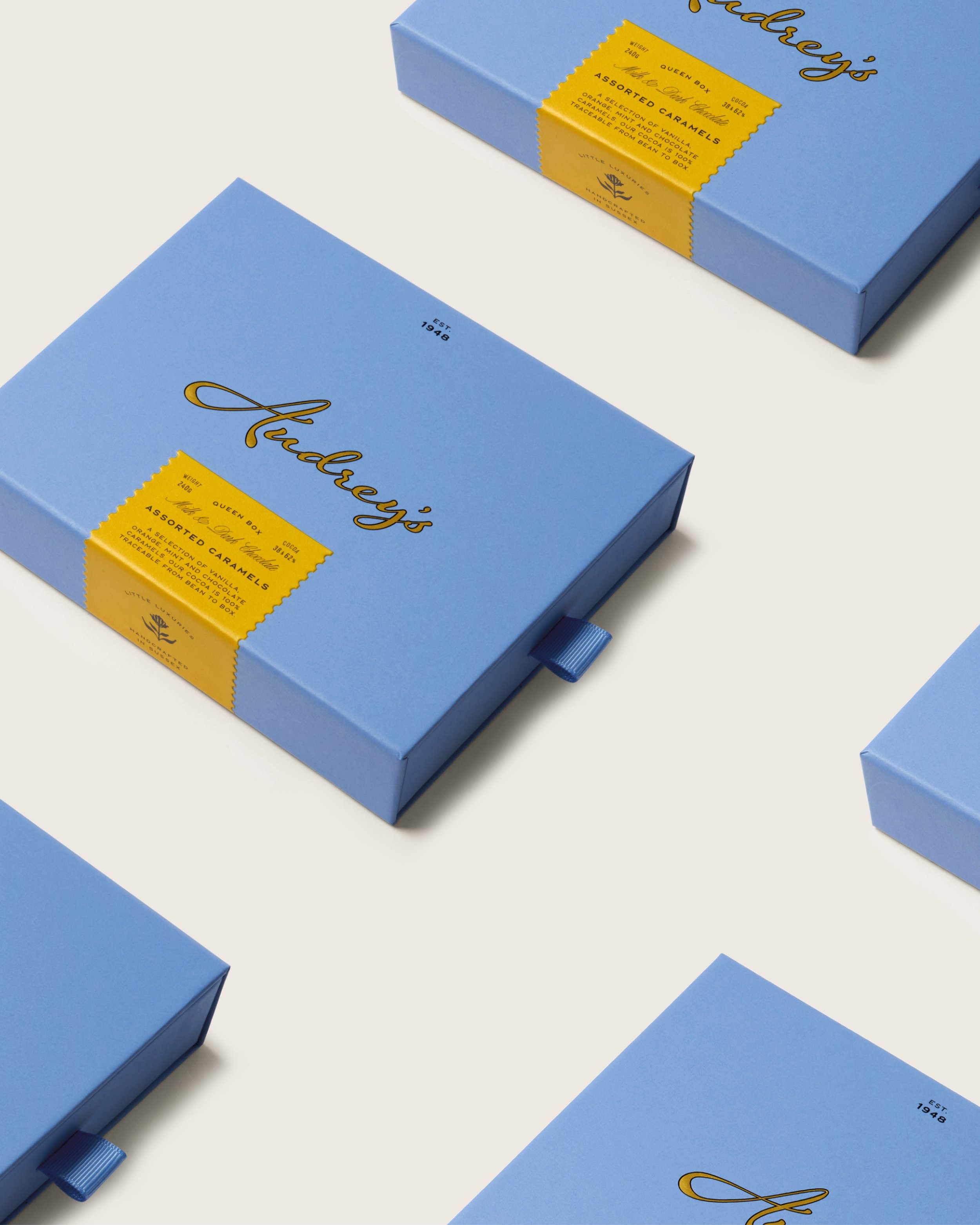
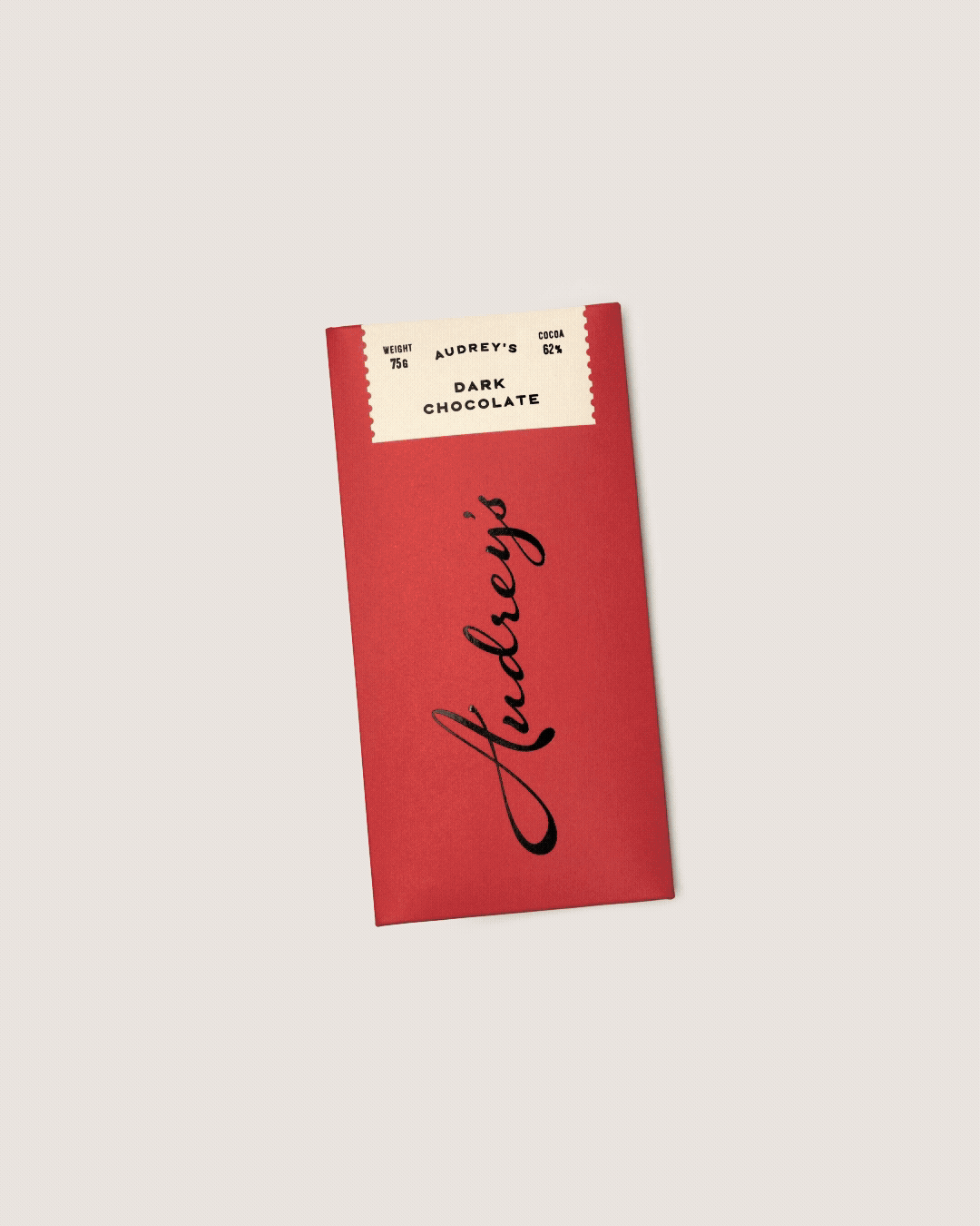
Audrey’s
Something a little bit extraordinary
[2025]
Services
Brand Strategy, Brand Narrative, Visual Identity, Packaging Design, Artworking, Art Direction & Photography
XXX
XXX
XXX
Press
[02] The Legado logotype behaves like a sign that’s weathered into place: carved in the way Spain marks its own street signs, markets and family-run restaurants, but tidied up just enough to feel at home in Shoreditch.
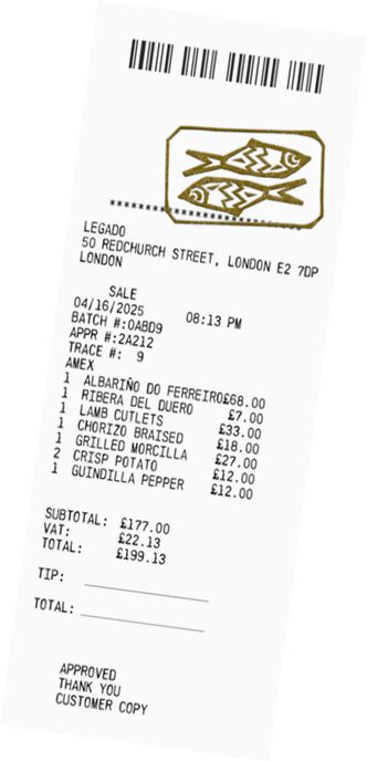
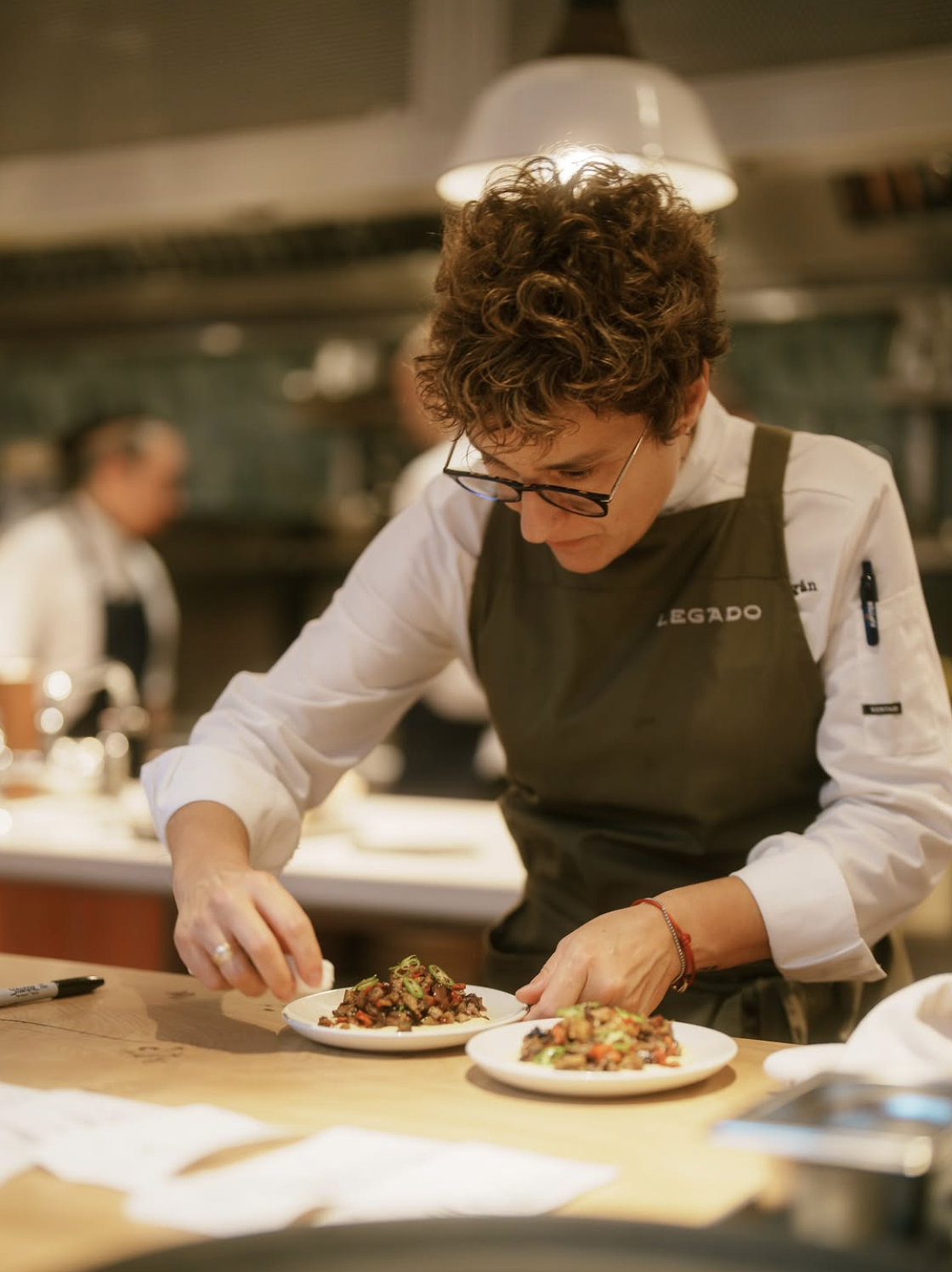
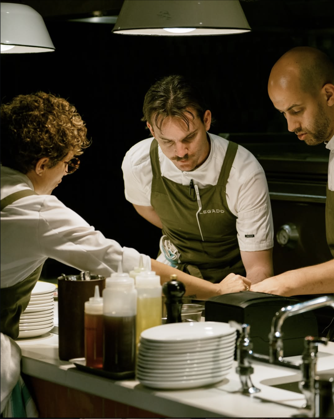
[03] Having opened in August 2025, Legado, a Michelin-Star restaurant lead by Chef Nieves Barragán Mohacho, has quickly established itself as one of London’s most talked-about tables.
When Chef Nieves Barragan approached us to develop her latest venture, Legado, we knew we had to deliver something extraordinary — a restaurant named and built around the idea of legacy. A project more personal to the chef than anything to date, Legado needed to strike a balance between place, craft and memory.
So, we challenged ourselves with a specific question: how do we translate a chef’s lifetime of rich experience into a visual language that behaves more like a living archive, than a static reference. We began by building an identity around what already existed in Nieves’ Spain, treating type, symbol and layout as a way to surface untold stories; a brand world built to live and move with the spirit of Spain.
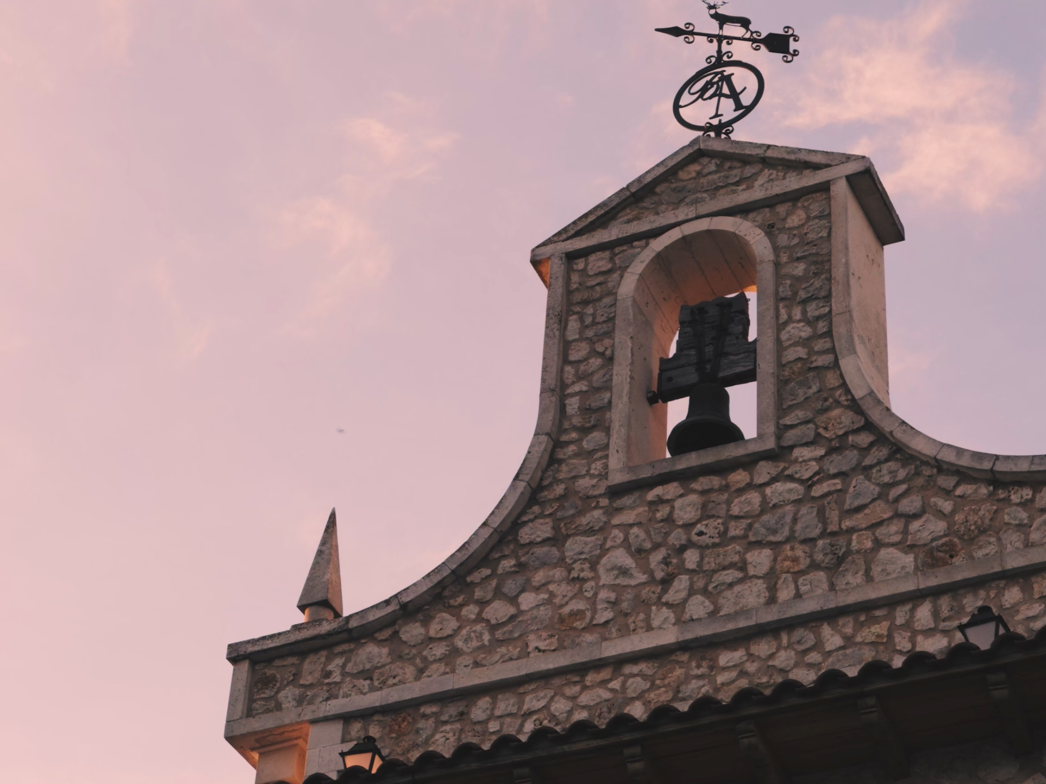
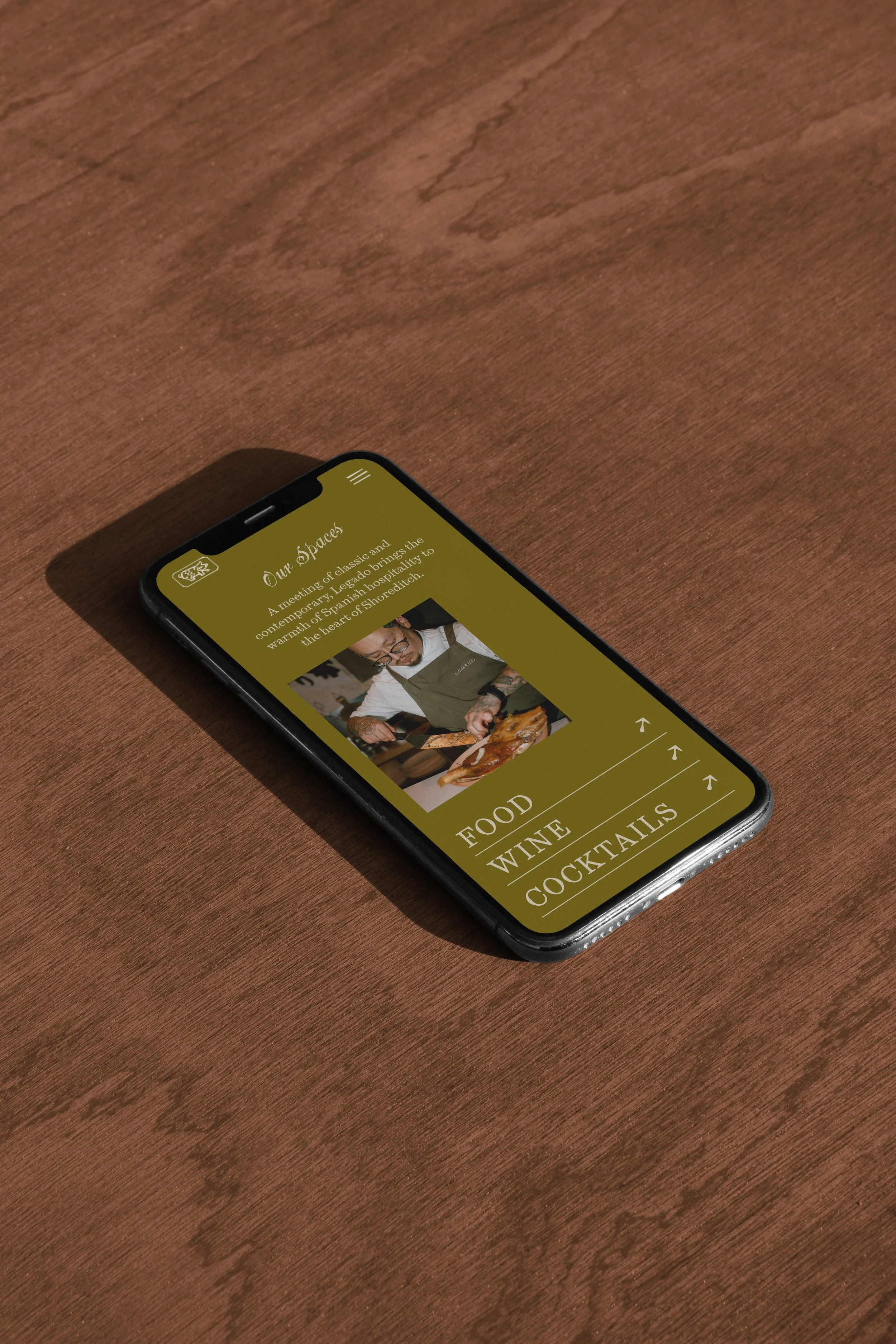
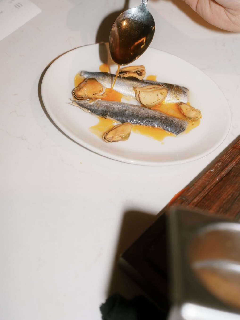
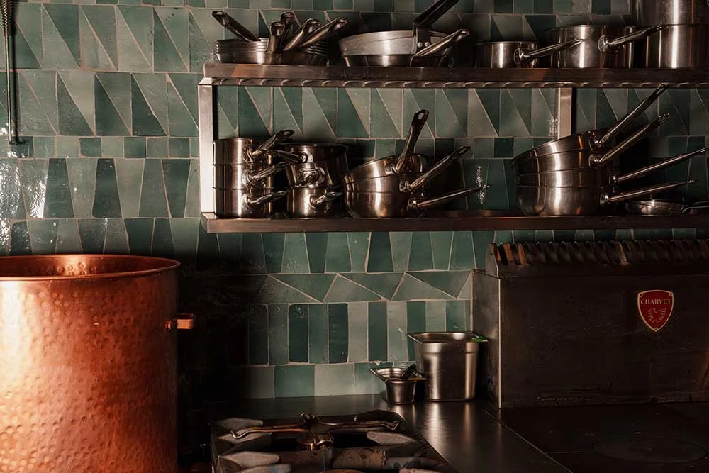
[04] Legado’s texture‑rich interior functions as a physical counterpart to the brand’s emphasis on craft and the sensory perception of memory. Each surface carries a memory of Spain; fluted ceilings inspired by Barcelona, plasterwork echoing Segovia, decorative metal referencing Bilbao, and a palette of greens, plaster‑pinks and terracotta that reflects different regions of Spain through colour and material.
DESIGNING A LEGACY
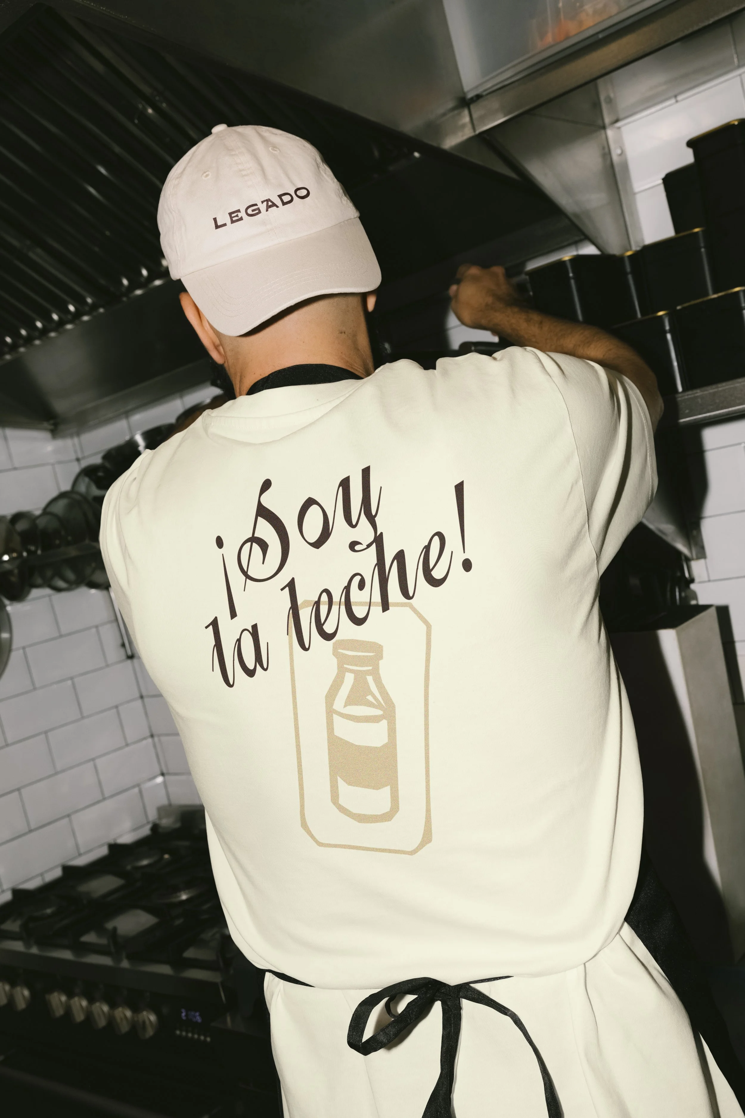
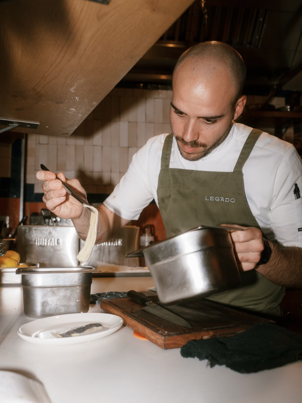
The brand identity for Legado captures the same raw, handmade quality that defines Nieves’ cooking; each element designed to feel purposeful, yet unpolished.
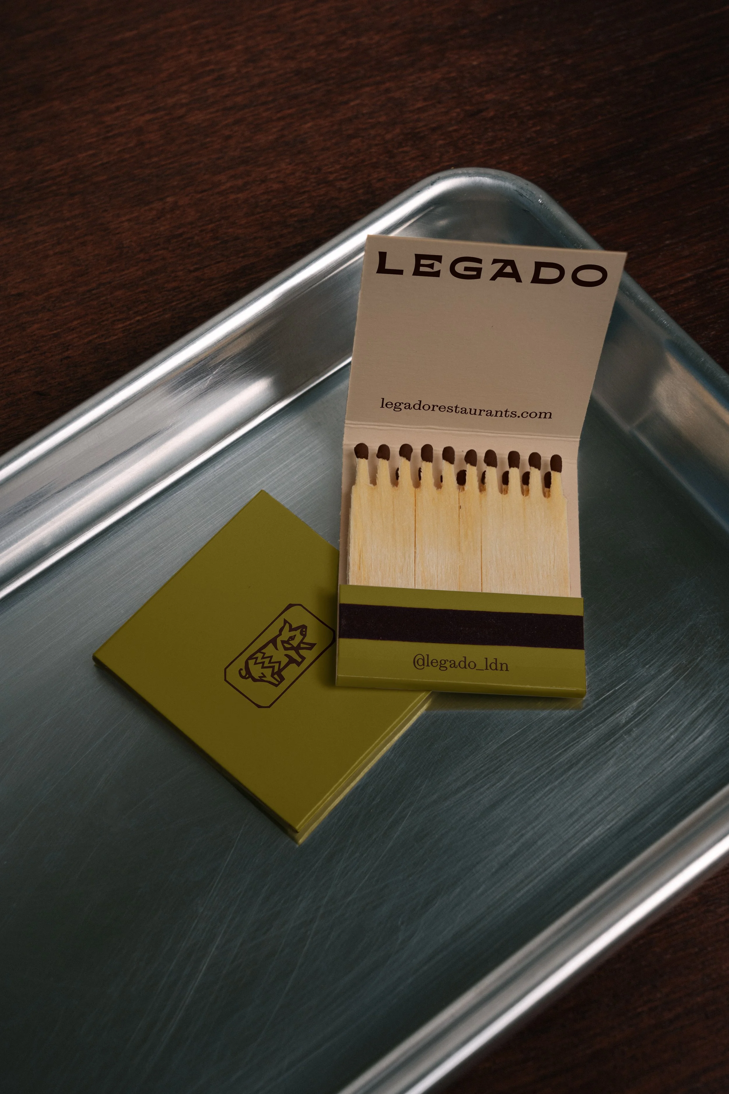
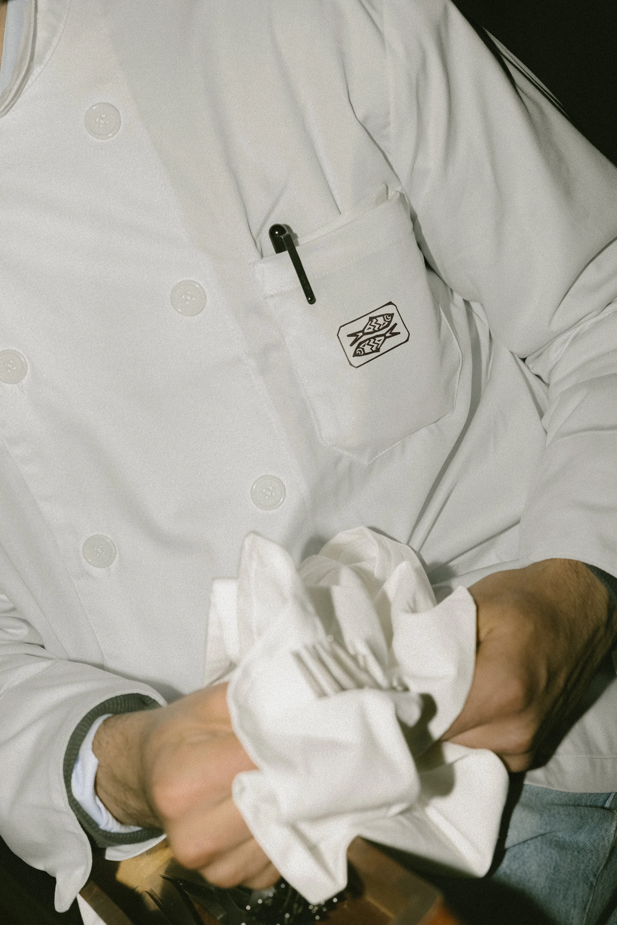
Honest in form and passionate in spirit, the brand is created to move with the same energy as the restaurant itself. The strength of the logotype carries the rhythm of Spanish street signs and market lettering, while the pig and fish illustrative emblems distill Nieves’ personal craft into a single moment: a balance of land and sea, memory and intuition.
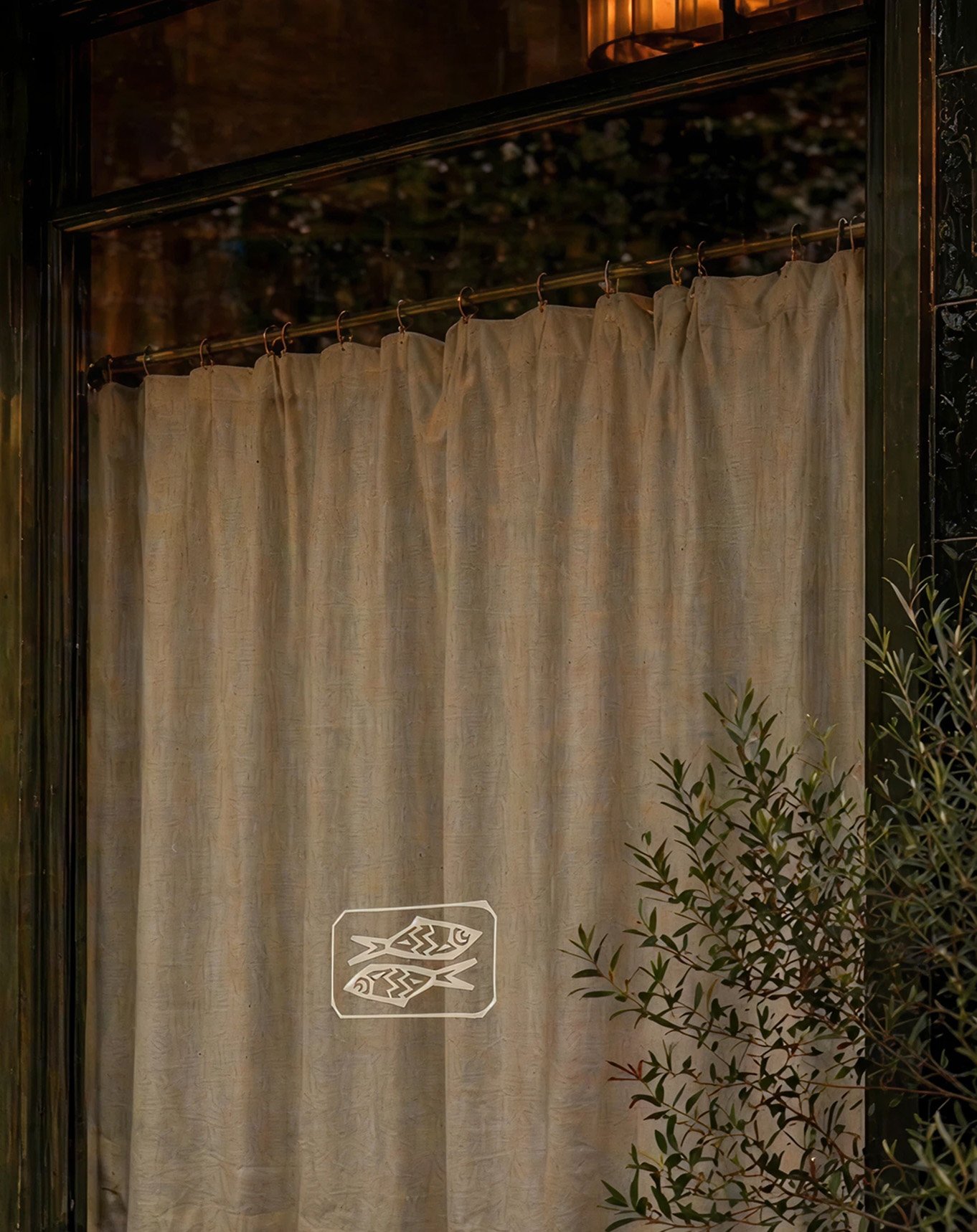
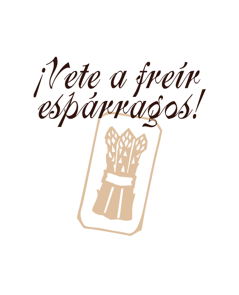
[05] The core brand assets are supported by an icon suite inspired by conversational Spanish idioms passed down through generations — phrases so rooted in the culture they don’t truly translate. They sit at the heart of the brand not as explainable references, but as felt gestures.
DESIGN details
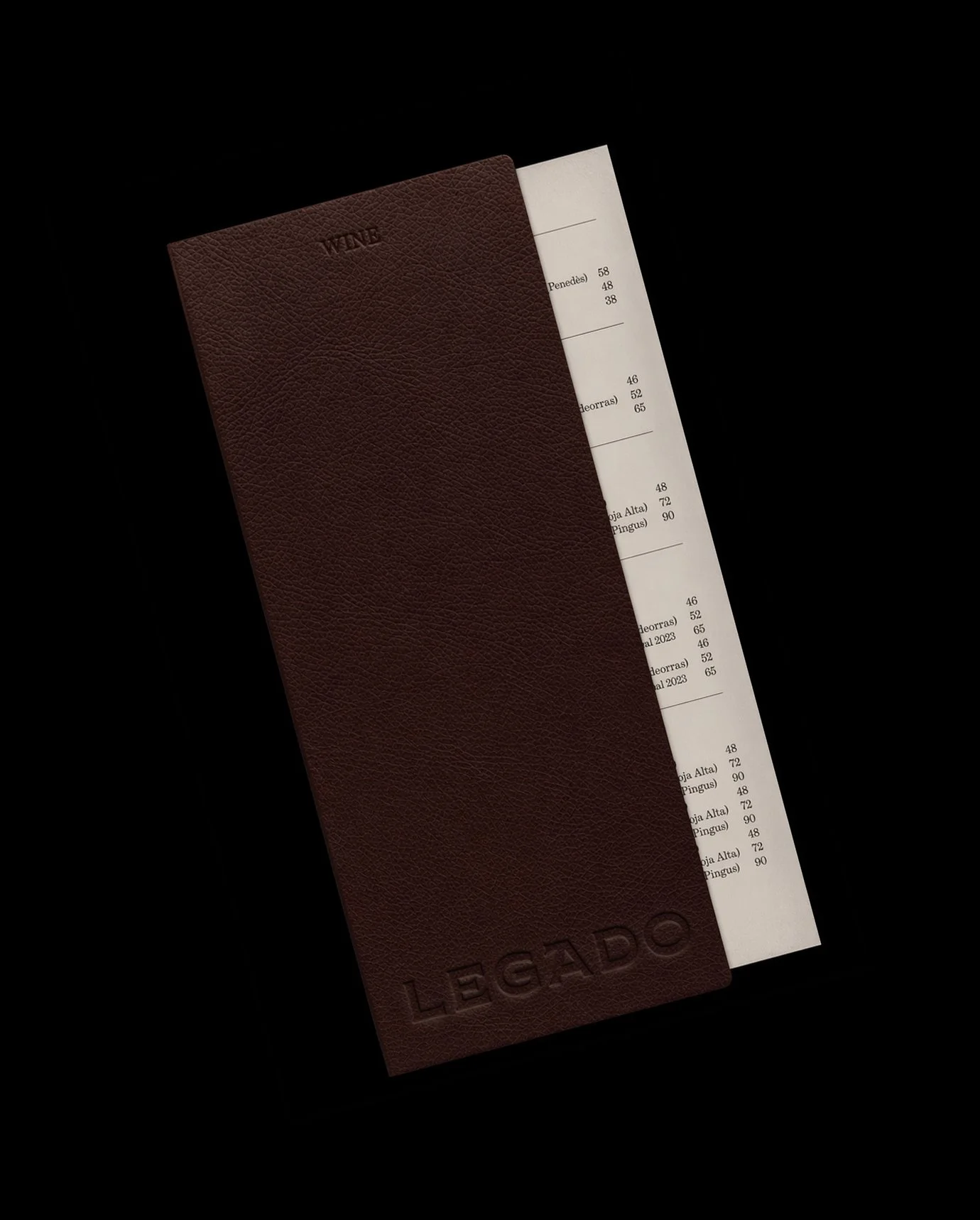
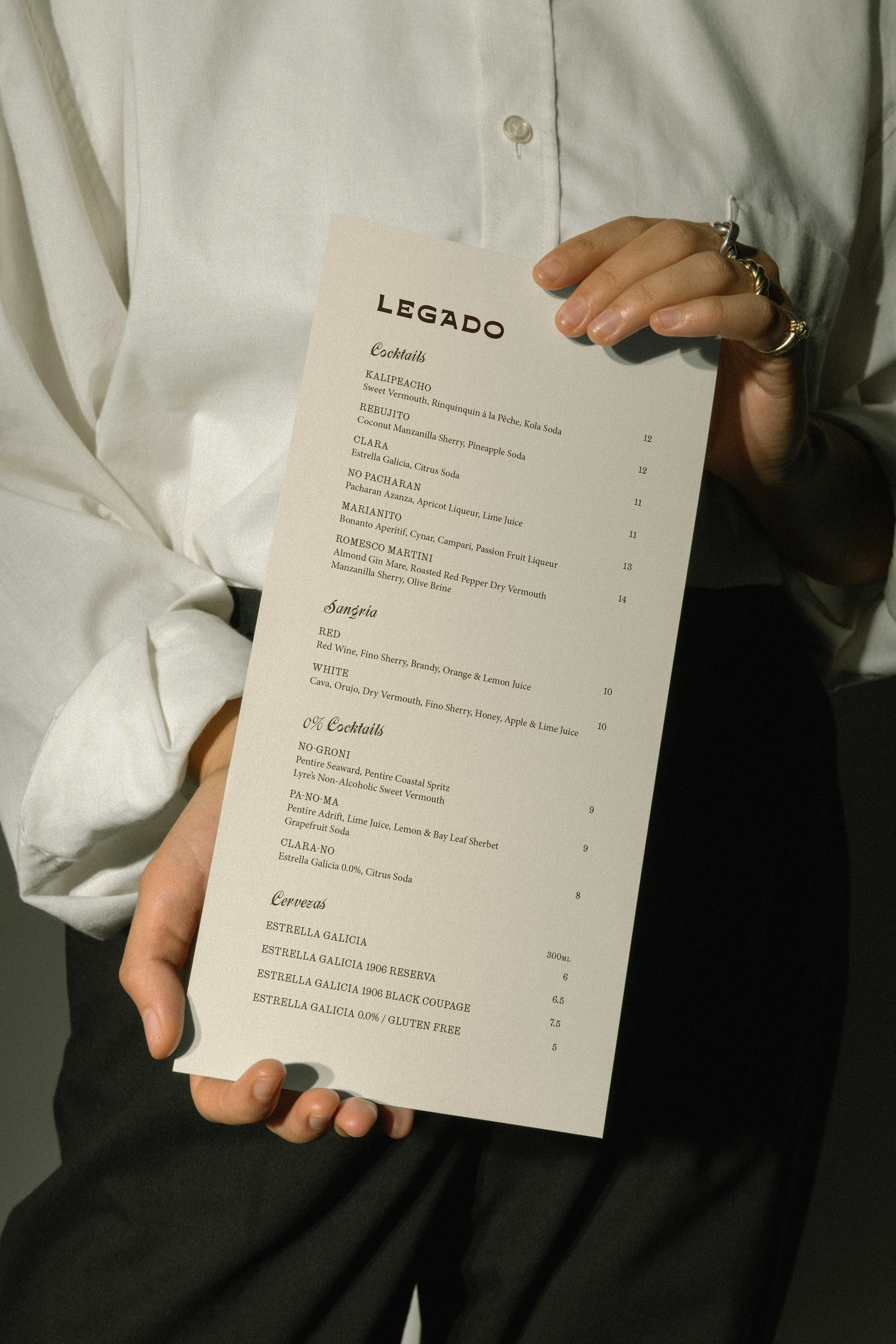
The concept of the ‘living archive’ is extended to the brand’s materiality. Diners are invited to slowly peel back the layers of the menu as if uncovering a forgotten recipe. Overlays of textured papers are combined with handwritten specials, dancing alongside classic typography combinations; each layer pulling you in, just as Nieves’ dishes do at the table.
The brand colour palette keeps it grounded — sun-warmed terracottas, smoky reds, and flecks of vibrant olive that nod to Basque hearths and Iberian soils. Everything designed to draw people deeper, making every interaction feel personal and intentional.
1st
Michelin Star, just seven months after launching
100+
regional dishes celebrated on
1
Best New Opening award received
5+
top‑tier critics celebrating opening
XXX
lorem ipsum
lorem
XXX
lorem ipsum
lorem
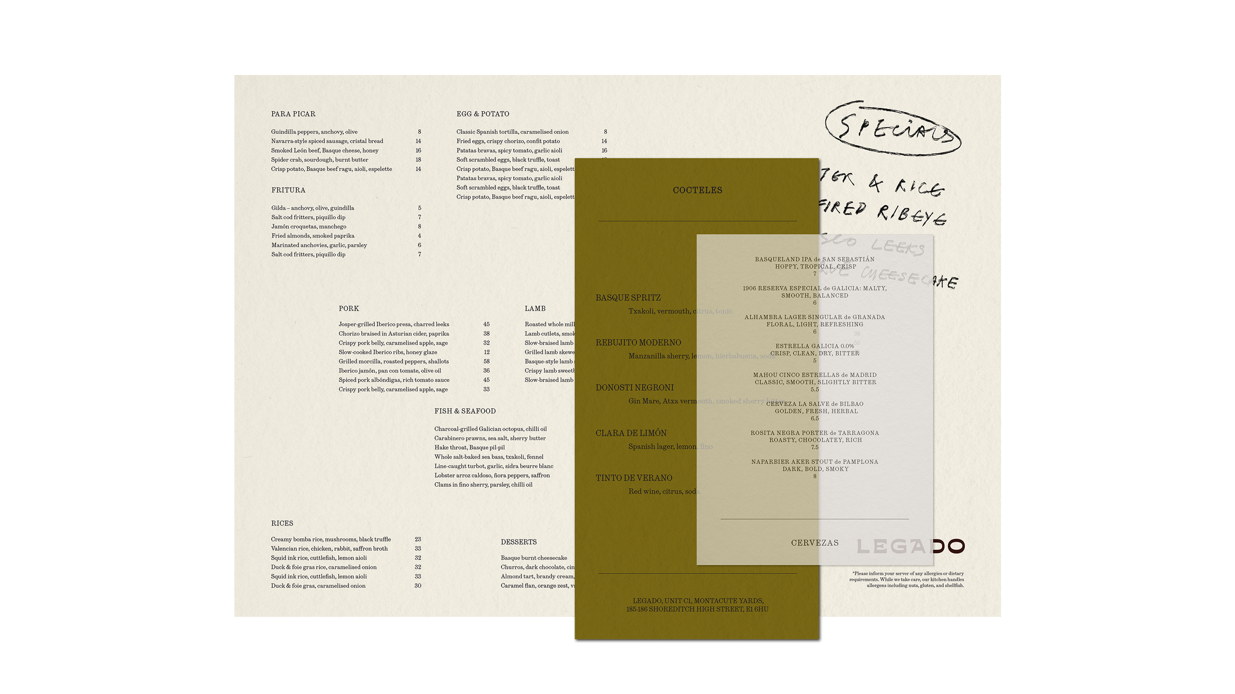
[10] A menu design inspired by the concept of a living archive, we introduce textured overlays, handwritten specials, and classic typography. Every layer invites discovery, mirroring the cuisine’s sensory depth.
The Legado
CHRONICLE
Scroll to discover the brand in action today >


FOOT NOTES & CREDITS
[05] Photographer Name
[06] Photographer Name
[01] Photographer Name
[04] Photographer Name
[02] Photographer Name
[05] Photographer Name
[03] Photographer Name
[06] Photographer Name
[04] Photographer Name
ALIGNE Women going places
AUDREY'S Something a little bit extraordinary
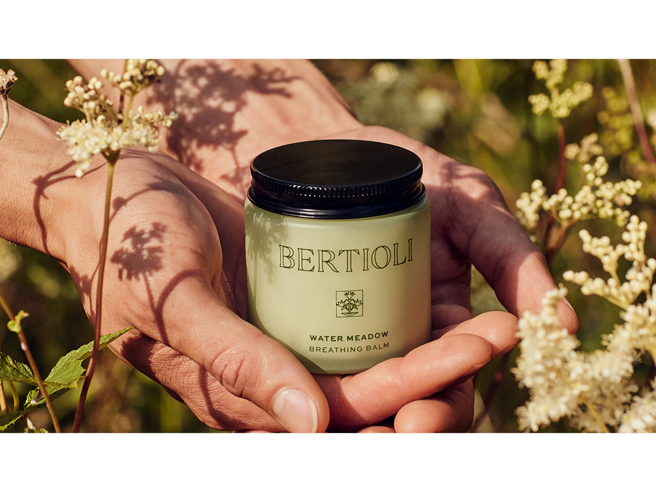
BERTIOLI The nature of beauty
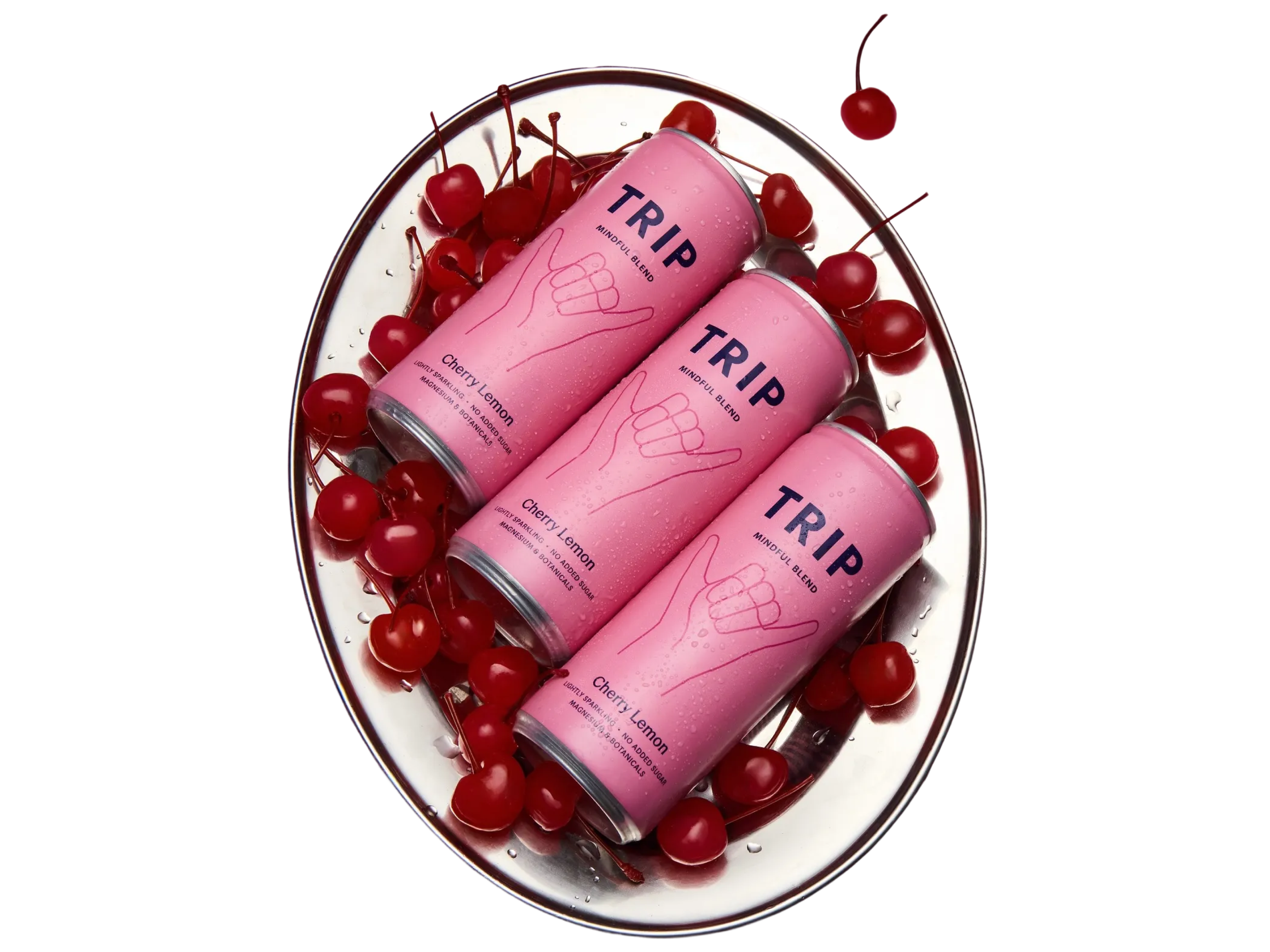
TRIP Take a Trip to find your calm