
Oovii
Everyday suncream for life’s adventures
[2026]
Services
Brand Narrative, Visual Identity, Packaging, Illustration, Website Design
The Brand Identity
The Telegraph
The Times
Press
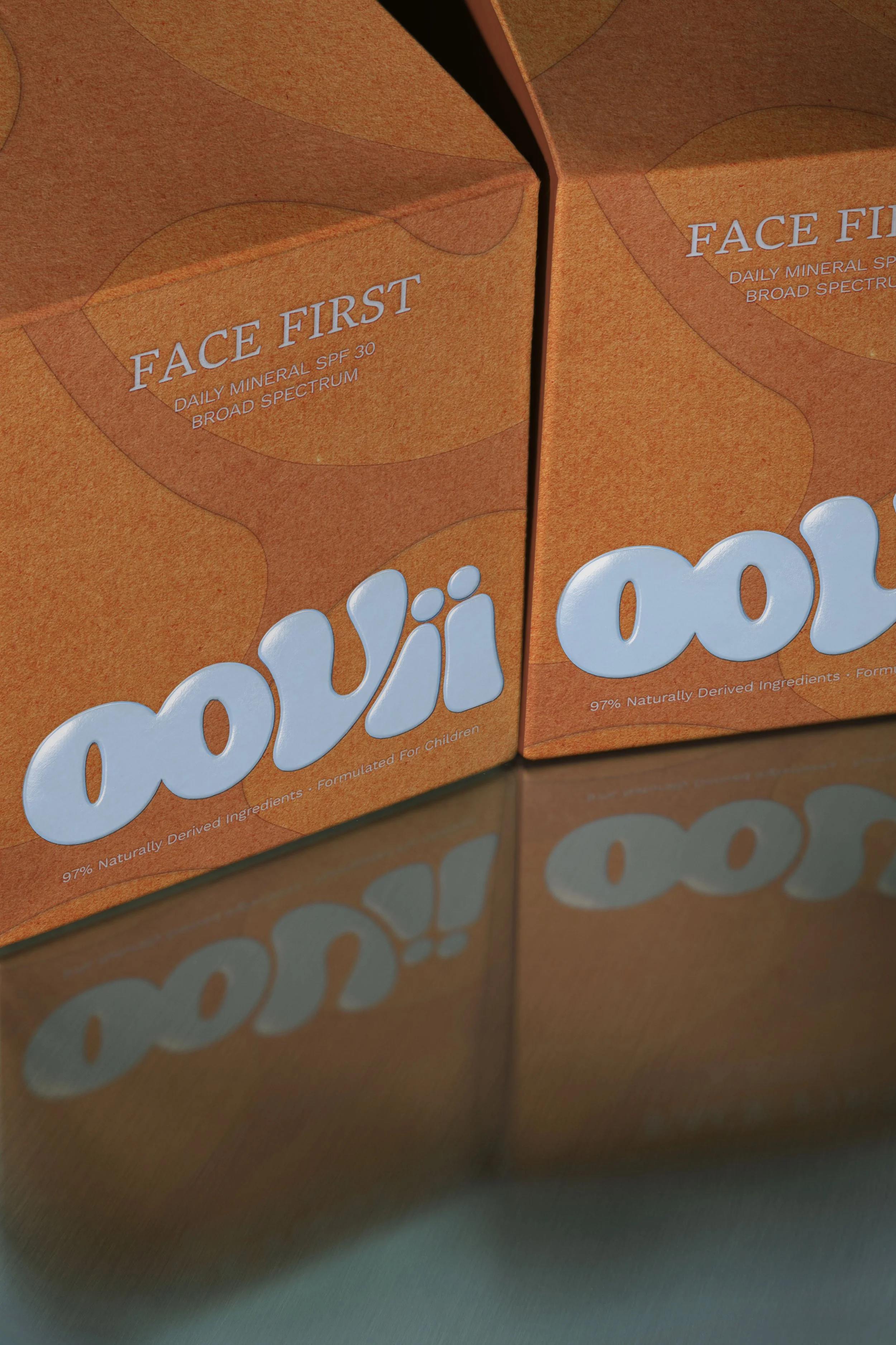
[01] The brand logo is a playful interpretation of liquid sun scream, bursting out the bottle. Expressive and characterful, the logo highlights the durability of the product and the care-free daily lifestyle it affords the children wearing it.
Parents themselves, they had spent years searching for products that weren't filled with chemicals, weren't greasy, and didn't turn every top-up into a battle. By the time they reached us, they had their first product, a daily face suncream, and a name: Oovii, inspired by the way a young child might attempt to say "UV." Everything else was still to be discovered. This was a dream brief for Duzi; a strong idea at its centre, and a mission greater still. So that's where we began.
Oovii is one of those lovely examples of true creative partnership. When its founders came to Duzi, they brought an idea: a sun protection product for kids that parents could finally feel confident about.
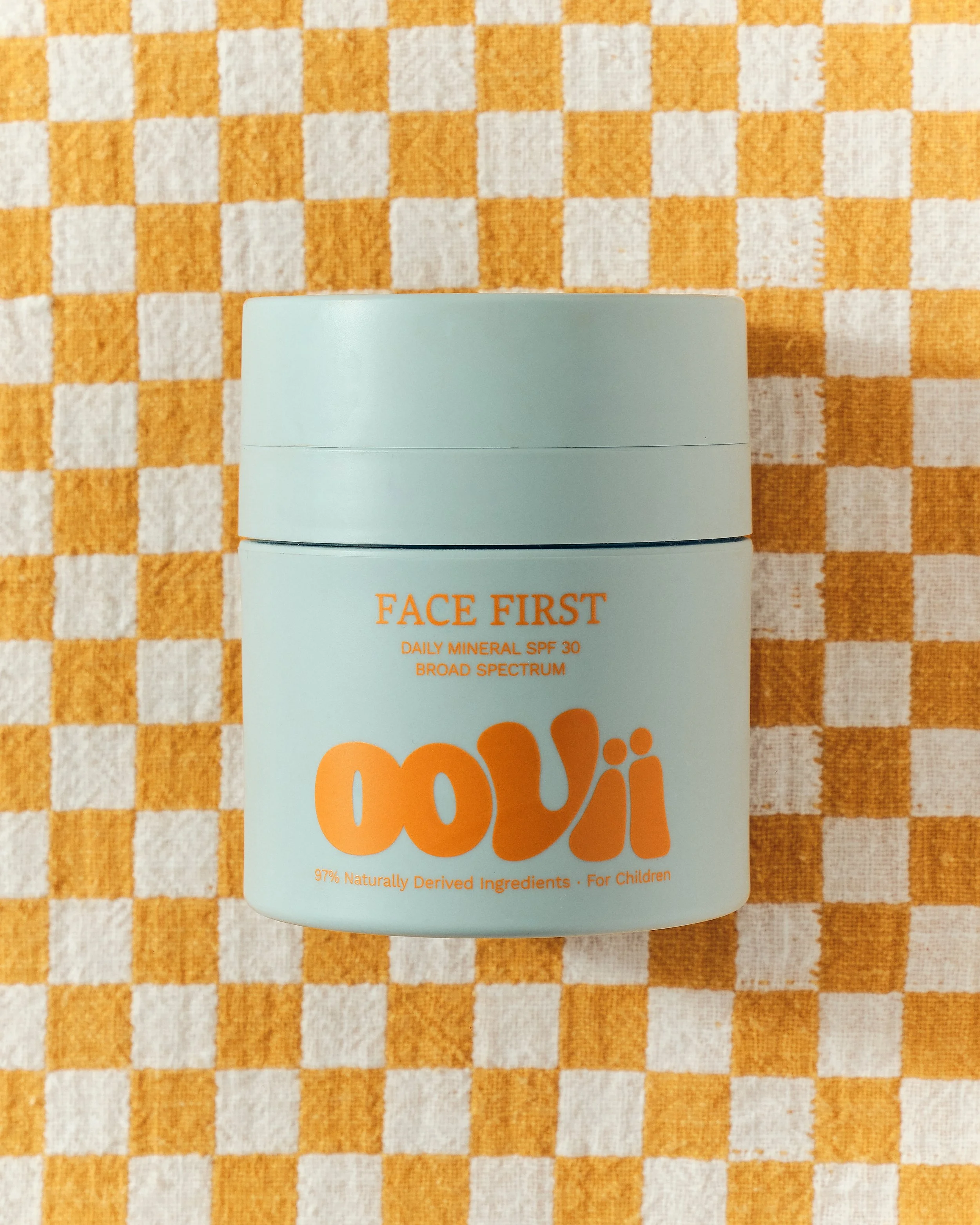
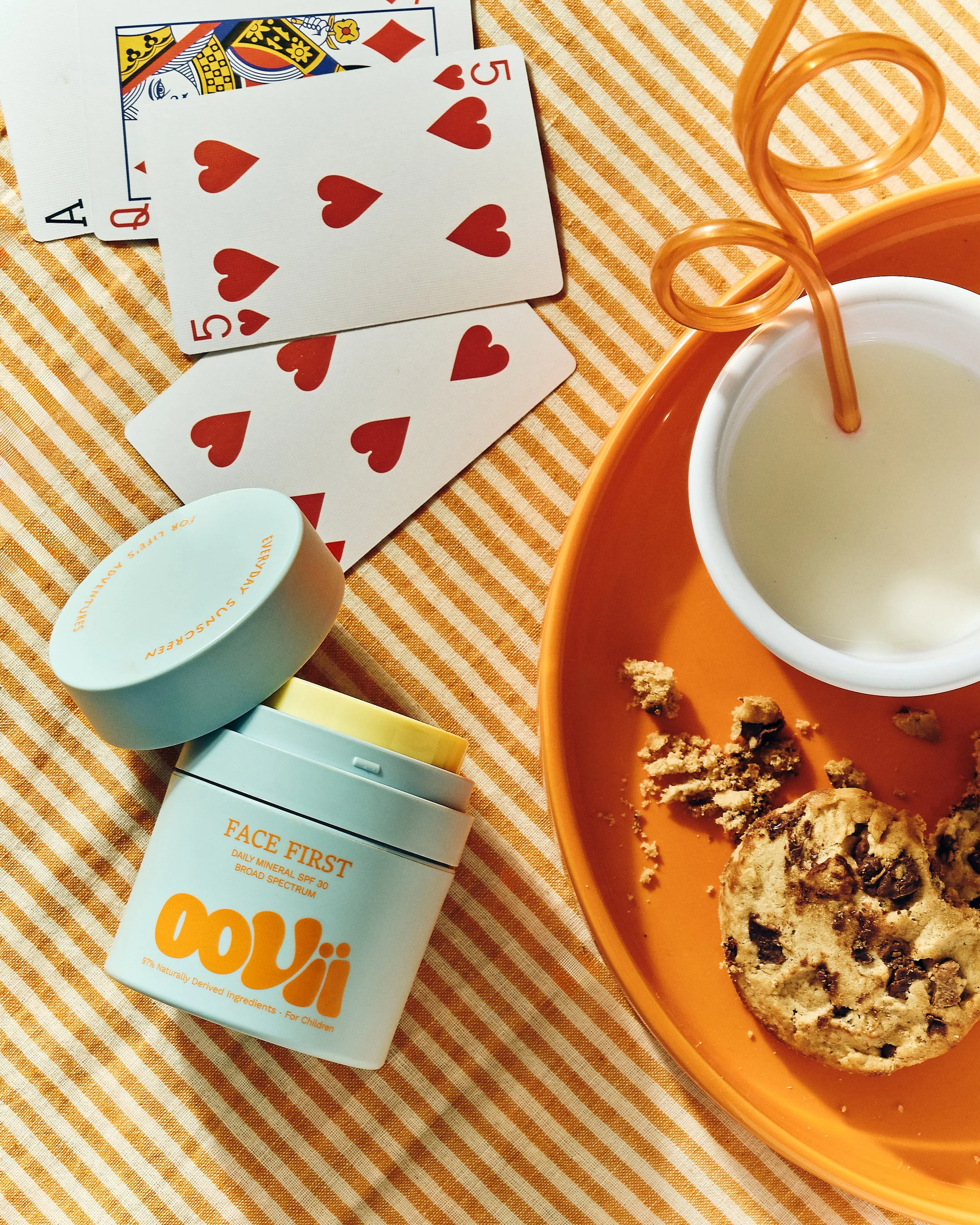
[01] Each Oovii product features two brand colours. These pairings, whilst contrasting, feels unified in their warmth and tone. The logo is always featured oversized; anchoring the design with expression and playfulness.
Building a world kids want to play in
We developed a strategy built on a simple formula: Oovii provides the protection, the kids provide the play. It's a positioning that sits in the space between protection and freedom — reframing sunscreen as something that makes play possible, rather than something that restricts it. Rather than leading with fear of the sun, we positioned Oovii as the quiet enabler of carefree childhood adventure.
That idea shaped the entire brand identity, with play at its core. The logo is the clearest expression of this. A graphic, characterful interpretation of liquid sunscreen, expressive in form and tactile in feel. It speaks to both the durability of the product and the freedom it gives the children wearing it. This visual language extends to a fluid, vibrant graphic world; one that reflects Oovii's place in daily life: ever-present, flexible, ready for whatever adventure comes next.
![[ 01 / 12 ]](https://images.squarespace-cdn.com/content/v1/697bcd1af89ab47bd0161ef5/1e49d5e7-43f0-4465-9a2b-12cd3bc7ba39/unnamed+1.jpg)
[ 01 / 12 ]
![[ 02 / 12 ]](https://images.squarespace-cdn.com/content/v1/697bcd1af89ab47bd0161ef5/04dec313-3afc-41ac-b332-175228968dab/unnamed+1-1.jpg)
[ 02 / 12 ]
![[ 03 / 12 ]](https://images.squarespace-cdn.com/content/v1/697bcd1af89ab47bd0161ef5/fbbc73ef-bf8a-497c-a95b-dfbfdf663019/OovyApril2026-220+3.jpg)
[ 03 / 12 ]
![[ 04 / 12 ]](https://images.squarespace-cdn.com/content/v1/697bcd1af89ab47bd0161ef5/c04231a4-e845-4db4-9e42-3956fd51a58b/unnamed+6.jpg)
[ 04 / 12 ]
![[ 05 / 12 ]](https://images.squarespace-cdn.com/content/v1/697bcd1af89ab47bd0161ef5/b4075b2d-0339-41a6-8779-a9b9190ba097/unnamed+4.jpg)
[ 05 / 12 ]
![[ 06 / 12 ]](https://images.squarespace-cdn.com/content/v1/697bcd1af89ab47bd0161ef5/cb19e5b0-10ff-47ec-b54f-5410ce4350f9/OovyApril2026-356+2.jpg)
[ 06 / 12 ]
![[ 07 / 12 ]](https://images.squarespace-cdn.com/content/v1/697bcd1af89ab47bd0161ef5/6183942d-b7b5-4141-b95d-1fba17e61ea7/unnamed+5.jpg)
[ 07 / 12 ]
![[ 08 / 12 ]](https://images.squarespace-cdn.com/content/v1/697bcd1af89ab47bd0161ef5/5892ad75-d2ea-4760-85f6-57749140d6e7/unnamed+2.jpg)
[ 08 / 12 ]
![[ 09 / 12 ]](https://images.squarespace-cdn.com/content/v1/697bcd1af89ab47bd0161ef5/cbc467cd-32ec-4ba3-8634-92a0cd404365/OovyApril2026-396+2.jpg)
[ 09 / 12 ]
![[ 10 / 12 ]](https://images.squarespace-cdn.com/content/v1/697bcd1af89ab47bd0161ef5/6daecb74-fd7a-4614-8302-f62da8d1bd62/unnamed+7.jpg)
[ 10 / 12 ]
![[ 11 / 12 ]](https://images.squarespace-cdn.com/content/v1/697bcd1af89ab47bd0161ef5/0f32b5fb-0fff-4ea9-835e-66c530eaf081/unnamed+8.jpg)
[ 11 / 12 ]
![[ 12 / 12 ]](https://images.squarespace-cdn.com/content/v1/697bcd1af89ab47bd0161ef5/e8bd6fea-2724-4915-b563-74fe0f0cb4cd/OovyApril2026-220+2.jpg)
[ 12 / 12 ]
The brand’s art direction follows the same instinct toward discovery. Nothing is posed or overly curated; instead, the imagery captures real, carefree moments of daily life, featuring children of all ages to show how Oovii moves through every stage of childhood. Natural light and reportage-style shooting keep the focus on real people in real moments.
![[01 / 11]](https://images.squarespace-cdn.com/content/v1/697bcd1af89ab47bd0161ef5/1439cf6b-06c2-40ee-9e45-b69bd4f7a2eb/Oovi_+27+2.jpg)
[01 / 11]
![[02 / 11]](https://images.squarespace-cdn.com/content/v1/697bcd1af89ab47bd0161ef5/44e246fc-2f09-4d56-833e-7a5634ba8c35/image+886.jpg)
[02 / 11]
![[03 / 11]](https://images.squarespace-cdn.com/content/v1/697bcd1af89ab47bd0161ef5/2c559126-6caf-4830-968e-d0a9cd3639d0/Oovi_+35+1.jpg)
[03 / 11]
![[04 / 11]](https://images.squarespace-cdn.com/content/v1/697bcd1af89ab47bd0161ef5/948f91ae-8dd6-469e-a508-8520a07e3d6f/OovyApril2026-66+1.jpg)
[04 / 11]
![[05 / 11]](https://images.squarespace-cdn.com/content/v1/697bcd1af89ab47bd0161ef5/04423528-b718-4691-9331-d112522984fb/Oovi_+36+1.jpg)
[05 / 11]
![[06 / 11]](https://images.squarespace-cdn.com/content/v1/697bcd1af89ab47bd0161ef5/d78cb372-4463-48e4-99df-358247ce6a8f/Oovi_+51+3.jpg)
[06 / 11]
![[07 / 11]](https://images.squarespace-cdn.com/content/v1/697bcd1af89ab47bd0161ef5/5608d068-fdb9-4191-b2c1-8699e3c83007/OovyApril2026-143+1.jpg)
[07 / 11]
![[08 / 11]](https://images.squarespace-cdn.com/content/v1/697bcd1af89ab47bd0161ef5/bc9ba752-d5ed-4697-8282-66b8835ae8c1/Oovi_+51+1.jpg)
[08 / 11]
![[09 / 11]](https://images.squarespace-cdn.com/content/v1/697bcd1af89ab47bd0161ef5/9b49f00b-491a-45f2-a962-33756151dfc3/Oovi_+51+4.jpg)
[09 / 11]
![[10 / 11]](https://images.squarespace-cdn.com/content/v1/697bcd1af89ab47bd0161ef5/f686d0ff-01eb-4b49-883f-6bca78673fdc/Oovi_+53+1.jpg)
[10 / 11]
![[11 / 11]](https://images.squarespace-cdn.com/content/v1/697bcd1af89ab47bd0161ef5/766157da-2d73-47fb-9803-a2bc8e7420ff/OovyApril2026-178+2.jpg)
[11 / 11]
Already in the know
That same sense of everyday presence shapes the brand's verbal identity. Our hero messaging nods to the small, recognisable scenarios where Oovii shows up, often pre-empting the moments that follow: the pleas for five more minutes, the imaginative made-up games, the questions only a parent hears. It's a tone that positions Oovii as a brand that's already in the know; self-assured, experienced, and easy for parents to recognise themselves in.
This youthful expression comes fully alive in digital. Doodle-like iconography and animation meet an eclectic, bright palette, balancing shopability with a more soulful kind of storytelling. That same brand world lets the print collateral stay refreshingly simple. Each product carries two contrasting brand colours, creating a look that's kid-friendly enough to be mistaken, in a packed rucksack or beach bag, for just another toy.
Testamonials
services
Credits
The Collider

Scroll to discover the brand in action today >
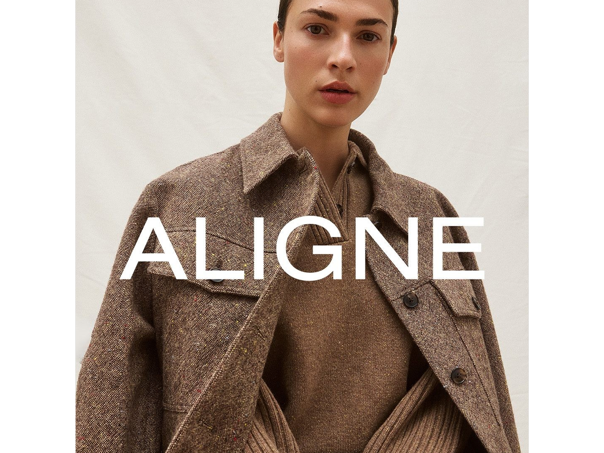
ALIGNE Women going places

AUDREY'S Something a little bit extraordinary
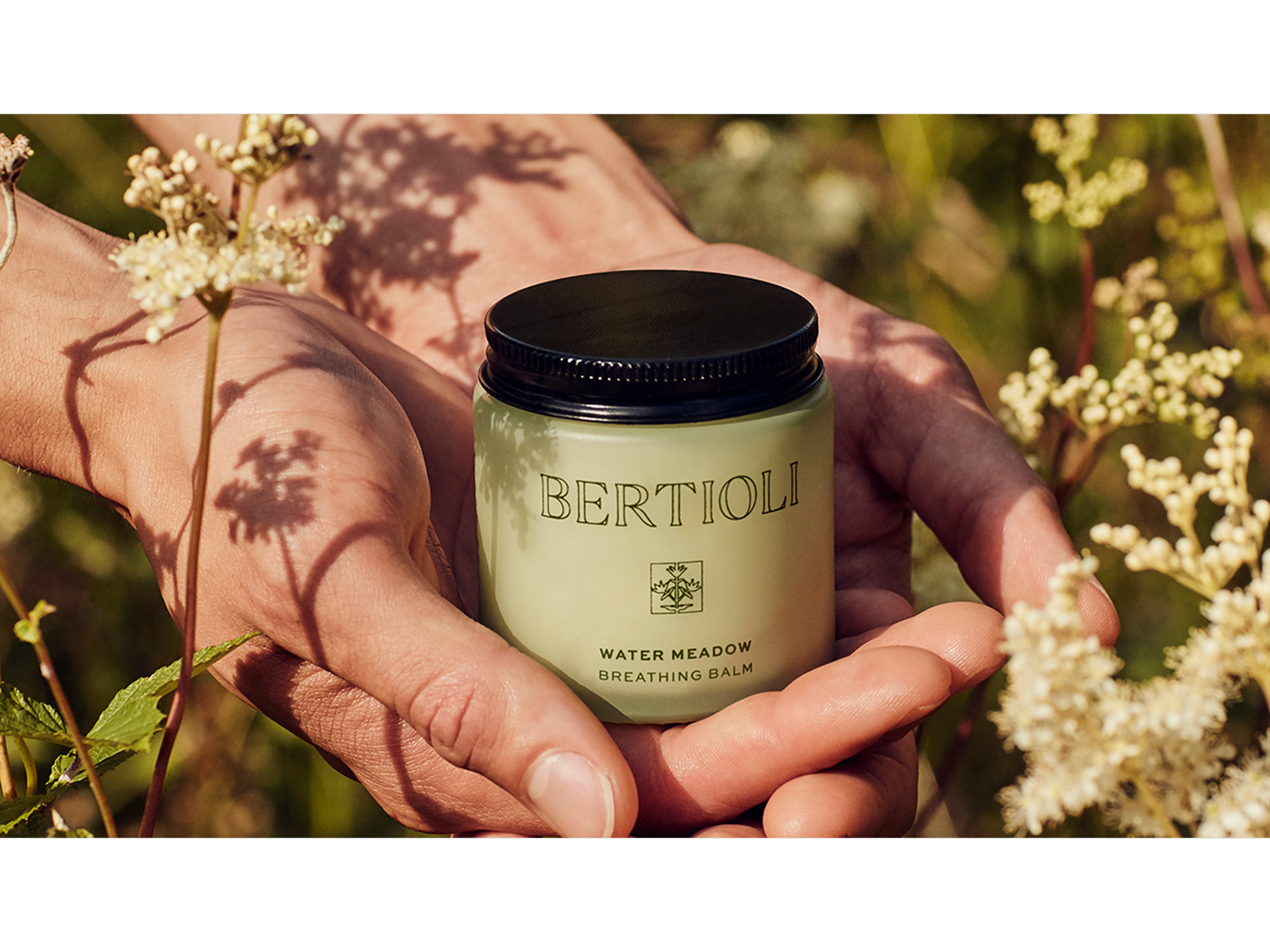
BERTIOLI The nature of beauty
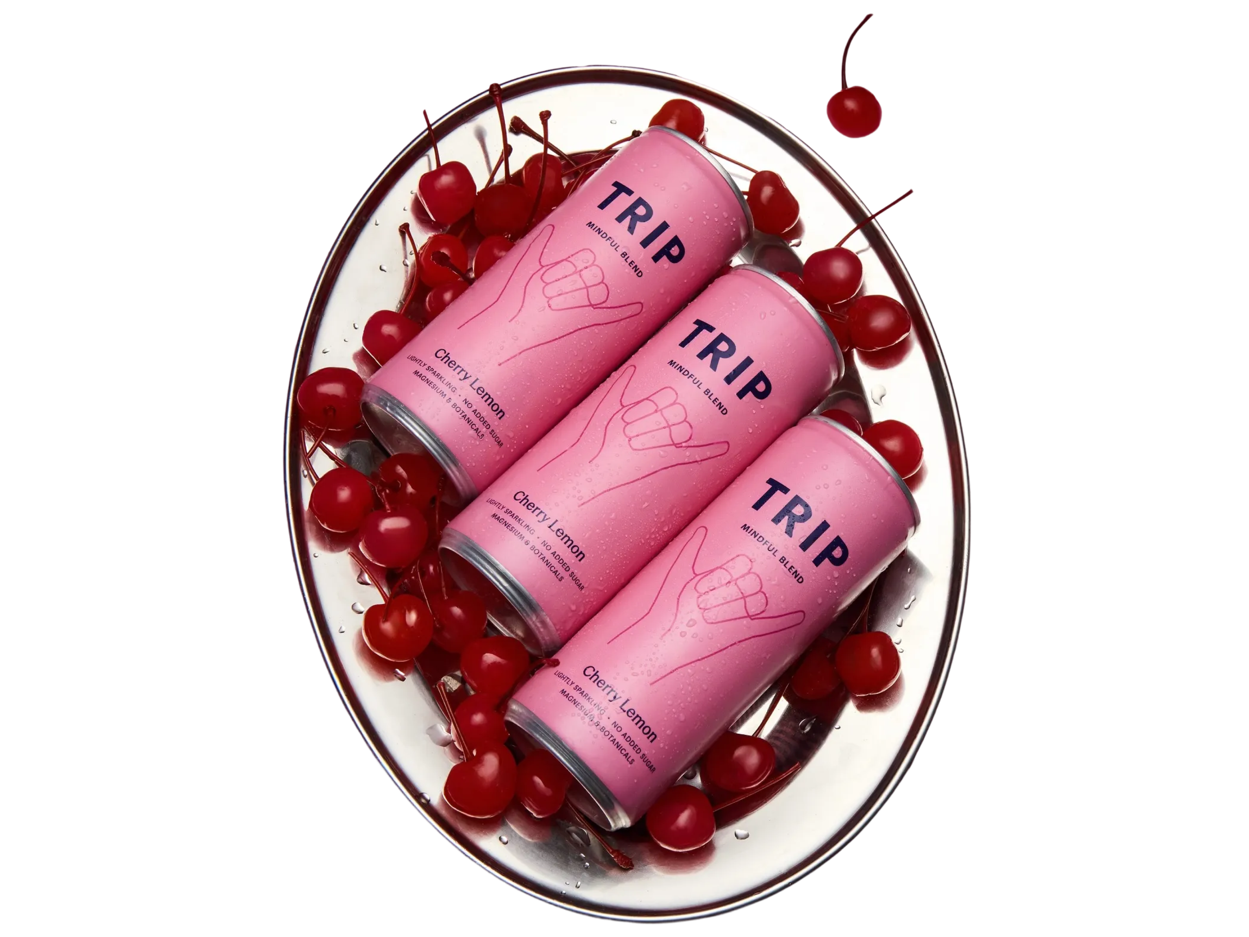
TRIP Take a Trip to find your calm