
Picoso
For each and every spirit
[2024]
Services
Press
Brand Strategy
Brand Narrative
Visual Identity
Illustration
Art Direction & Production
Website Design


[01] The Collider logotype is a modern sans serif, kept simple for clarity and form. At its centre sits a spark motif that signals collision: a nod to the meeting of social and science, while also suggesting a burst of energy; an uplifting moment; a boost in mood.

The finished brand gives Picoso a bold, ownable platform as it launches in London; one that feels as at home in a bar as it does in a sunlit park, at dinner or on a dancefloor. It is an invitation to turn up the heat, try something different and raise a glass to every kind of spirit. Picoso follows Duzi’s approach of building brands through close collaboration, using a distinct story and visual world rather than simply positioning a product within an existing category.
Picoso was inspired by a simple shared belief: that a drink without alcohol should never mean a drink without character. Inspired by experiences of life in Madrid and Mexico, Picoso came to Duzi with the clear ambition to create a soda that could bring heat, depth and a little more occasion to every glass.

[ 01 / 12 ]

[ 02 / 12 ]

[ 03 / 12 ]

[ 04 / 12 ]

[ 05 / 12 ]

[ 06 / 12 ]

[ 07 / 12 ]

[ 08 / 12 ]

[ 09 / 12 ]

[ 10 / 12 ]

[ 11 / 12 ]

[ 12 / 12 ]


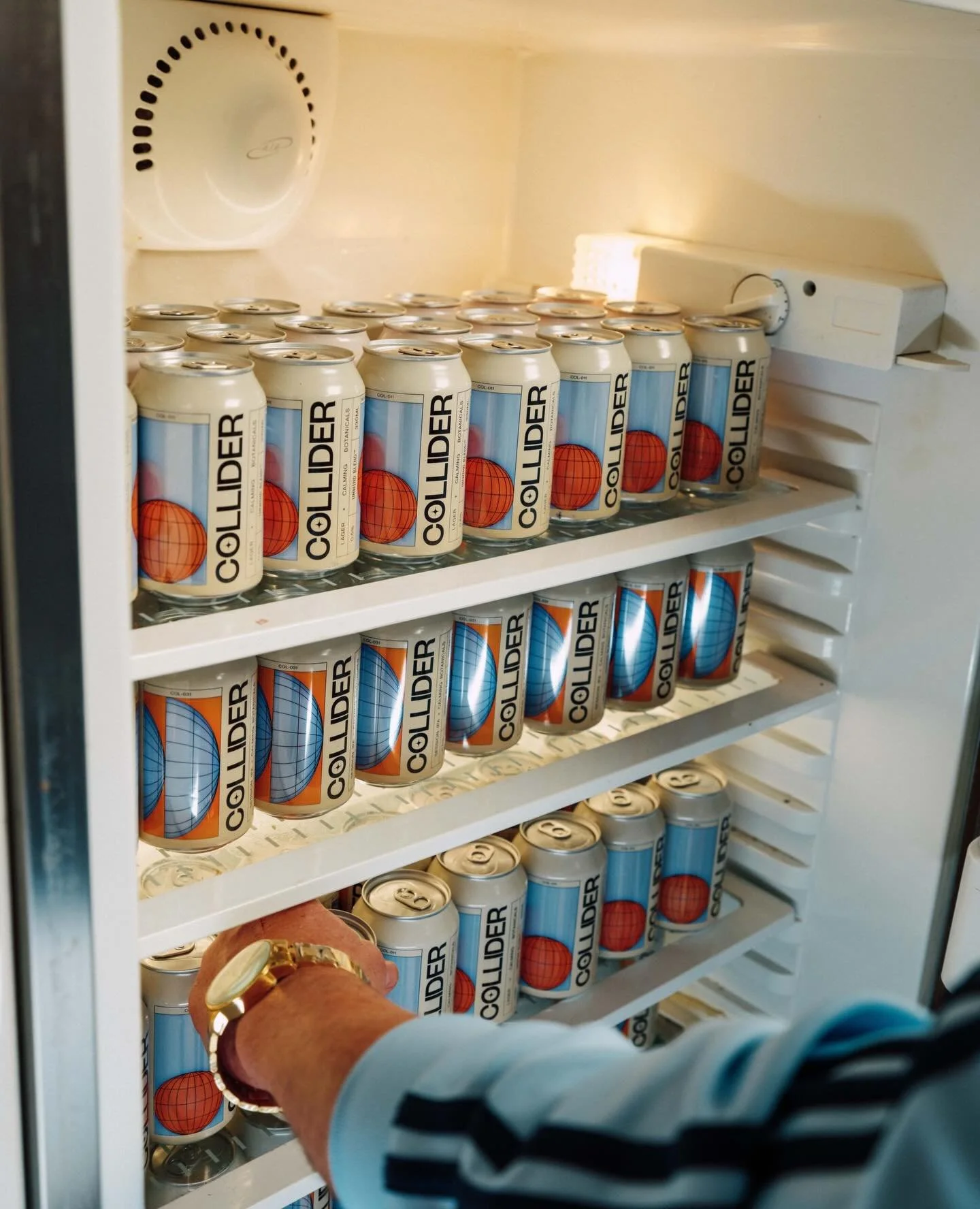
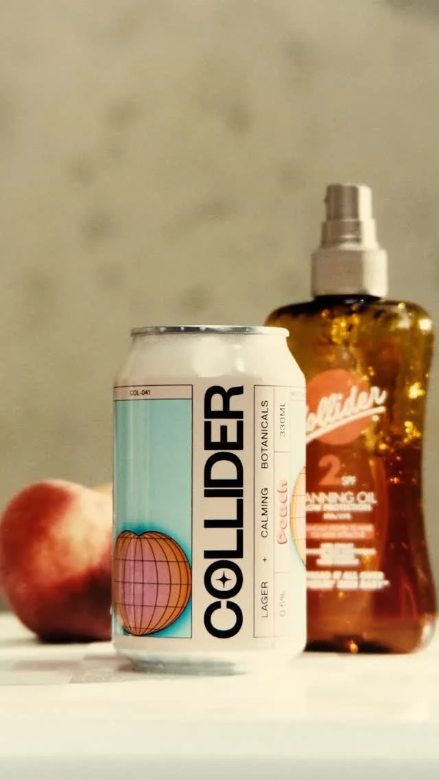
[03] The packaging design extends the same logic across can and bottle formats, using a structured grid to hold the system together. It creates consistency across expressions while allowing each variant to carry its own sense of momentum and visual rhythm.

[ 01 / 08 ]

[ 02 / 08 ]

[ 03 / 08 ]

[ 04 / 08 ]

[ 05 / 08 ]

[ 06 / 08 ]

[ 07 / 08 ]

[ 08 / 08 ]
Building a world with heat
From brand strategy and narrative through to identity, packaging and digital, this was a partnership built through conversation. We worked alongside the founders to shape not just how Picoso looks, but what it stands for: a more inclusive drinking culture where everyone has a place at the table.
We built the brand around the feeling behind the flavour. Bright fruit foundations are layered with carefully chosen chillies, creating a crisp, complex kick that builds rather than overwhelms. It is a drink that wakes the palate.
Shared over long dinners, spontaneous plans, crowded tables and the energy that happens when people come together. The identity needed to capture this sense of warmth and connection, while giving Picoso the presence and edge to sit confidently among premium alcoholic and non-alcoholic drinks.


“I've worked with a number of brand design and creative agencies in my time and Duzi were the best.”
-
“I've worked with a number of brand design/creative agencies in my time and Duzi were the best. They get the right balance between incorporating founder feedback into their designs but also pushing back when they feel it is necessary, without being dogmatic. Most, importantly though, their work just looks cool.”
Harry Cooke, Founder:


[02] The Final Frontier for Beer.
Made to hold it’s own
Rather than borrowing the visual codes true of the category, we created a world of Picoso’s own. A bespoke logotype brings a sense of confidence and character, while custom typography, angular illustration and vivid colour work together to create movement, tension and heat.
Every element was designed to hold the same duality as the drink itself: considered but playful; sophisticated but never serious. Layered typography adds depth to the packaging, while the distinctive illustration system gives each can its own energy.
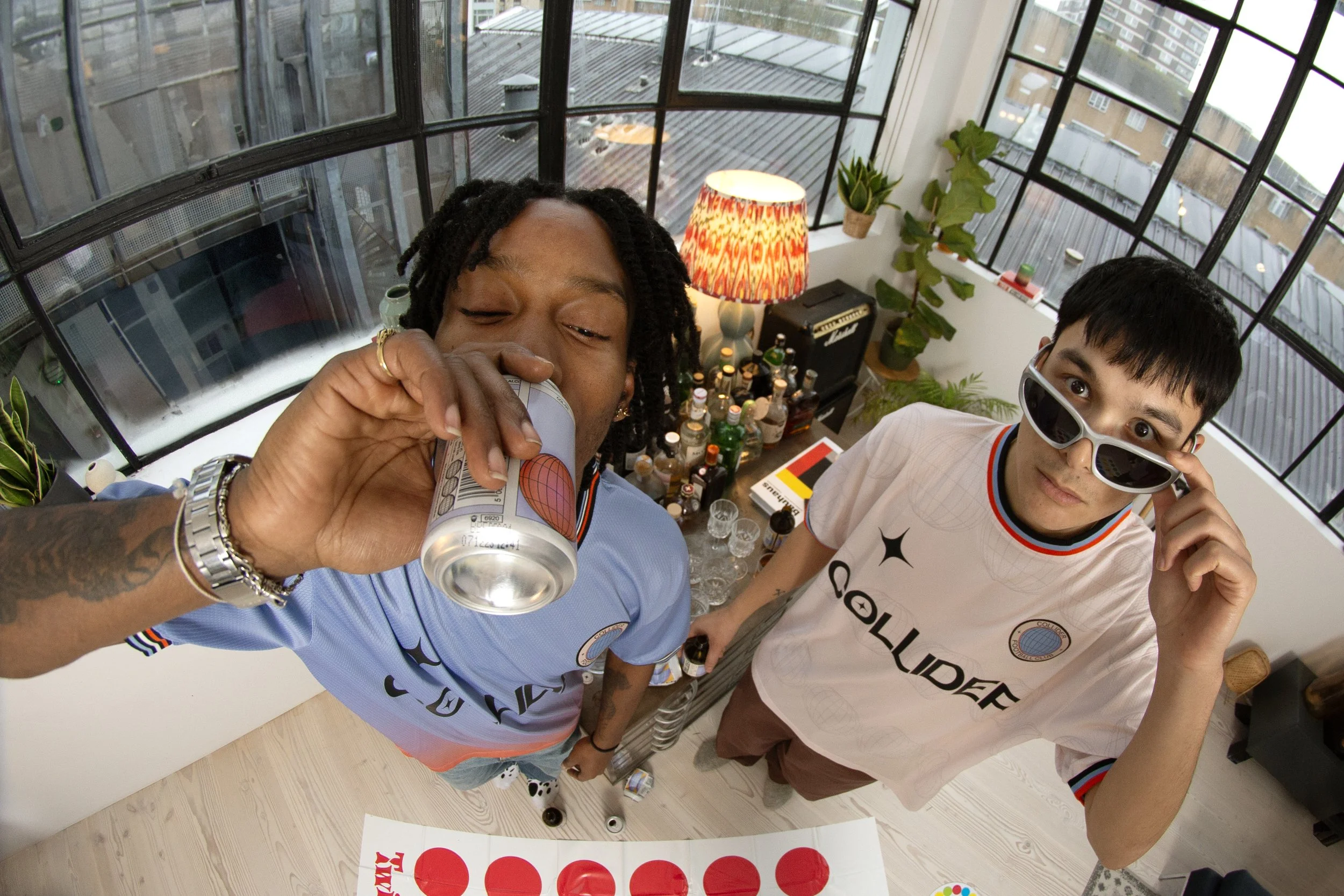
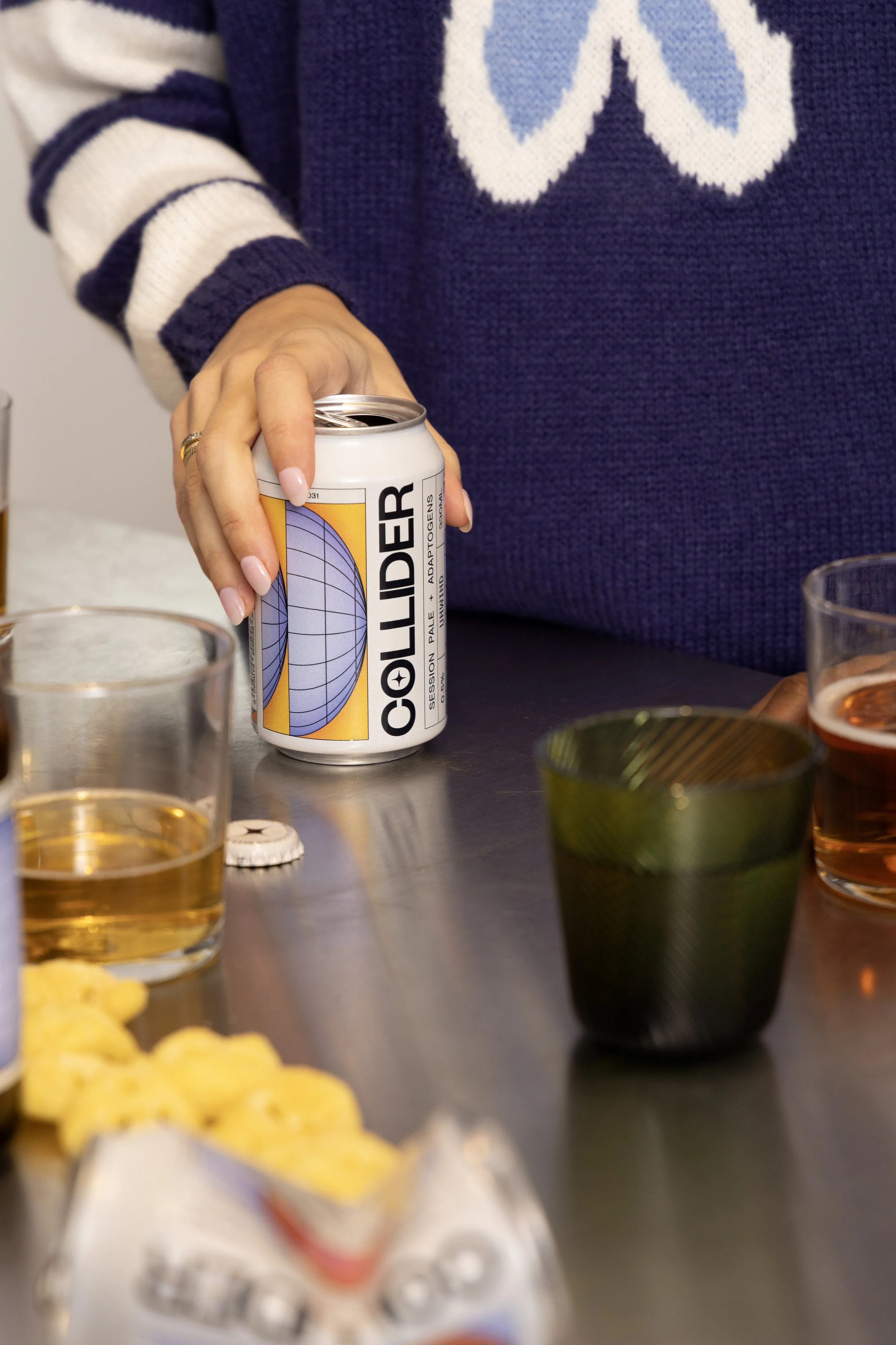
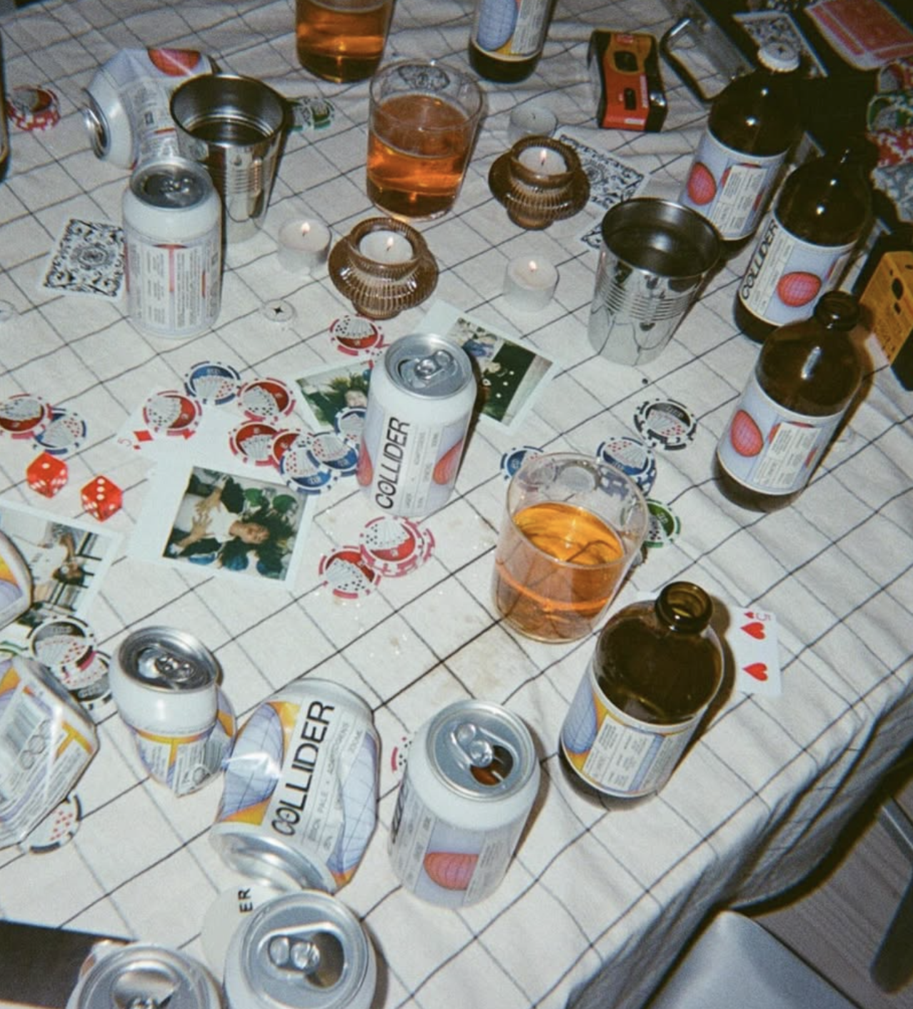
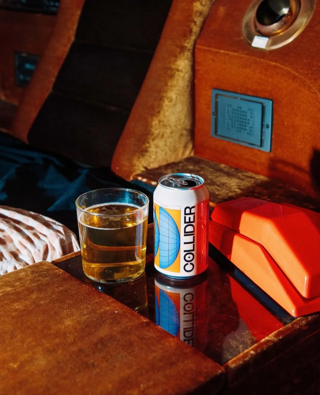
[04] The brand’s art direction builds a world that feels social, playful and always just a little out of this world. Energetic photography and mood-boosting environments give the brand its lift, turning Collider into something that feels as alive in content as it does on shelf.

[01 / 10]

[02 / 10]

[03 / 10]

[04 / 10]

[05 / 10]

[06 / 10]

[07 / 10]

[08 / 10]

[09 / 10]

[10 / 10]
The Picoso

Scroll to discover the brand in action today >
ALIGNE Women going places
AUDREY'S Something a little bit extraordinary
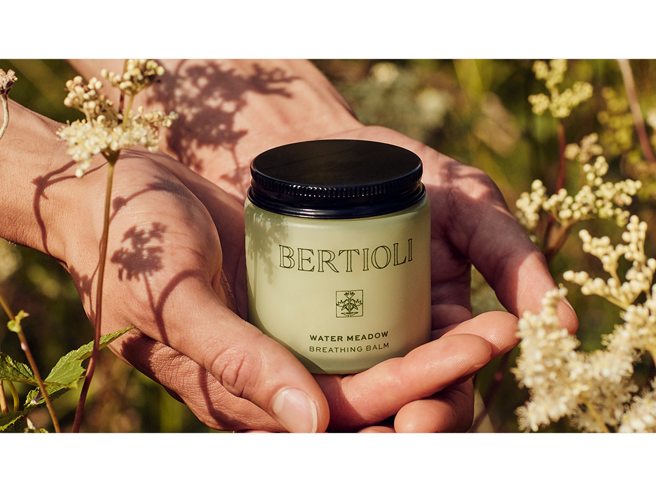
BERTIOLI The nature of beauty
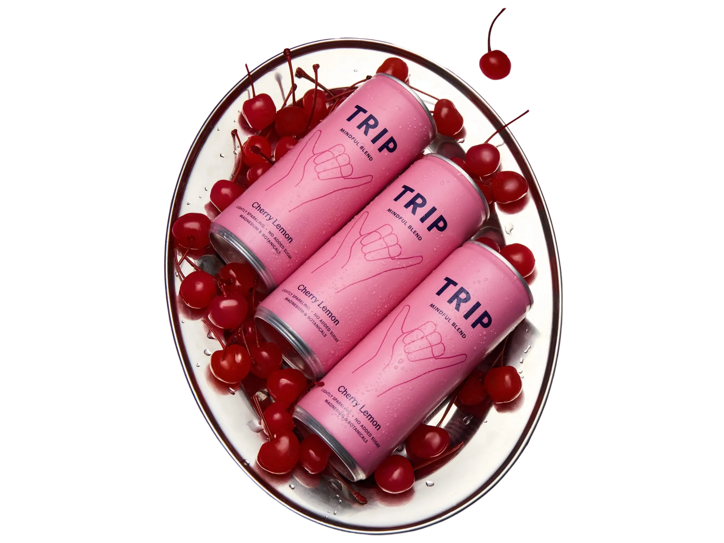
TRIP Take a Trip to find your calm