
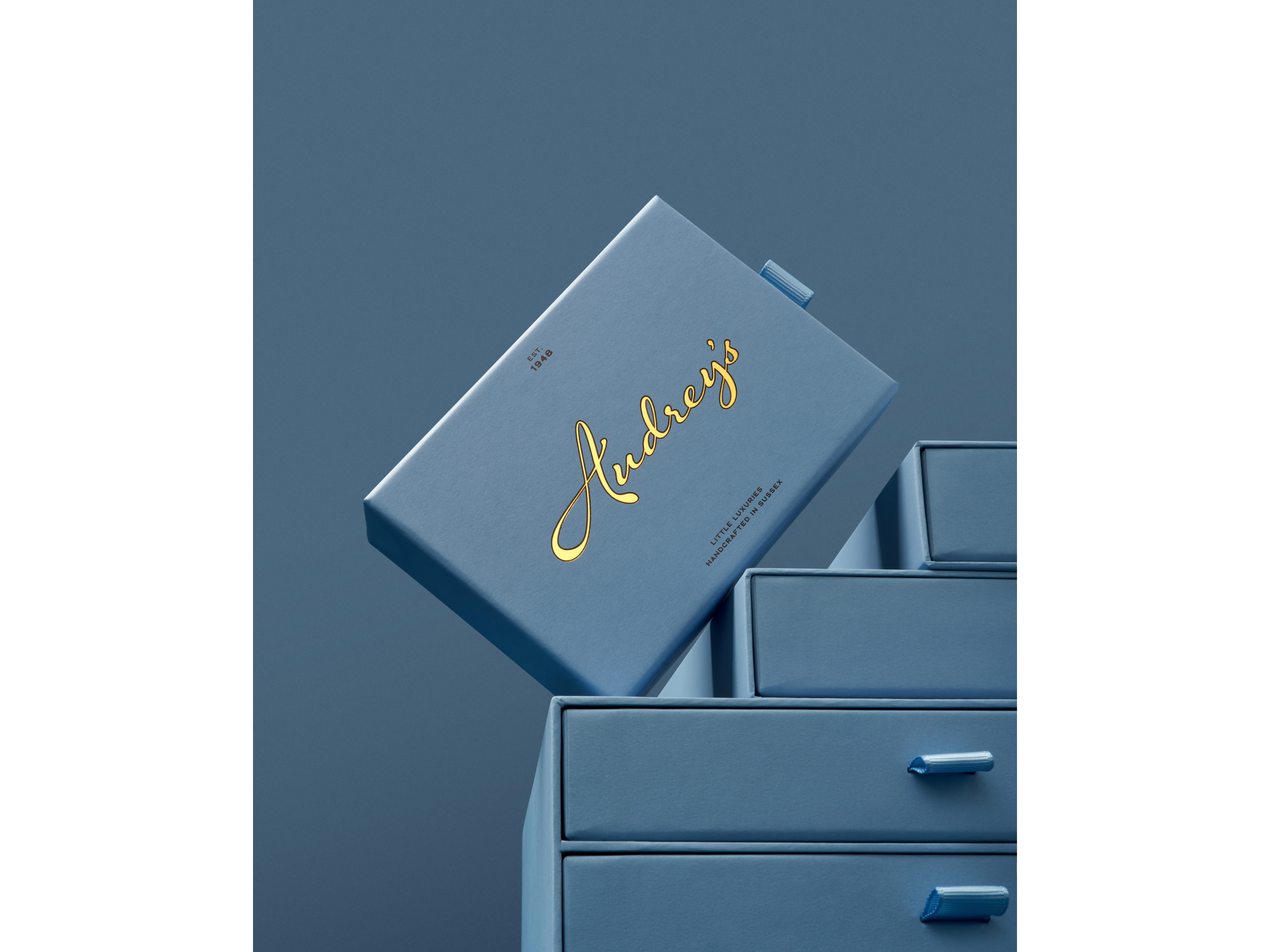
Audrey’s
Something a little bit extraordinary
[2025]
Services
Brand Strategy, Brand Narrative, Visual Identity, Packaging Design, Artworking, Art Direction & Photography
The Brand Identity
The Telegraph
The Times
Press
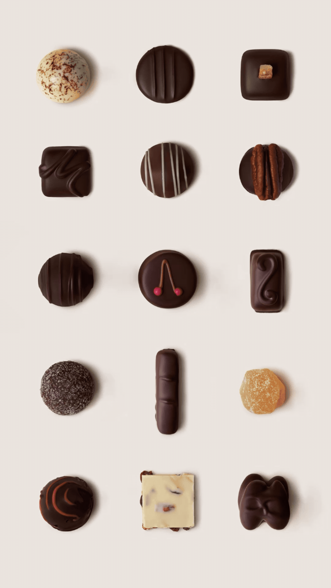
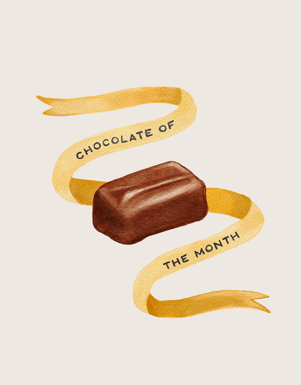
[01] Inspired by the heritage brand, we handcrafted Audrey’s new logotype to feel modern and fluid, with indulgent letterforms that echo the drizzled chocolate famously used to decorate the brand’s chocolate fondants. Each letter lovingly handmade much like the product.
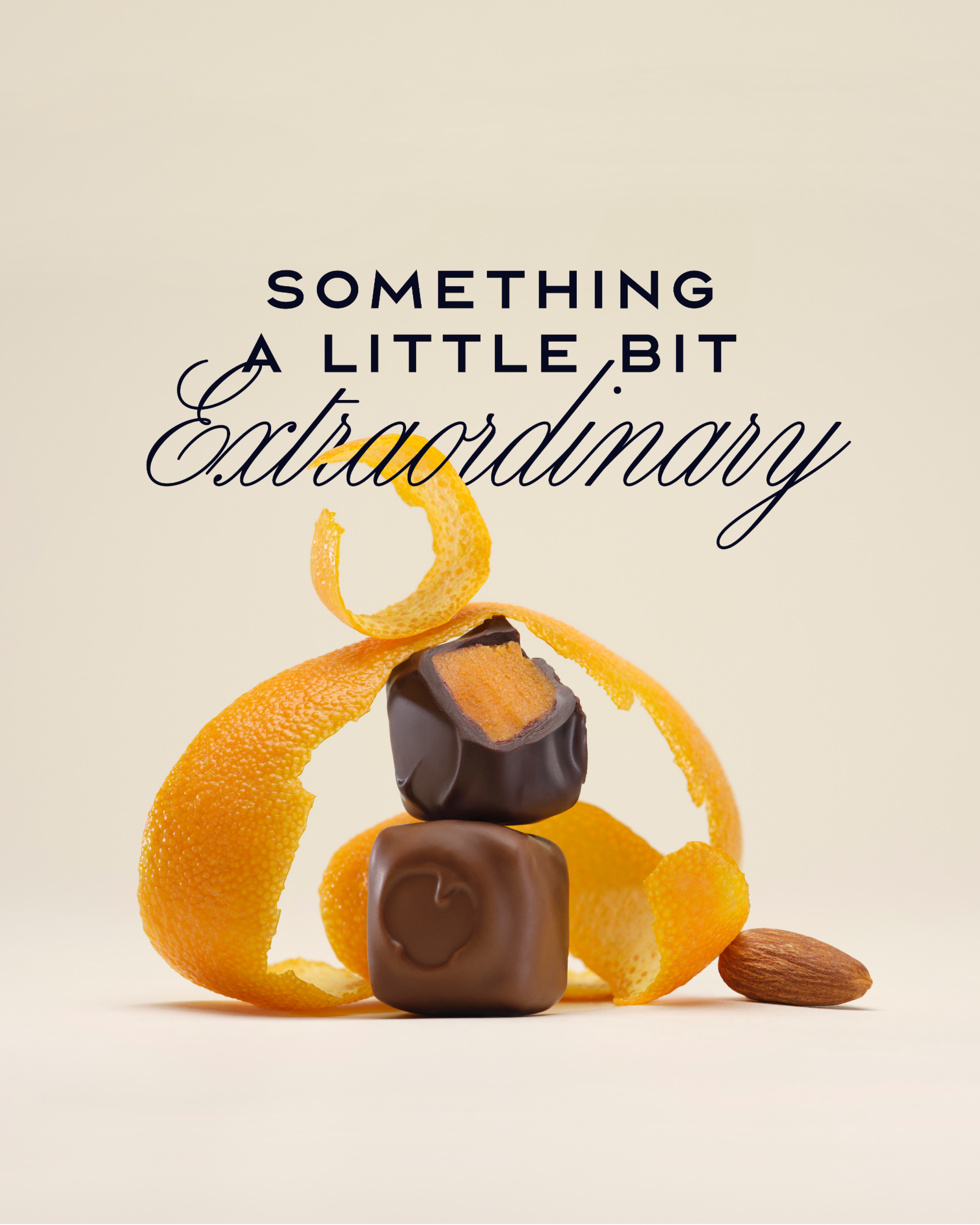
[02] Art direction is what brings a brand’s story to life. For Audrey's, we defined a photographic vision rooted in wonder. Each still life composition balances time-honoured craft with contemporary flair, capturing the essence of the brand and translating their narrative into an ownable visual language.
[03] Handcrafted in Sussex since 1948, Audrey’s was founded by master chocolatier William Pain, who infused every creation with care and tradition. Today, Audrey’s invites chocolate lovers to discover a world where heritage meets modern magic.
Audrey’s is the story of a Sussex-born business that was formed thoughtfully, by hand, over decades; a world that you discover, not a product you are sold. The starting point of this collaboration wasn’t to reinvent the brand, but to help Audrey’s feel more like itself: to let the craftsmanship, the quirks and the years of quiet, diligent work sit proudly in the light.
Working closely with the team, it was clear that this rebrand was less about prioritising a ‘luxury’ product, and more about framing chocolate as a memorable gesture; the box you remember giving, the bar you take time to unwrap, the little indulgence that feels earned and generous; the kind of chocolate that shows up as a small gift, but that leaves a lasting impression.
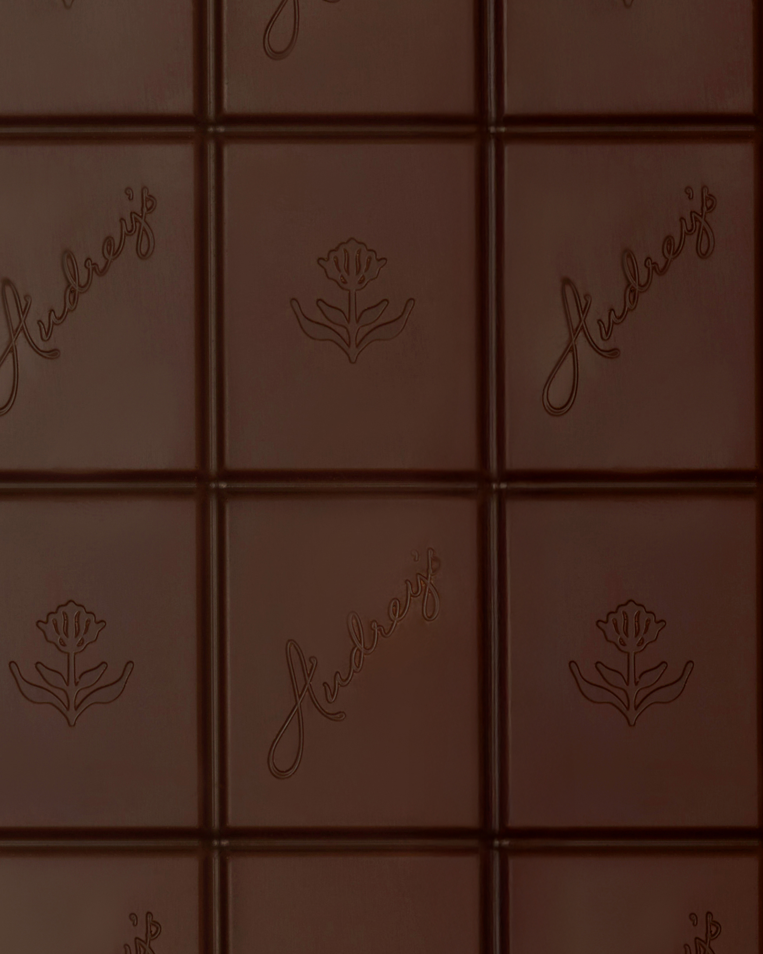
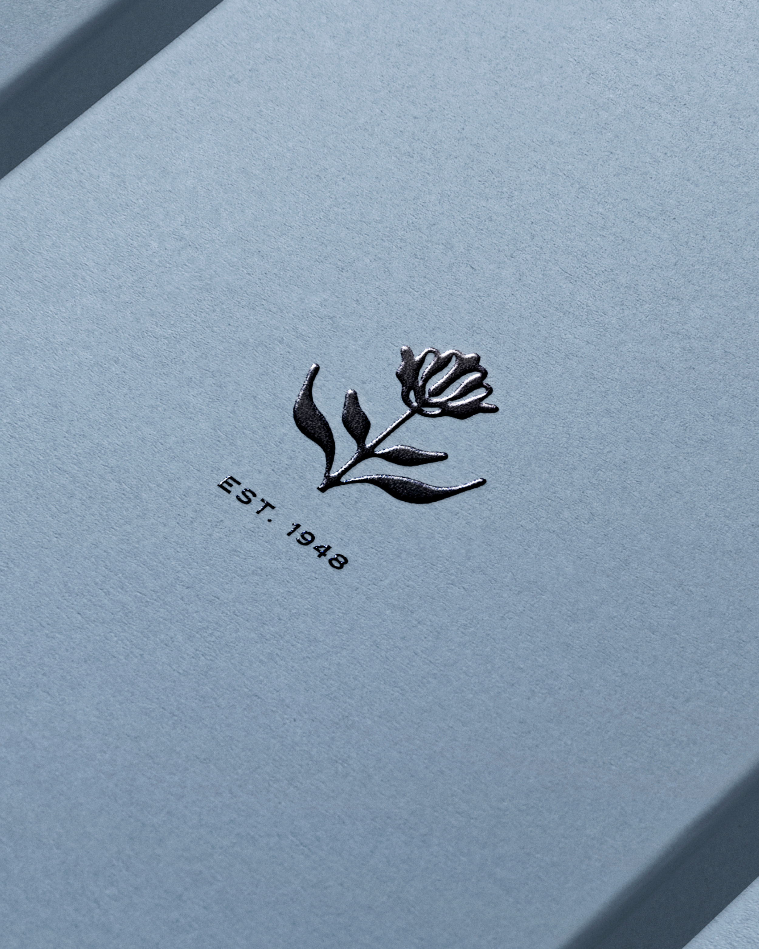
Complementing the bespoke logotype is the Audrey’s signature mark; a roundheaded rampion, the native flower of Sussex. The symbol roots the brand in place of whimsical natural beauty.
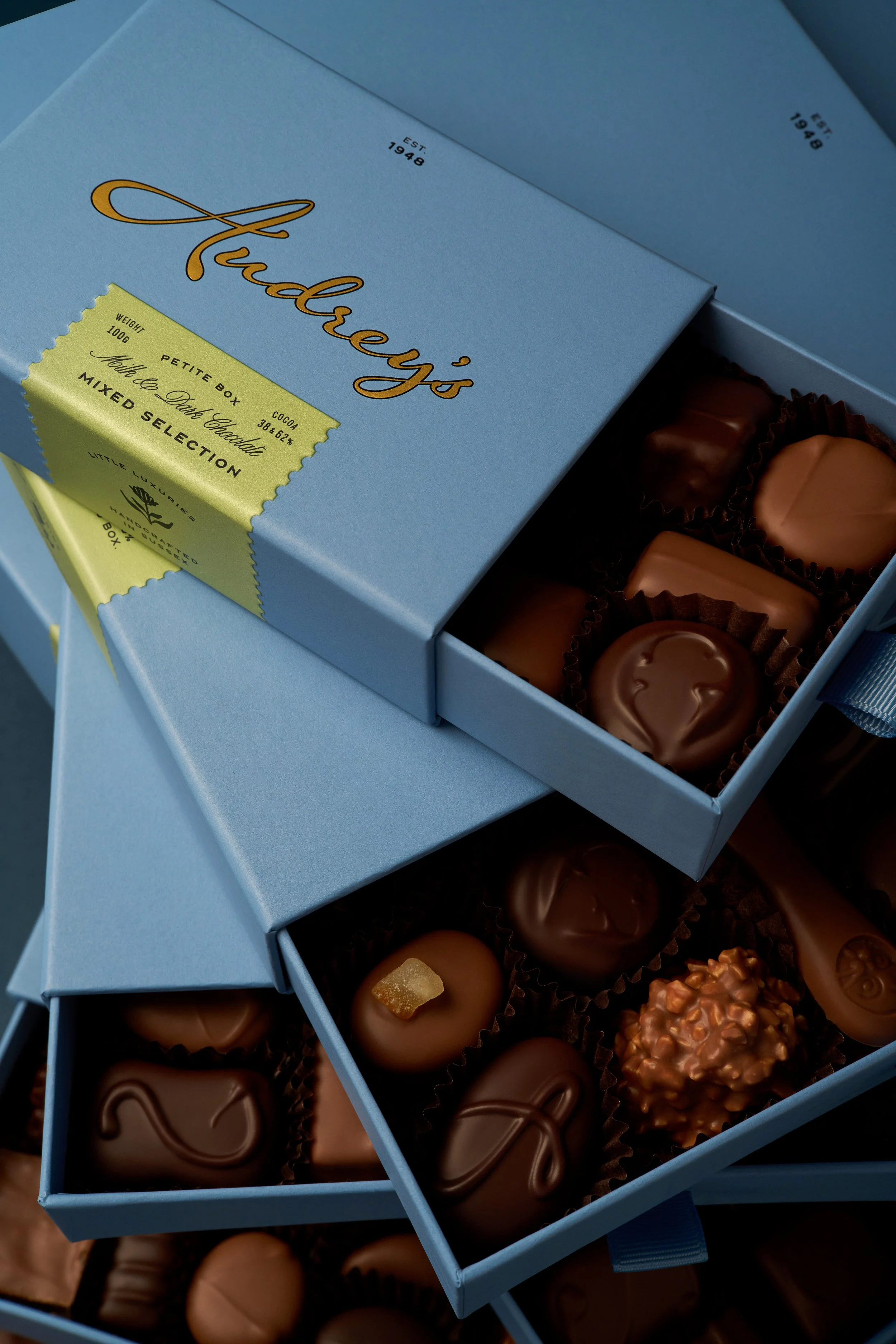
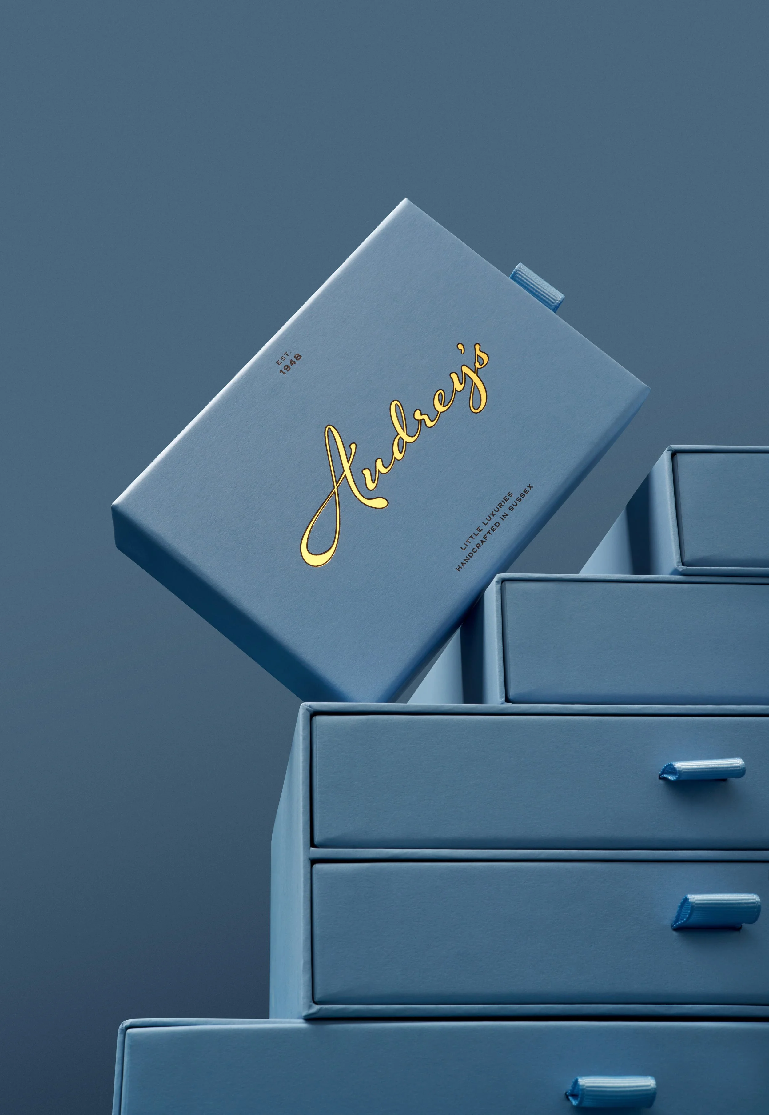
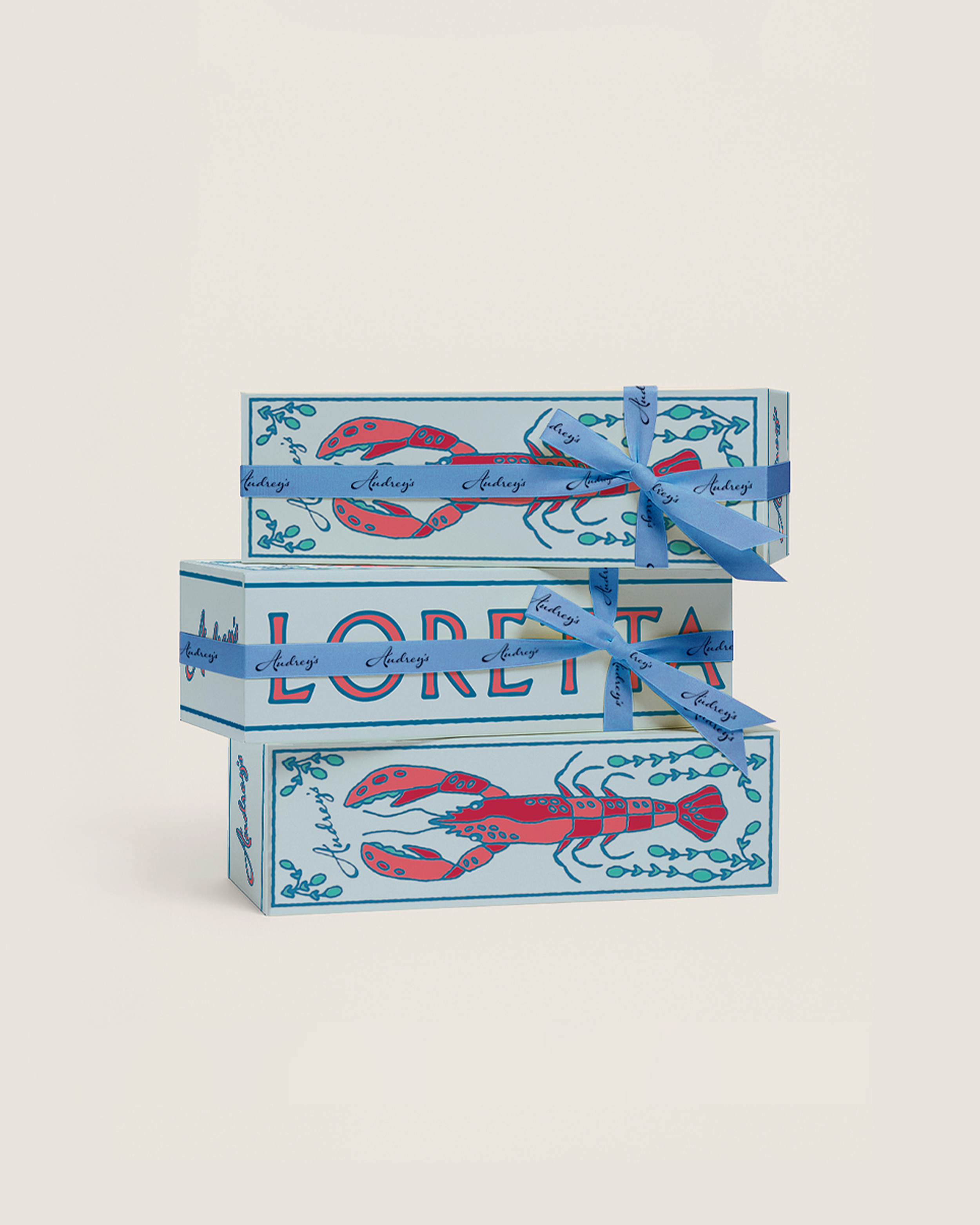
The rebrand transforms each box into a sensory experience to be savoured and shared, from the signature blue paper to the aroma of rich cocoa, ensuring that every unwrapping is filled with anticipation and delight.
![[1 / 10]](https://images.squarespace-cdn.com/content/v1/697bcd1af89ab47bd0161ef5/28000285-2103-46c2-9a98-1415b21944b9/Wrapped+Boxes+Stacked_480+copy.jpg)
[1 / 10]
![[2 / 10]](https://images.squarespace-cdn.com/content/v1/697bcd1af89ab47bd0161ef5/d221b973-c366-4000-87de-7b9228db9fb3/07_Celebration+of+Timeless+Craftsmanship.png)
[2 / 10]
![[3 / 10]](https://images.squarespace-cdn.com/content/v1/697bcd1af89ab47bd0161ef5/3afc5ced-b005-4a7a-bddc-bd41c6dd644a/08_Beca+Jones.png)
[3 / 10]
![[4 / 10]](https://images.squarespace-cdn.com/content/v1/697bcd1af89ab47bd0161ef5/b31797cb-e372-42ae-9708-a72941d76bc0/09_Marina+Fresh+Angle.png)
[4 / 10]
![[5 / 10]](https://images.squarespace-cdn.com/content/v1/697bcd1af89ab47bd0161ef5/efb93551-9a31-4894-b3db-b5c25d0af7e8/04_Rikki+Ward.png)
[5 / 10]
![[6 / 10]](https://images.squarespace-cdn.com/content/v1/697bcd1af89ab47bd0161ef5/0559beba-32ed-47ae-80cd-27bba2f7c211/Audrey%27s+Handcrafted+Milk+Collection+Queen_108.jpg)
[6 / 10]
![[7 / 10]](https://images.squarespace-cdn.com/content/v1/697bcd1af89ab47bd0161ef5/4357e4b4-9771-4c32-bf99-dcdac5ae1da6/17_Rikki+Ward.png)
[7 / 10]
![[8 / 10]](https://images.squarespace-cdn.com/content/v1/697bcd1af89ab47bd0161ef5/ff4114f5-65f3-4a5f-8492-78802d823ceb/Wrapped+Box_242.jpg)
[8 / 10]
![[9 / 10]](https://images.squarespace-cdn.com/content/v1/697bcd1af89ab47bd0161ef5/92eadbc6-d2b6-4d79-92aa-07839289c5d7/16_Beca+Jones+Process.png)
[9 / 10]
![[10 / 10]](https://images.squarespace-cdn.com/content/v1/697bcd1af89ab47bd0161ef5/be8bcc63-e418-435d-b753-6a463e5b0e9a/Milk+Salted+_271.jpg)
[10 / 10]
The Gift You’ll Never Forget
The new look and feel positions Audrey’s as both a treat and a keepsake. Throughout the identity, colour, illustration and typography are treated as part of the Audrey’s recipe: they don’t simply dress up the chocolate, they carefully reflect the way it’s made and how it makes people feel.
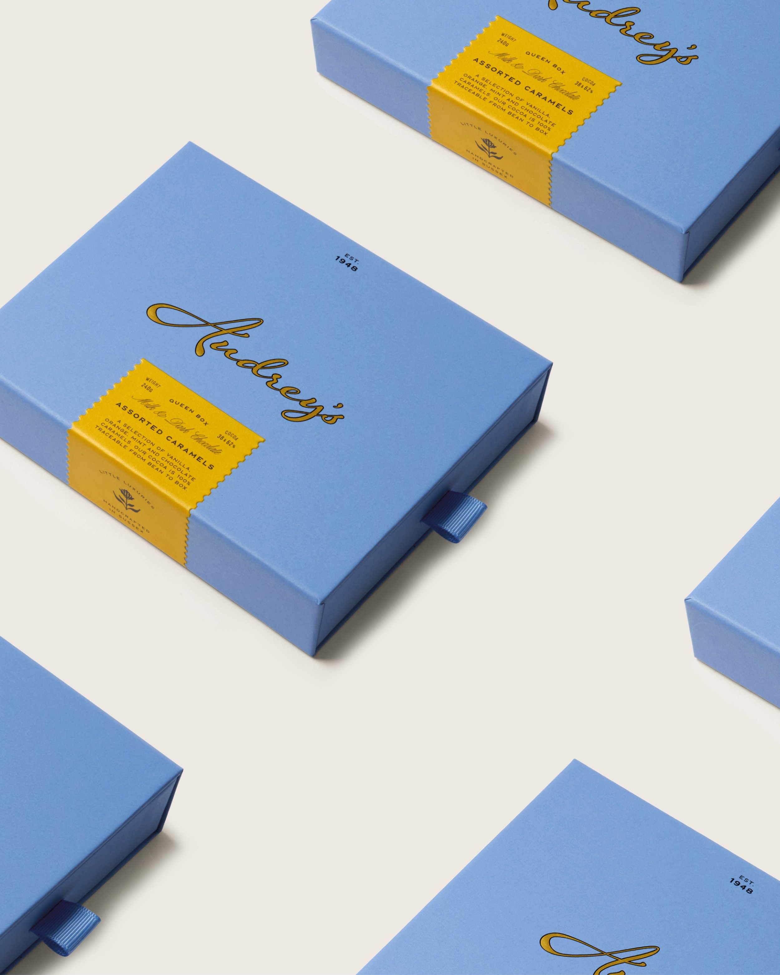
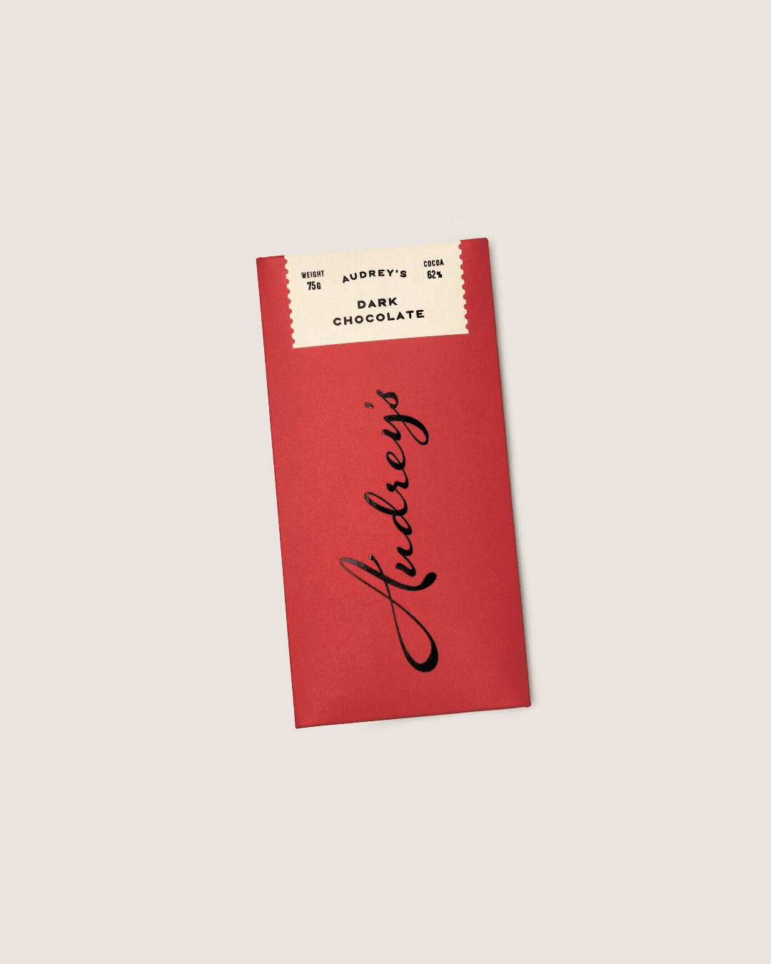
The bespoke logotype elevates the original mark into something more fluid and modern, with indulgent letterforms that echo the drizzled chocolate famously used to decorate the brand’s chocolate fondants, while the packaging is anchored by a crisp, memorable blue that nods to the brand’s coastal roots.
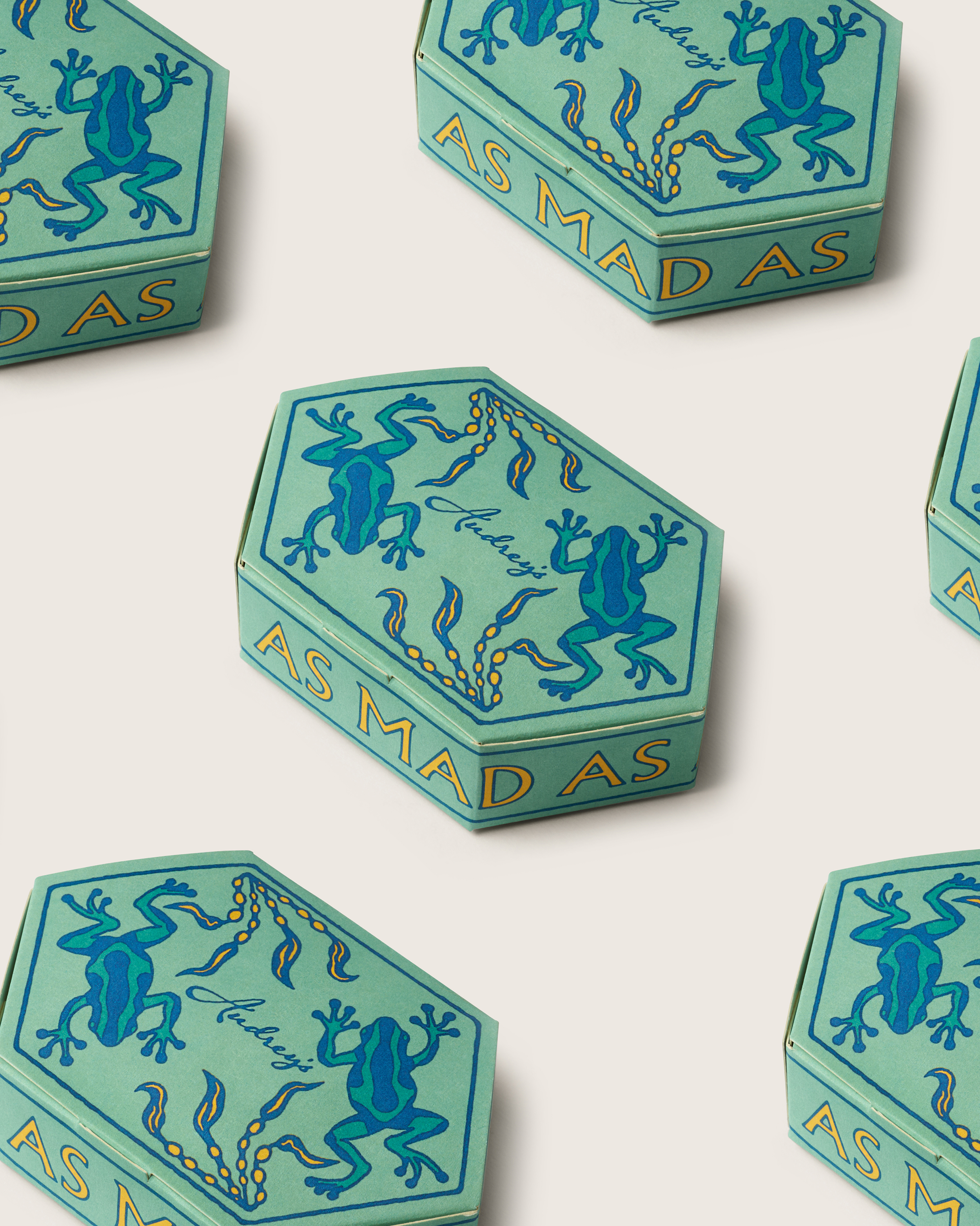
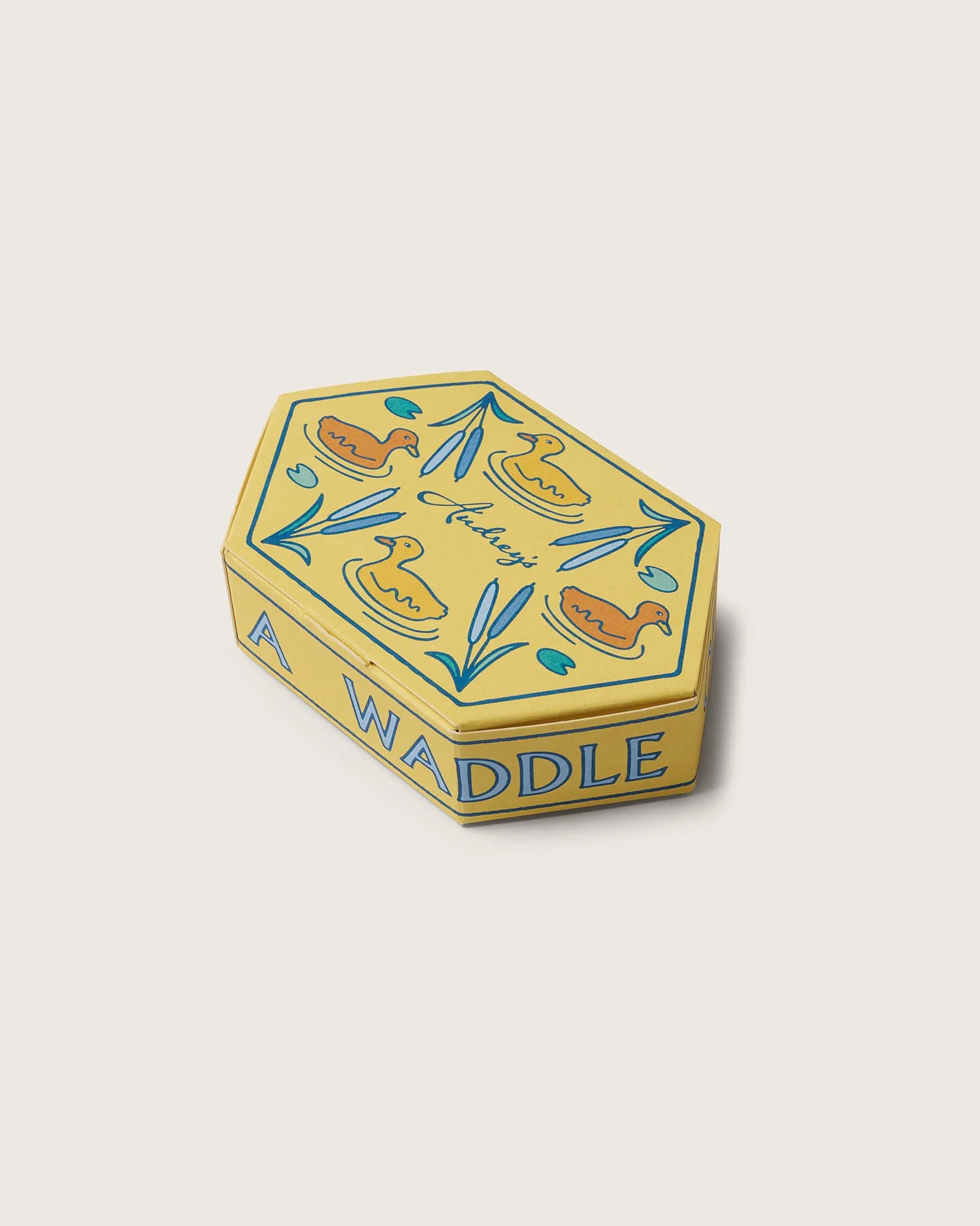
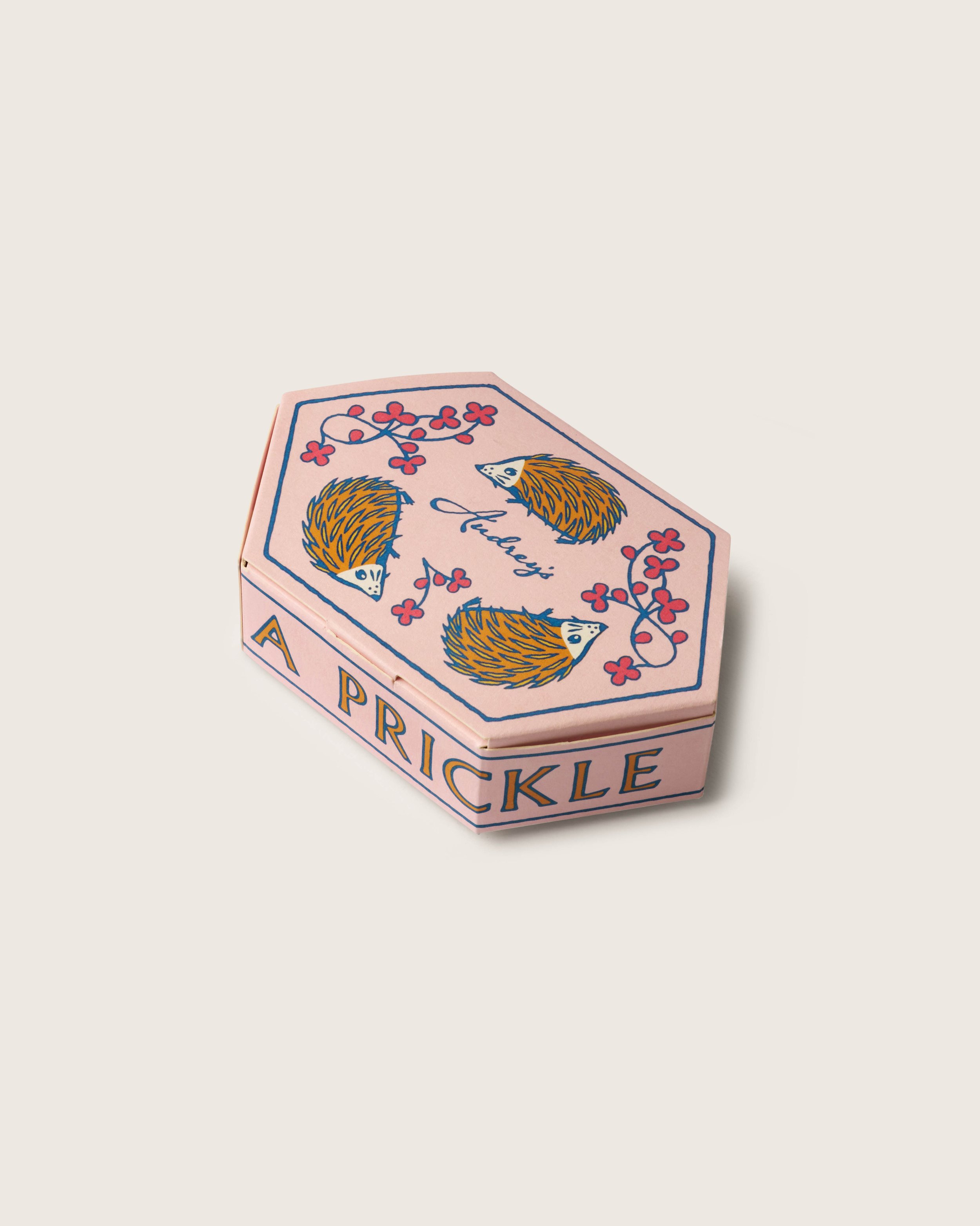
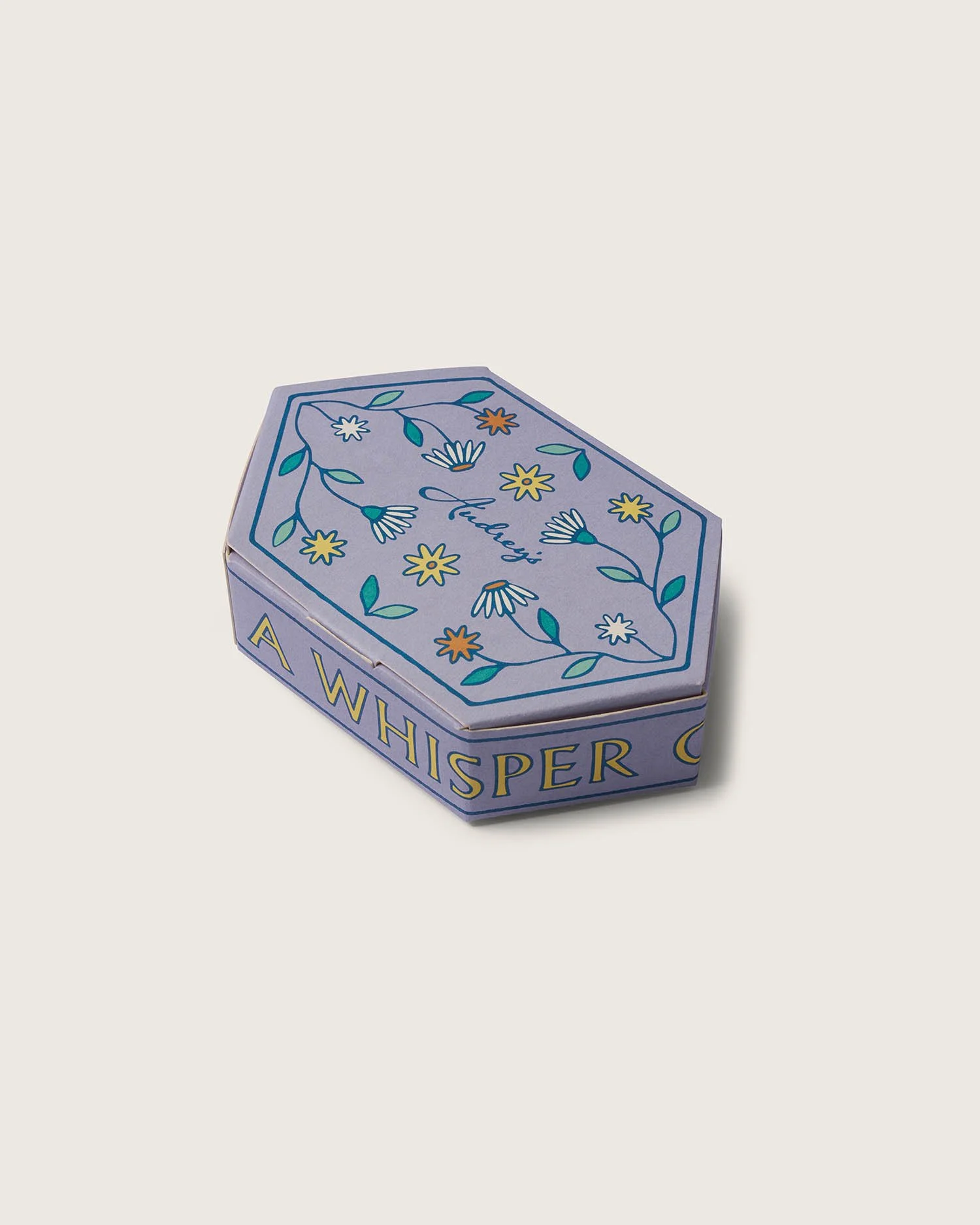
Our collaboration with Audrey's was built on a mutual respect for artistry, a love of storytelling, and a belief that luxury should always come with a wink of delight. The result: a collection of novelty packaging where each illustrated box brings its own narrative to life; from collective nouns to vibrant patterns that make the gifting experience both playful and premium.
Across the product range, we developed a colour-coded product matrix that helps shoppers navigate chocolate type and flavour at a glance, turning the packaging into an intuitive wayfinding system.
DESIGN details
Imagination takes the lead in the packaging design, showcasing Audrey’s joyful personality. Every box is peppered with playful illustrations and enchanting typography, each telling a story that echoes the little luxuries inside. The result is a suite of products that hold their own on the shelf, spark curiosity and turn every unboxing into a multi-sensory moment of delight.
XXX
lorem ipsum
lorem
XXX
lorem ipsum
lorem
XXX
lorem ipsum
lorem
XXX
lorem ipsum
lorem
XXX
lorem ipsum
lorem
XXX
lorem ipsum
lorem
Each novelty box is wrapped in its own illustrated world. A prickle of hedgehogs. A whisper of wildflowers. A waddle of ducks. Each product transforms chocolate into collectible stories.
![[01 / 10]](https://images.squarespace-cdn.com/content/v1/697bcd1af89ab47bd0161ef5/d1995b76-03ff-4dd1-a15c-e58e8bfbdee4/English+Spring+Garden+227g+Dark_1271.jpg)
[01 / 10]
![[02 / 10]](https://images.squarespace-cdn.com/content/v1/697bcd1af89ab47bd0161ef5/618b2e47-9d4d-43ed-81f9-0661c9c5801a/Heart+Selection_364.jpg)
[02 / 10]
![[03 / 10]](https://images.squarespace-cdn.com/content/v1/697bcd1af89ab47bd0161ef5/48d5e92c-ebca-4e89-ab25-221190275d1f/19_Peggy+the+Pig.jpg)
[03 / 10]
![[04 / 10]](https://images.squarespace-cdn.com/content/v1/697bcd1af89ab47bd0161ef5/56674932-0a56-4d89-9bb5-23f42d6d72ce/22_Heart+Box+Animation.gif)
[04 / 10]
![[05 / 10]](https://images.squarespace-cdn.com/content/v1/697bcd1af89ab47bd0161ef5/1ac5d762-4cba-463c-847f-9ef90e1a8810/21_Delighful+Bites.jpg)
[05 / 10]
![[06 / 10]](https://images.squarespace-cdn.com/content/v1/697bcd1af89ab47bd0161ef5/bd734989-8a0a-46e5-acc2-5b850f9e394f/Day+Of+The+Deaa+Skulls_031.jpg)
[06 / 10]
![[07 / 10]](https://images.squarespace-cdn.com/content/v1/697bcd1af89ab47bd0161ef5/195a0287-9bd2-4747-8c97-bf1323a0c139/Milk+Chocolate+Egg+Silver+227g+%28Packed+Egg%29_310.jpg)
[07 / 10]
![[08 / 10]](https://images.squarespace-cdn.com/content/v1/697bcd1af89ab47bd0161ef5/699873d8-3305-485e-b2af-650916b65fe9/Vampire+Bear+White.jpg)
[08 / 10]
![[09 / 10]](https://images.squarespace-cdn.com/content/v1/697bcd1af89ab47bd0161ef5/cd939656-85ce-4e05-95b7-adf19ea90b51/27_Raspberry+CreamC+hocolate+Stack_Rikki+Ward_Audreys.gif)
[09 / 10]
![[10 / 10]](https://images.squarespace-cdn.com/content/v1/697bcd1af89ab47bd0161ef5/32cf99b1-cc18-4f16-9df3-4a228e52b5b7/English+Spring+Garden+454g+Milk_364.jpg)
[10 / 10]

Frame-by-frame stop motion animations became our way of showcasing Audrey's extensive range in a playful and engaging manner.
![[01 / 12]](https://images.squarespace-cdn.com/content/v1/697bcd1af89ab47bd0161ef5/f55e59b4-cbb9-4ce8-b80e-576eeb846985/01.png)
[01 / 12]
![[02 / 12]](https://images.squarespace-cdn.com/content/v1/697bcd1af89ab47bd0161ef5/45e96e31-7a53-4b43-ab74-ae9a908f1645/02.1+%281%29.png)
[02 / 12]
![[03 / 12]](https://images.squarespace-cdn.com/content/v1/697bcd1af89ab47bd0161ef5/5ef3a4a3-e2e3-47ad-ac53-96d23b08e3c3/02.2.png)
[03 / 12]
![[04 / 12]](https://images.squarespace-cdn.com/content/v1/697bcd1af89ab47bd0161ef5/566fa49b-62d0-4748-b407-c7d24d1922df/03.png)
[04 / 12]
![[05 / 12]](https://images.squarespace-cdn.com/content/v1/697bcd1af89ab47bd0161ef5/b72ae8b4-4c5c-4787-8384-0404ced948d7/04.png)
[05 / 12]
![[06 / 12]](https://images.squarespace-cdn.com/content/v1/697bcd1af89ab47bd0161ef5/b0ff197d-154f-42a3-9184-f7bb64ea81a8/05.1.png)
[06 / 12]
![[07 / 12]](https://images.squarespace-cdn.com/content/v1/697bcd1af89ab47bd0161ef5/be433fbf-ca21-4990-b5a7-cd3223873f11/05.2.png)
[07 / 12]
![[08 / 12]](https://images.squarespace-cdn.com/content/v1/697bcd1af89ab47bd0161ef5/c0ac321f-dd55-414d-8e30-1ba9cbed51d8/06.png)
[08 / 12]
![[09 / 12]](https://images.squarespace-cdn.com/content/v1/697bcd1af89ab47bd0161ef5/626bd762-dbc2-4a09-bffb-3e2b4085d1ab/07.1.png)
[09 / 12]
![10 / 12]](https://images.squarespace-cdn.com/content/v1/697bcd1af89ab47bd0161ef5/fd4d1557-06cf-4954-8f28-7c5b0851d9ef/12.jpg)
10 / 12]
![[11/ 12]](https://images.squarespace-cdn.com/content/v1/697bcd1af89ab47bd0161ef5/2edbe080-ccce-4bed-89cc-f9ed584ae126/07.2.png)
[11/ 12]
![[12 / 12]](https://images.squarespace-cdn.com/content/v1/697bcd1af89ab47bd0161ef5/988d92ed-f003-4302-87fc-fc5291e66013/05.4.png)
[12 / 12]
Taking a tactile, sensory brand into the digital space isn't just about resizing assets — it's about finding new ways to translate the physical touch of the product. For Audrey's social presence, we built frame-by-frame stop motion animations that bring energy to their product shots without losing sight of the handmade quality. The digital world moves fast, but we made sure every frame felt as considered as the chocolate inside the box.
The AUDREY’s

Scroll to discover the brand in action today >
FOOT NOTES & CREDITS
[05] Photographer Name
[06] Photographer Name
[01] Photography: Fresh Angle Studios
[04] Photographer Name
[02] Photography: Rikki Ward
[05] Photographer Name
[03] Photographer Name
[06] Photographer Name
[04] Photographer Name
ALIGNE Women going places
AUDREY'S Something a little bit extraordinary
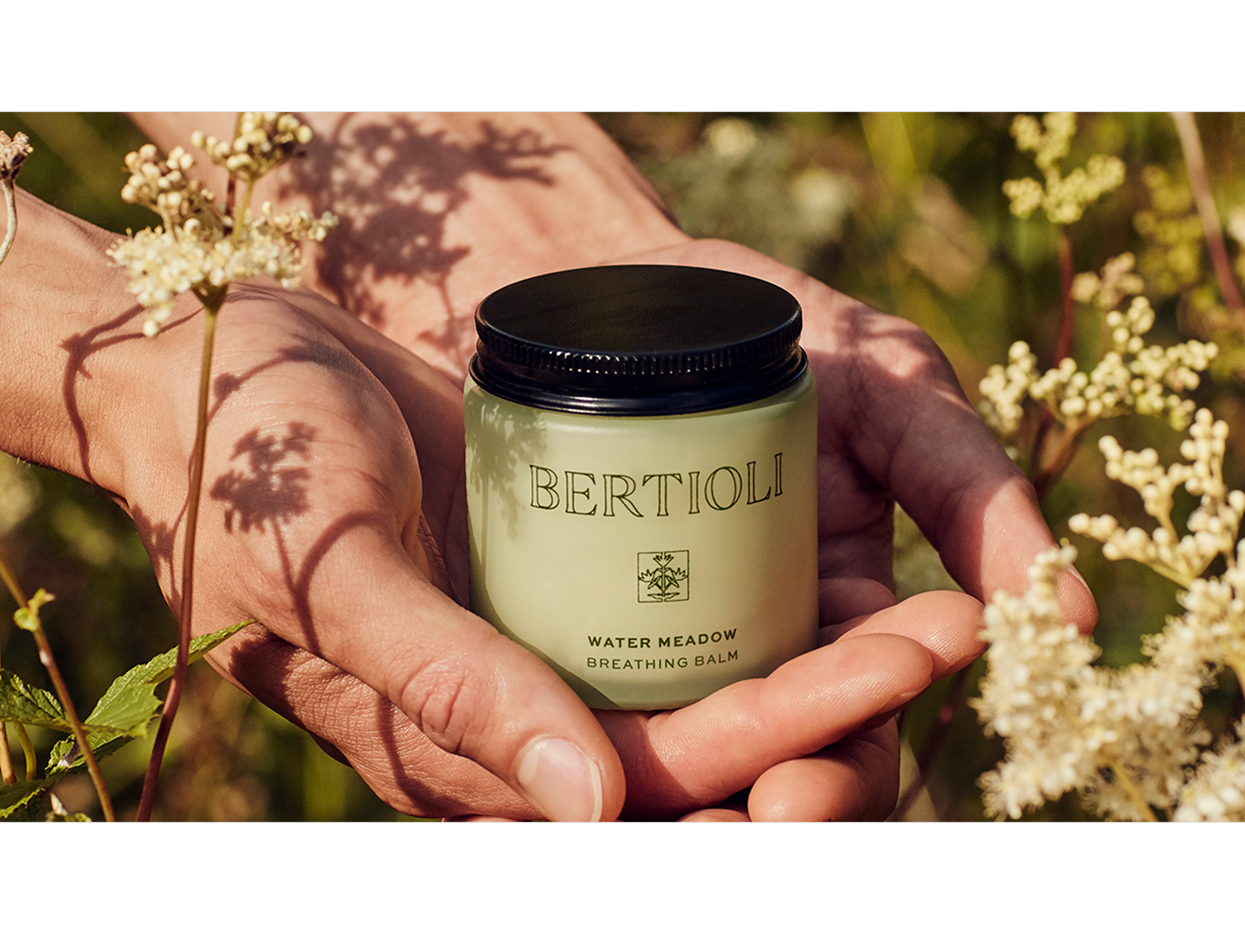
BERTIOLI The nature of beauty
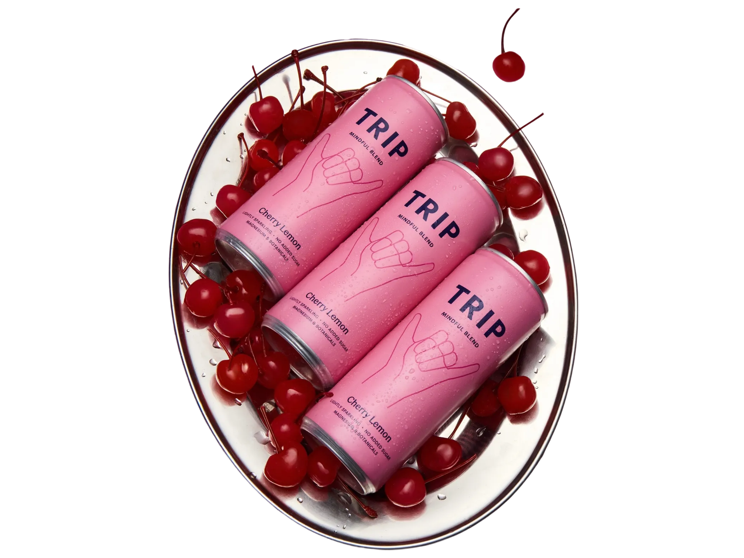
TRIP Take a Trip to find your calm