
LUCY BRONZE
Shaped by signature style
[2026]
Services
Brand Strategy, Brand Narrative, Visual Identity, Art Direction, Website Design, Social Media
The Brand Identity
The Telegraph
The Times
Press
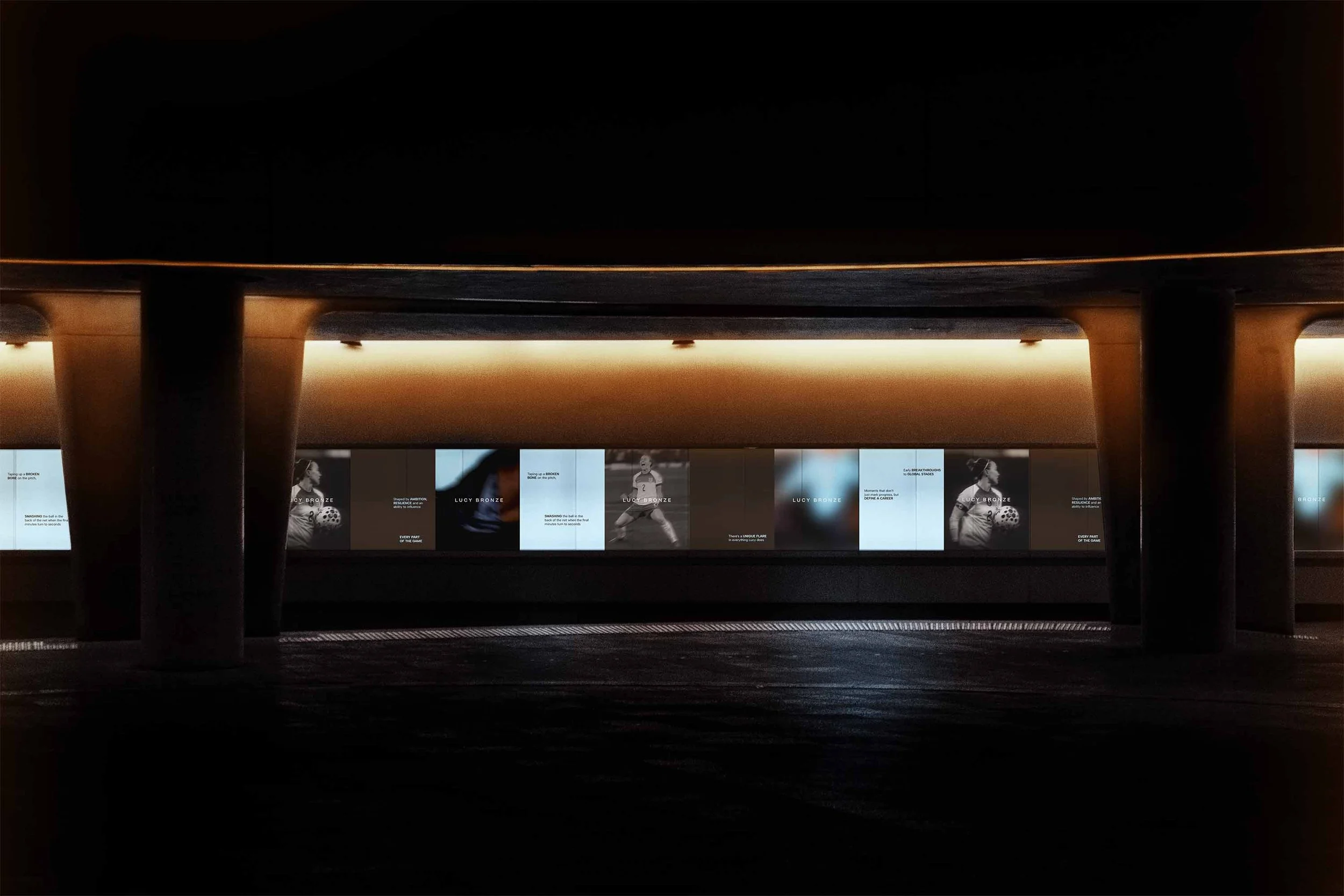
[01] Every element of Lucy’s website is designed with momentum in mind; mirroring the way Lucy Bronze plays the game. Nothing is passive. Nothing is ornamental. From the first scroll to the final interaction, the experience is alive; responsive, reactive and always pushing forward.

[02] The logo leads with confidence; a modern mark for a modern athlete. Whilst rooted in creative conceptual thinking and unique flare, the Lucy Bronze visual identity finds its power in simplicity. And a bold, stripped back logo leads the way for an identity built to last.
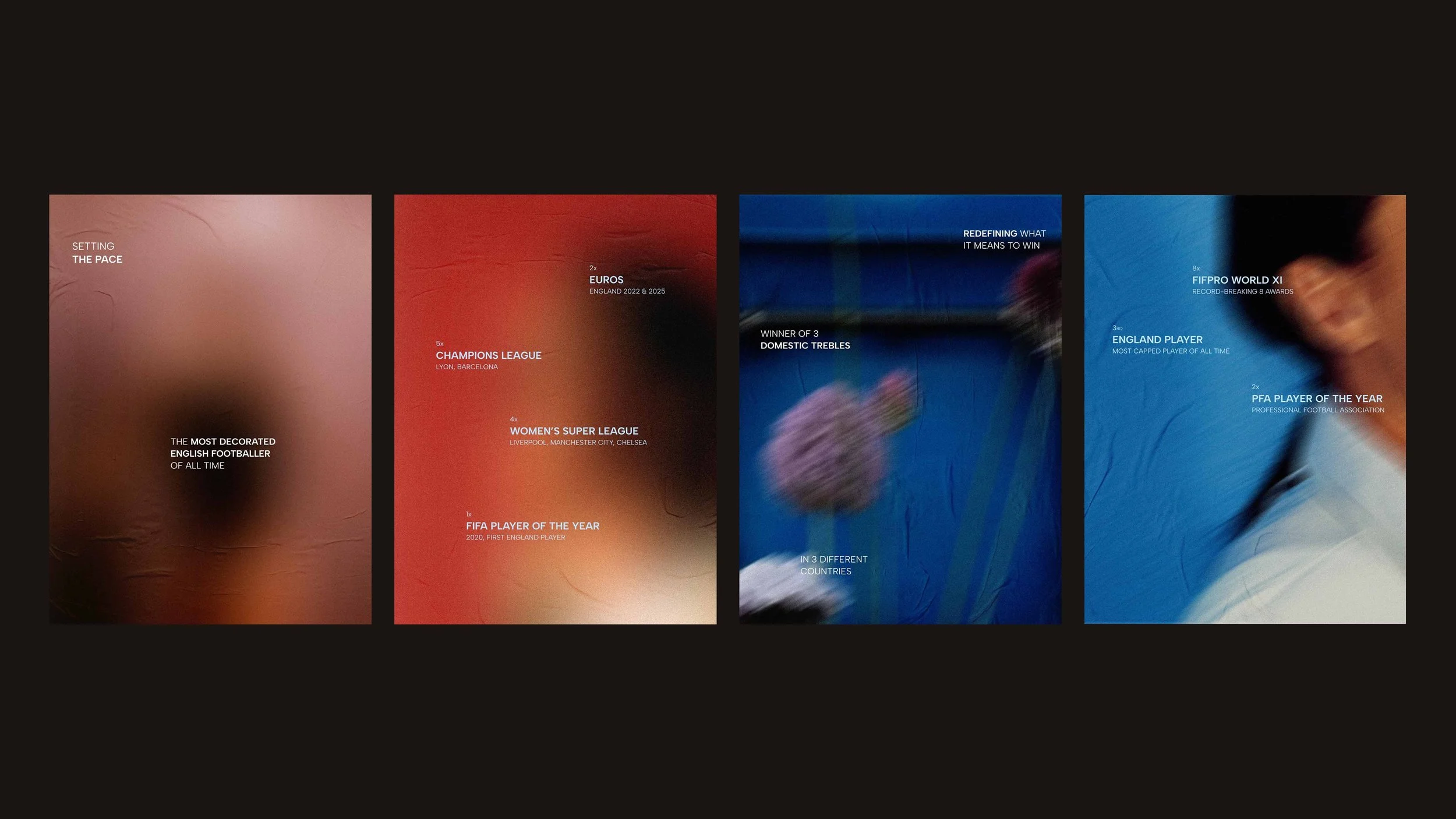
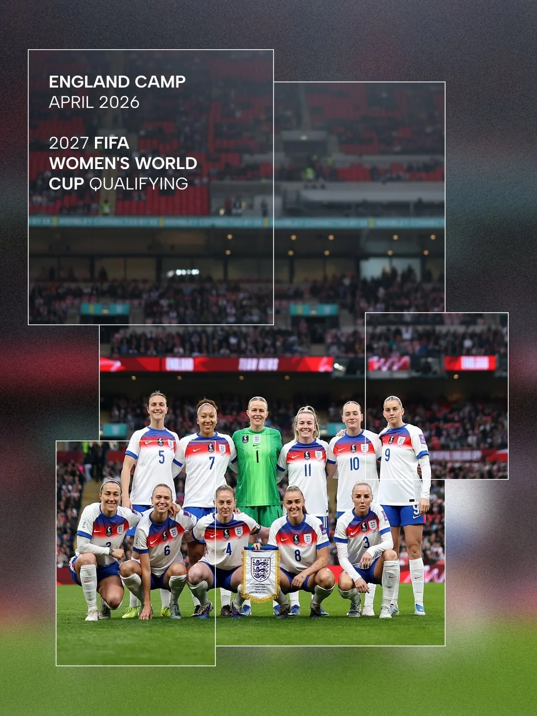
Lucy Bronze MBE is a defensive powerhouse. A player who has redefined what it means to win. With 5 Champions League titles, 9 domestic league crowns and 2 European Championship wins, she stands among the most decorated footballers of all time. The first female player ever to achieve domestic trebles in three different countries, Bronze hasn't just etched her legacy in gold, but in the history of the game itself.
Now, we welcome a new era for Lucy Bronze; the introduction of her brand. In creative partnership with Duzi St., the Lucy Bronze brand allows fans to experience Lucy, not just the footballer, but the icon. A brand world that plays with impact, informs and inspires, capturing the same dynamism Lucy shows on the pitch.
[03] The logotype is designed to move with context, shifting from full expression to a more concise form for partnerships. This flexibility aims to reflect the same instinct and control that defines Lucy’s game.
Our partnership became an exercise in brand restraint. Lucy has a clear voice and a powerful message, but that message doesn’t need to be shouted in order to be heard. Every decision was guided by a single intention; to represent Lucy through her hard fought reputation as an athlete of unique resilience.
We shaped a visual identity designed to endure, one that speaks to Lucy’s legacy whilst leaving space for what comes next. Rather than chasing relevance or leaning into commercial cues, the identity is grounded in simplicity and confidence, echoing the way Lucy carries herself both on and off the pitch.
XXX
lorem ipsum
lorem
XXX
lorem ipsum
lorem
XXX
lorem ipsum
lorem
XXX
lorem ipsum
lorem
XXX
lorem ipsum
lorem
XXX
lorem ipsum
lorem
[04] Interactions aren’t there to decorate, they’re there to be felt. Micro-animations snap with intent. Transitions carry weight. Hover states invite action. Every detail is tuned to create a sense of rhythm and flow, echoing Lucy’s instinctive movement on the pitch.
![[01 / 09]](https://images.squarespace-cdn.com/content/v1/697bcd1af89ab47bd0161ef5/0e148c13-89f6-4fbe-bbe4-700af562bf62/Next+Drop_Lucy+Bronze_Duzi+St.jpg)
[01 / 09]
![[02 / 09]](https://images.squarespace-cdn.com/content/v1/697bcd1af89ab47bd0161ef5/e348fb87-5e4c-4f69-850b-5cc6bdce78b8/Behind+the+Scene_Lucy+Bronze+x+ALIGNE_Duzi+St.jpg)
[02 / 09]
![[03 / 09]](https://images.squarespace-cdn.com/content/v1/697bcd1af89ab47bd0161ef5/23cd1494-1728-4473-9d13-be07a38a4e70/Lucy+Bronze_Aligne+Partnership_Duzi+St.gif)
[03 / 09]
![[04 / 09]](https://images.squarespace-cdn.com/content/v1/697bcd1af89ab47bd0161ef5/45ac92e2-8322-4cbe-a1c8-b78230b23158/Footer+Signature_Lucy+Bronze_Duzi+St.jpg)
[04 / 09]
![[05 / 09]](https://images.squarespace-cdn.com/content/v1/697bcd1af89ab47bd0161ef5/a6643a93-8e2b-4774-b2f7-085ee7bc52ca/In+Motion+Hover+State_Lucy+Bronze_Duzi+St.gif)
[05 / 09]
![[06 / 09]](https://images.squarespace-cdn.com/content/v1/697bcd1af89ab47bd0161ef5/846b5dbb-36a4-485b-96a8-d9bae335dec5/System_Lucy+Bronze_Duzi+St.jpg)
[06 / 09]
![[07 / 09]](https://images.squarespace-cdn.com/content/v1/697bcd1af89ab47bd0161ef5/10ee3083-f38c-402e-a9d2-59a7f16aab12/Launch_Lucy+Bronze_Duzi+St.jpg)
[07 / 09]
![[08 / 09]](https://images.squarespace-cdn.com/content/v1/697bcd1af89ab47bd0161ef5/cdfe5921-acc8-41ce-b5b7-42f3b09343da/In+Motion+Hover_Lucy+Bronze_Duzi+St.gif)
[08 / 09]
![[09 / 09]](https://images.squarespace-cdn.com/content/v1/697bcd1af89ab47bd0161ef5/548d4915-2957-44ab-a0e3-38f069d029d1/BTS_Lucy+Bronze_Aligne+Partnership_Duzi+St.gif)
[09 / 09]
Defining a design system
The design system draws directly from her. A confident yet sleek logotype reflects Lucy’s leadership; a modern mark for a modern athlete. The visual language pays homage to Lucy’s dynamism by following a strict layout guide inspired by her own handwritten signature.
By mapping the corners and curves of Lucy’s signature, we arrived at a fragmented framework that reflects her journey as an athlete; rather than imposing a definitive structure, the system allows elements to shift and settle, mirroring the resilience required to navigate a career defined by both challenge and progression. This creates a visual language that feels dynamic and expressive, while remaining consistent across everything the brand touches.
[05] By plotting points at the corners and curves of Lucy’s signature, we are left with a unique composition that feels expressive and energetic. These plotted points decipher where content is positioned. From social posts and stories to presentation covers and event invitations, this unique guide ensures Lucy’s brand feels expressive and unexpected at every step.

Lucy in motion
The Lucy Bronze brand has its own signature style of image treatment. This treatment is inspired by the idea of Lucy in Motion. This style of image treatment affords the brand toolkit a textural backdrop that allows us to transform standard images into vibrant backgrounds. It adds a sense of movement and power to branded content, reflecting Lucy’s continued momentum and unique spirit.
We utilise Lucy’s performance statistics to define the specific texture and motion to treat the images. This data can influence our settings of angles, pixels, distance and rotation to ensure all image treatments are bespoke to Lucy and authentically reflect her dynamism on the pitch.
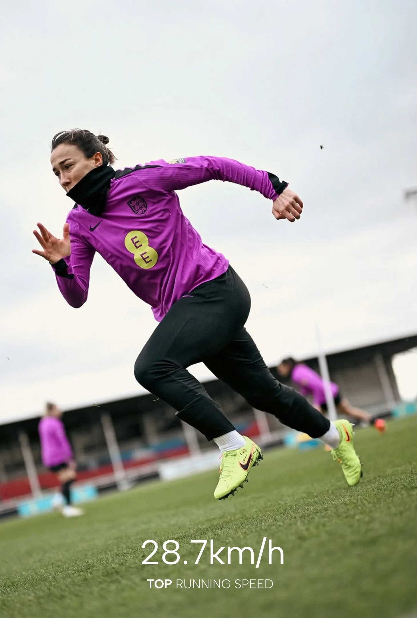
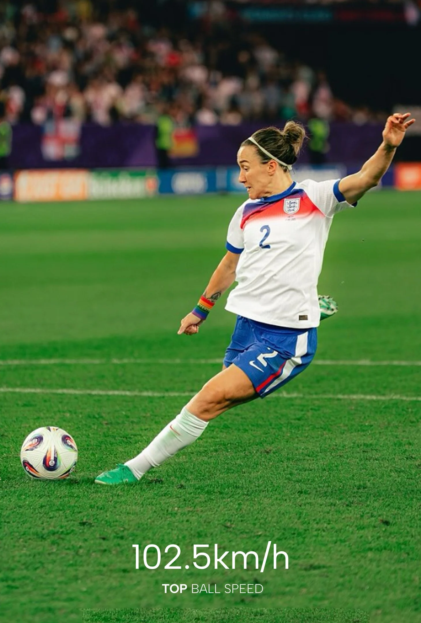
[07] A considered image treatment brings movement and texture into each composition; we use Lucy’s performance statistics as values to shift the angle, scale and rotation of each image, creating a visual rhythm that feels distinctive to Lucy.
[08] This style of image treatment affords the brand toolkit a textural backdrop that allows us to transform standard images into vibrant backgrounds. It adds a sense of movement and power to branded content, reflecting Lucy’s continued momentum and unique spirit.
The Lucy Bronze

Scroll to discover the brand in action today >
ALIGNE Women going places
AUDREY'S Something a little bit extraordinary
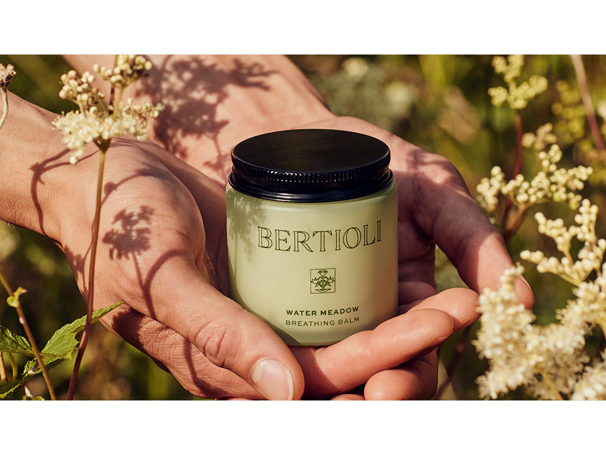
BERTIOLI The nature of beauty
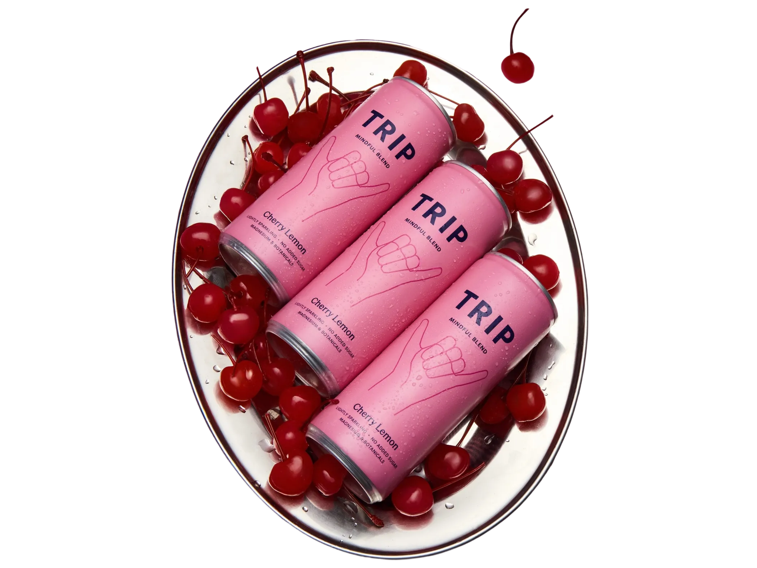
TRIP Take a Trip to find your calm